4 Best Vending Machine Website Designs for Inspiring Your Online Presence
A well-designed website is essential for vending machine companies aiming to stand out and attract more customers online. Effective website design helps streamline user experience, build trust, and showcase machine features clearly to potential buyers.
With many brands competing for attention, having an engaging and functional website gives businesses a competitive advantage. This article reviews examples of successful vending machine website designs to highlight what works in this specialized industry.
Key Elements of Vending Website Design
Good vending website design includes several essential features that improve user experience and support business goals. One important element is clear navigation. Simple menus and logical page structures help visitors find key information quickly.
A clean layout with high-quality images of vending machines is also vital. Sharp visuals help customers see product details and feel confident in their choices.
Fast page load speed is crucial. Users expect websites to load quickly, and slow sites may increase bounce rates.
Key contact details should be displayed clearly. Adding contact forms or live chat can make it easy for potential clients to reach out.
Consistent branding, through colors and logos, makes the website feel professional and trustworthy. Proper use of white space keeps the design uncluttered and user-friendly.
1) VendNet Pro
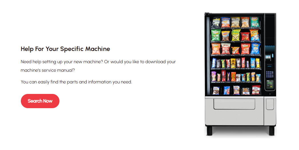
VendNet Pro features a clean and modern layout that makes it easy for visitors to find essential information. The menu is organized logically, with clear categories for products, services, and support.
Visuals on the site are high-quality and relevant, showcasing vending machine models without distractions. The color palette is simple and professional, contributing to a trustworthy first impression.
One notable strength is the responsive design, which works smoothly on both desktop and mobile devices. Contact details and inquiry forms are easily accessible, reducing barriers for potential customers.
VendNet Pro also provides concise descriptions and clear calls to action, supporting users who want to request quotes or learn more. Its attention to user experience sets it apart, although other sites like St. Louis Vending also offer strong competition in this area.
2) St. Louis Vending
St. Louis Vending features a clean, functional website that prioritizes user navigation. The homepage presents product categories and service options clearly, allowing visitors to find vending solutions quickly.
The color scheme is simple and professional, matching their brand identity. Information about vending technology, product selection, and service areas is easy to locate without unnecessary clutter.
Contact options are highly visible, including both phone and email, which helps build trust with prospective clients. The website uses concise language and straightforward facts, avoiding overwhelming visitors with too much information.
Their design works well on both desktop and mobile devices. The site loads quickly and includes clear calls to action for inquiries and service requests.
3) Shekel
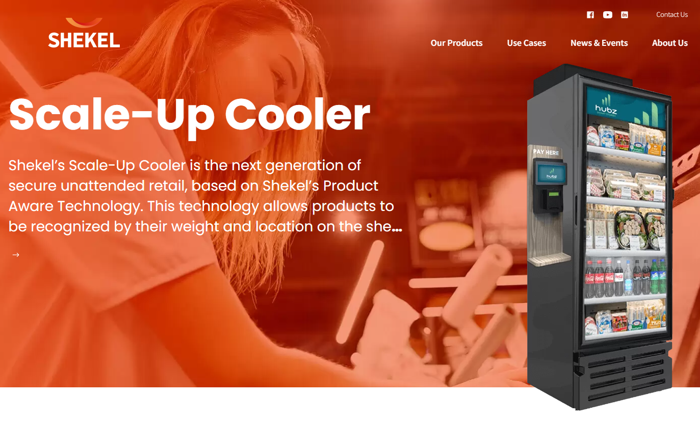
Shekel’s website stands out for its clean, modern design that immediately communicates professionalism and innovation. The homepage features intuitive navigation, allowing visitors to quickly find information about Shekel’s advanced vending solutions without feeling overwhelmed. High-resolution images and interactive product displays help users visualize the machines in real-world settings, making the browsing experience both engaging and informative.
Another strength of Shekel’s website is its clear presentation of complex technology. Technical specifications, features, and benefits are laid out in a way that’s easy to understand, even for those new to the vending industry. The site also includes case studies and testimonials, building trust and credibility with potential clients.
Finally, Shekel’s website is optimized for both desktop and mobile users, ensuring a seamless experience no matter how visitors access the site. With fast load times, accessible support options, and a well-organized structure, Shekel’s website exemplifies best practices in web design for the vending industry.
4) QuickVend
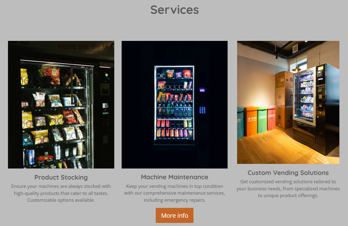
QuickVend’s website offers visitors a clean and simple experience. The navigation is straightforward, making it easy to find information about products and services. The homepage features concise product descriptions and large, clear images.
The site’s design uses consistent colors and plenty of white space. Contact forms and quote request options are accessible from every main page. Mobile users will find that pages load quickly and display elements correctly.
QuickVend highlights customer testimonials and frequently asked questions. These sections help build trust and address common concerns without overwhelming the reader. The site also includes a basic blog for news and updates.
Compared to others like St. Louis Vending, QuickVend emphasizes clarity and speed. Their focus on user experience ensures visitors can get details, request service, or make decisions without confusion.
Leave a Reply