Designing for Kids: UX Best Practices for Educational and Fun Websites
Children are interacting with online materials at younger ages than ever in the digital age of today. The internet presents great chances for young brains whether it comes to learning alphabets, reading stories, or playing educational games. Designing digital experiences for children does, however, provide particular difficulties. Children have different cognitive ability, visual preferences, and interaction styles than adults. User experience (UX) design for children thus calls for a careful, age-appropriate, and playful approach.
With references to reputable sites like Kids World Fun, a worldwide website providing stories, rhymes, and learning resources catered for young audiences, this article explores the best UX practices for producing interesting, educational websites for kids.
1. Know Your Audience: Age Matters
Children falling between the ages of three and twelve show different phases of behavioral and cognitive development. Designing a one-size-fits-all website thus proves unworkable. UX design has to be catered to particular age ranges:
- Ages 3–5: Simple visuals, large buttons, audio cues, and minimal text.
- Ages 6–8: Interactive elements, vibrant colors, short instructions, and early reading-level content.
- Ages 9–12: More complex navigation, richer content, and opportunities for exploration and learning.
For example, Kids World Fun carefully breaks out its material. The stories are age-appropriate and brief; the learning materials are arranged such that simple access depending on interest and ability is possible.
2. Simplify Navigation and Reduce Cognitive Load
Children’s working memory is limited, thus they could find difficult navigation intolerable. The navigational system should be:
- Simple and consistent: Keep menus minimal and use recognizable icons.
- Flat hierarchy: Avoid multiple levels of submenus.
- Always visible: Ensure important buttons and menu items are easy to spot.
For instance, the Learn section of Kids World Fun arranges English language materials in a straightforward, scrollable layout with few distractions so that kids may concentrate on their studies.
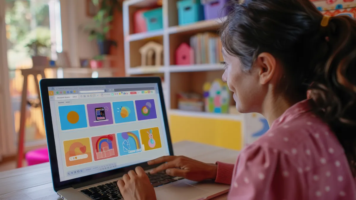
3. Use Bright Colors and Fun Visuals
Visual appeal is a major factor in keeping kids engaged. Colors should be:
- Bright and contrasting to attract attention.
- Used consistently for navigational cues (e.g., the same color for clickable items).
- In harmony with the educational tone (avoid overly saturated palettes that can cause eye strain).
Additionally improving appeal are images, friendly characters, and animations. Moderation is important, though; too many flashy animations might take focus away from the learning goal.
4. Create a Sense of Play and Exploration
Youngsters learn most through play. Excellent ways to keep younger users interested are gamification, narrative, and interactive quizzes. Good UX for kids includes:
- Rewards and encouragement: Stars, badges, and “Well Done!” pop-ups.
- Interactive elements: Drag-and-drop games, clickable story characters, and puzzles.
- Exploratory paths: Let kids discover new stories, words, or facts through curiosity-driven navigation.
Websites like Kids World Fun accomplish this by offering a range of entertaining learning opportunities, from moral tales and rhymes to word puzzles and quizzes, so motivating repeated visits.
5. Incorporate Audio and Visual Feedback
Children, especially pre-readers—gain much from visual feedback and audio cues. important components include:
- Voice-over instructions that explain tasks or read content aloud.
- Sound effects when buttons are clicked or tasks are completed.
- Visual indicators like changing colors, bouncing icons, or sparkles when an action is successful.
Younger children find these signals comforting and help the site to seem alive and responsive.
6. Prioritize Accessibility and Readability
Inclusive design is vital in educational content for kids. Your website should cater to:
- Emerging readers: Use large fonts, simple vocabulary, and short sentences.
- Visually impaired children: Ensure high contrast and provide alt-text for images.
- Neurodiverse users: Avoid flashing graphics and use predictable navigation patterns.
Younger children find these signals comforting and help the site to seem alive and responsive.
7. Minimize Ads and External Distractions
Children find it easy to get distracted, thus cluttered interfaces can interfere with their learning. Excellent practices include:
- Avoiding third-party ads where possible, especially those not child-safe.
- Keeping the layout clean with a good balance of white space.
- Avoiding pop-ups unless they provide useful navigation or educational prompts.
Safe environments where children may explore free from being drawn away by pointless content are what educational websites should be.
8. Design for Touch, Not Just Clicks
Children are more likely to use tablets or touchscreen devices. UX should account for:
- Larger touch targets (minimum 44×44 pixels).
- Spacious layouts to avoid accidental taps.
- Swipe and tap interactions that are intuitive for small fingers.
To be sure your website is touch-friendly and responsive on several devices, test it. The layout of Kids World Fun ensures access on mobile phones and tablets by adjusting nicely over screen sizes.
9. Engage Parents and Educators
Although children are the main users, parents and teachers usually help to enable their access. A great kids’ website also:
- Offers printable resources or downloadable content.
- Explains the learning goals clearly to adults.
- Includes contact or feedback options for parents to reach out.
Without upsetting the child-centric experience, sections like guest post invitations or story contributions on Kids World Fun gently engage adult users.
10. Test with Real Users (Children!)
The most important UX habit is ultimately testing your design with actual users. What makes sense to adults might not be intuitive to kids. See their interactions with your website.
- Do they get stuck on a page?
- Can they recognize clickable buttons?
- Are they excited to return?
Get comments, iterate, and change depending on real use patterns. Designing for children is a lifelong education.
Conclusion
Creating fun and instructional websites for kids calls for more than just vivid colors and cartooning. It calls for thorough knowledge of usability ideas, learning behavior, and child psychology. Children can have significant digital experiences if developers and designers give simplicity, accessibility, engagement, and visual feedback top priority.
Leave a Reply