The Psychology Behind Effective Logo Design: How Color, Shape, and Symbolism Influence Brand Perception
Imagine if a simple visual element could boost your brand’s recognition by a staggering 80% and shape 93% of first impressions.
A logo can.
Consumers care about logos, and so should you.
In fact, 72% of people believe a brand’s logo quality reflects its commitment to innovation and continuous improvement.
So, if a logo looks careless, people will think whatever the business offers is an extension of the logo.
As a result, creating a thoughtfully designed brand logo as part of your marketing efforts builds:
- An emotional connection with potential customers.
- A positive brand perception.
- A strong visual identity.
If you want to know more about how designing a logo creates positive perceptions for your target market, you’ve landed on the right blog.
We’ll cover the following:
- Why a logo matters and its contributions to overall brand recognition and customer loyalty.
- The role of color psychology in logo design.
- The influence of shape in logo design.
- The role symbolism plays in a logo.
Why do logos matter?
Asking why logos matter is like asking why people’s names matter.
Logos create recognition, memorability, and a good first impression. As cliched as the following statement may sound, a logo is a brand’s face. It is a way for customers to identify and recall the company.
If we were to ask about the company with the half-bitten fruit in its logo, you’d immediately know who we’re talking about. Over time, the logo (specifically its shape and colors) becomes etched into people’s minds.
Consider StudioSuits, a men’s clothing brand specializing in tweed jackets, suits, and pants. Their logo is a straightforward, all-caps text design that reads “STUDIOSUITS” in a bold, black font.
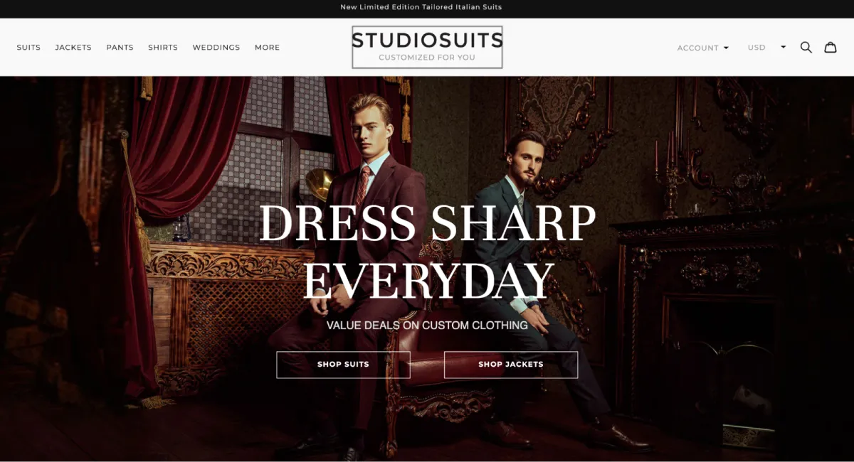
This minimalist approach makes the logo instantly recognizable and memorable. The lack of intricate details or complex imagery makes the brand name stand out, allowing customers to identify and associate with it easily.
A simple logo design like StudioSuits’ can help build brand loyalty. Its clean and uncluttered appearance aligns with the brand’s style, reinforcing its business identity and values.
On a more practical level, brands need to look different from competitors. A visually striking logo automatically differentiates you from competitors (for better or worse, but hopefully for the better).
Brand marketers and professional designers frequently discuss how a logo fosters an emotional connection and inspires trust in people. You might find the idea hard to believe as someone who doesn’t work in this space.
A logo on its own won’t create a connection. The branding associated with the logo does.
Take Nike’s logo. Over the years, the company has tirelessly worked to represent the Swoosh as a symbol of perseverance and self-belief.
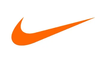
If you’ve ever watched a Nike ad, it’s almost always about breaking barriers and pushing through your potential. Each ad, celebrity endorsement, and piece of merchandise featuring the Swoosh makes that design a representation of all those values.
So, all it takes is for someone to see the logo, and they immediately feel those things.
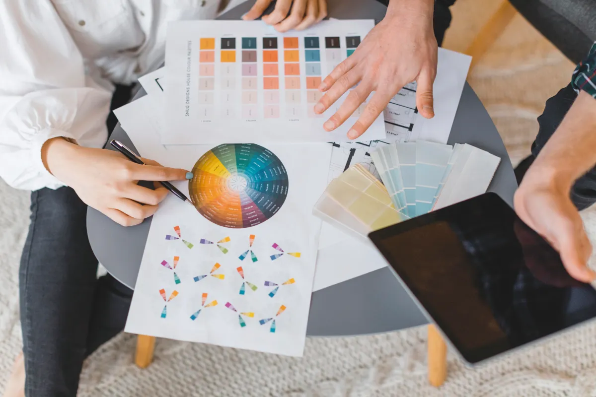
The psychology of color in logo design
Nike used a set of brand characteristics to establish a relationship with its customer base. Another way is through a color scheme.
Colors automatically evoke certain associations and emotions. In a process known as color psychology, the mere presence of color is enough for people to form a perception of your brand.
For example:
- Red can mean passion and energy or danger and aggression.
- Yellow radiates optimism, cheerfulness, and warmth.
- Green is associated with growth, nature, and health.
- Blue creates a sense of security and trust.
SoFi, a financial company, provides an excellent example of how effective logo design can influence brand perception. It uses a combination of blue and white in its logo. People often associate blue with trust and professionalism. This choice helps SoFi convey reliability, which is crucial for a financial services business.
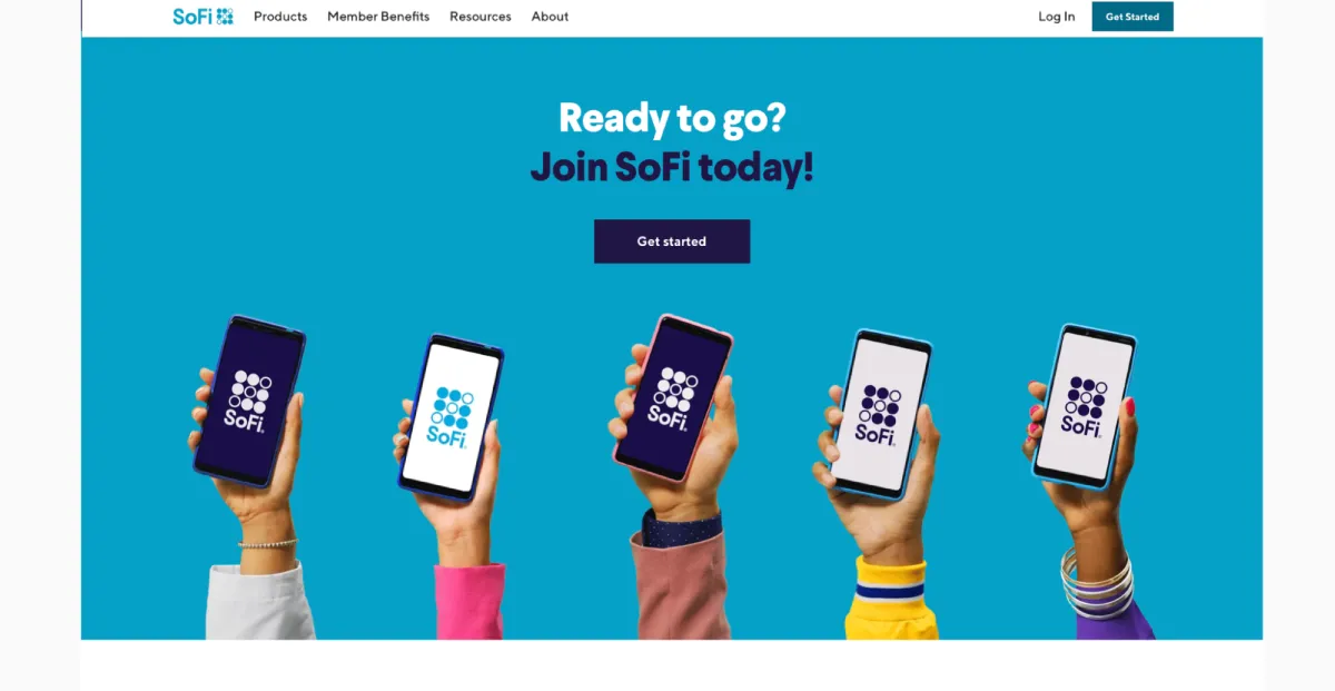
The simplicity and clarity of the design further enhance the brand’s message, making it approachable and trustworthy.
The blue color in SoFi’s logo can have a calming effect on viewers, promoting a sense of stability and confidence. For a company dealing with financial services, this is especially important as it reassures potential clients that they are in safe hands.
Tip: When designing your logo templates or custom logos, consider using a logo maker like Canva. An AI logo generator tool allows you to experiment with different color palettes, typography, and design options to match your brand personality and industry.
The influence of shape in logo design
Believe it or not, the shape of a logo can tap into our emotional core.
First, we have geometric shapes. These are circles, squares, rectangles, and triangles.
Ever wondered why the majority of logos are circular? It’s not just to make them fit perfectly on business cards or social media. Circles illustrate unity, community, and friendship — and every company wants people to feel those things.
You’ll find technology companies using squares or rectangles (think Microsoft and Samsung). Why? These shapes represent stability, professionalism, and honesty.
Technological investments are huge from a customer’s perspective, and companies want to make sure they demonstrate that they are serious about their technology to push customer purchase decisions in their favor.
And depending on how a triangle is positioned (which end the apex point faces), it reflects masculinity, power, and strength.
The next group of shapes includes organic and abstract forms. These are shapes that do two things.
They mimic natural forms and nature (such as leaves, trees, and animals). Any company delivering wellness and therapeutic healthcare services, or those working in this environment, may adopt such shapes.
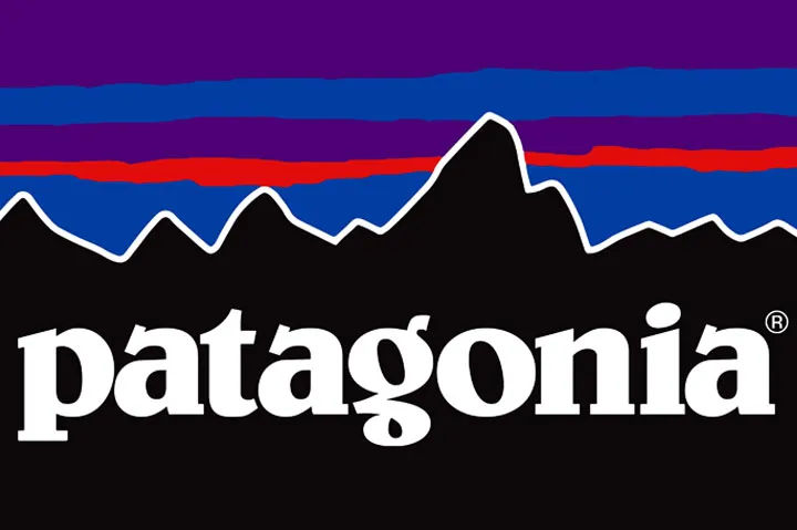
For example, Patagonia’s logo, a simple mountain sketch, demonstrates its commitment to sustainability and sustainable printing solutions for its merchandise.
Another example we can mention is the logo of Cruise America, a company known for RV rentals in Colorado. Their logo features a stylized illustration of an RV, accompanied by the brand name.
This visual representation immediately conveys the nature of their business to anyone who sees the logo. The RV icon serves as a powerful visual cue, instantly establishing an association between the brand and the recreational vehicle industry.
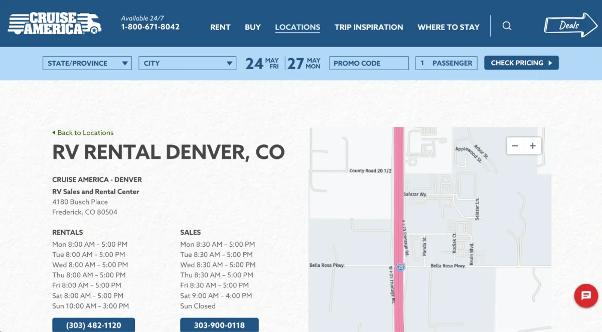
By combining the brand name with a relevant symbol, Cruise America’s logo achieves several advantages: it enhances brand recognition, communicates its core offering clearly, and strengthens its brand identity.
Firstly, it enhances brand recognition by creating a distinctive visual identity that sets them apart from competitors.
Secondly, it communicates the brand’s core offering in a clear and concise manner, facilitating instant understanding for potential customers.
The role of symbolism in logo design
Symbols can convey complex ideas, values, or emotions instantly.
With a symbol, a brand can combine its essence into one striking visual element. Over time, symbols tap into our collective unconscious, evoking certain emotions or meanings.
(If you’re a sports fan, think about how you feel when you see your favorite team’s emblem).
Animals, for instance, are common design elements. Lions symbolize strength and courage, while doves represent peace. Brands should leverage existing connections where possible and stylishly incorporate them into their logo.
Symbols can also take you back in history or create associations with certain audience segments.
Take Beaches of Normandy, a travel agency specializing in WWII historical tours, as an example of how logo design leverages symbolism to create a specific customer experience.
Their target audience— history buffs, veterans, and relatives of WWII heroes — is deeply interested in the stories of the men who fought there.
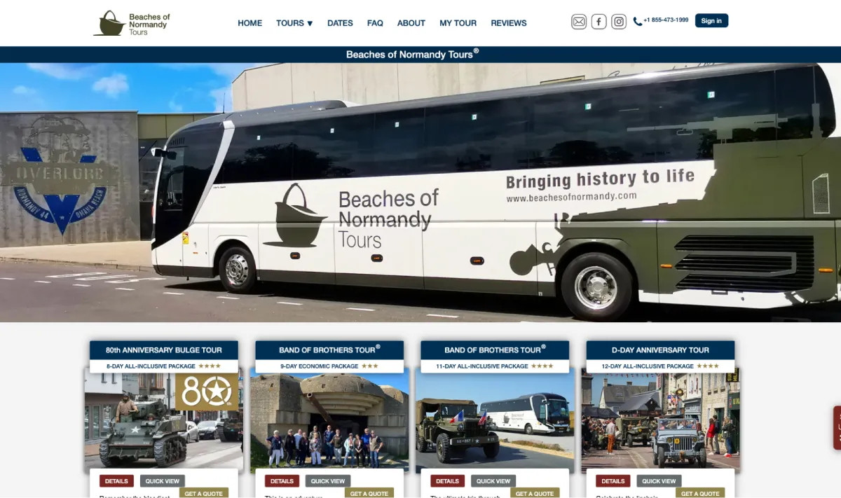
Beaches of Normandy understands this, and their logo reflects it perfectly.
The military green color evokes the uniforms and equipment of the era, while the centerpiece — a classic WWII soldier’s helmet — is a universally recognized symbol of war and service.
This symbolism is incredibly impactful when considering the core historical experiences they offer, like a visit to the Führerbunker, or one of their main offerings, the Band of Brothers Tour in Normandy.
For potential customers, the logo serves as a visual representation of the immersive historical experience that Beaches of Normandy offers, solidifying the company’s brand identity and forging an emotional connection with its target audience.
In the CBD space, the word “delta” and the delta symbol (∆) are significant as they are part of the names of several of the most well-known compounds. This trend is exemplified by the company Delta Remedys, which embraces the delta motif by incorporating the delta symbol and an uppercase “D” into its logo design.
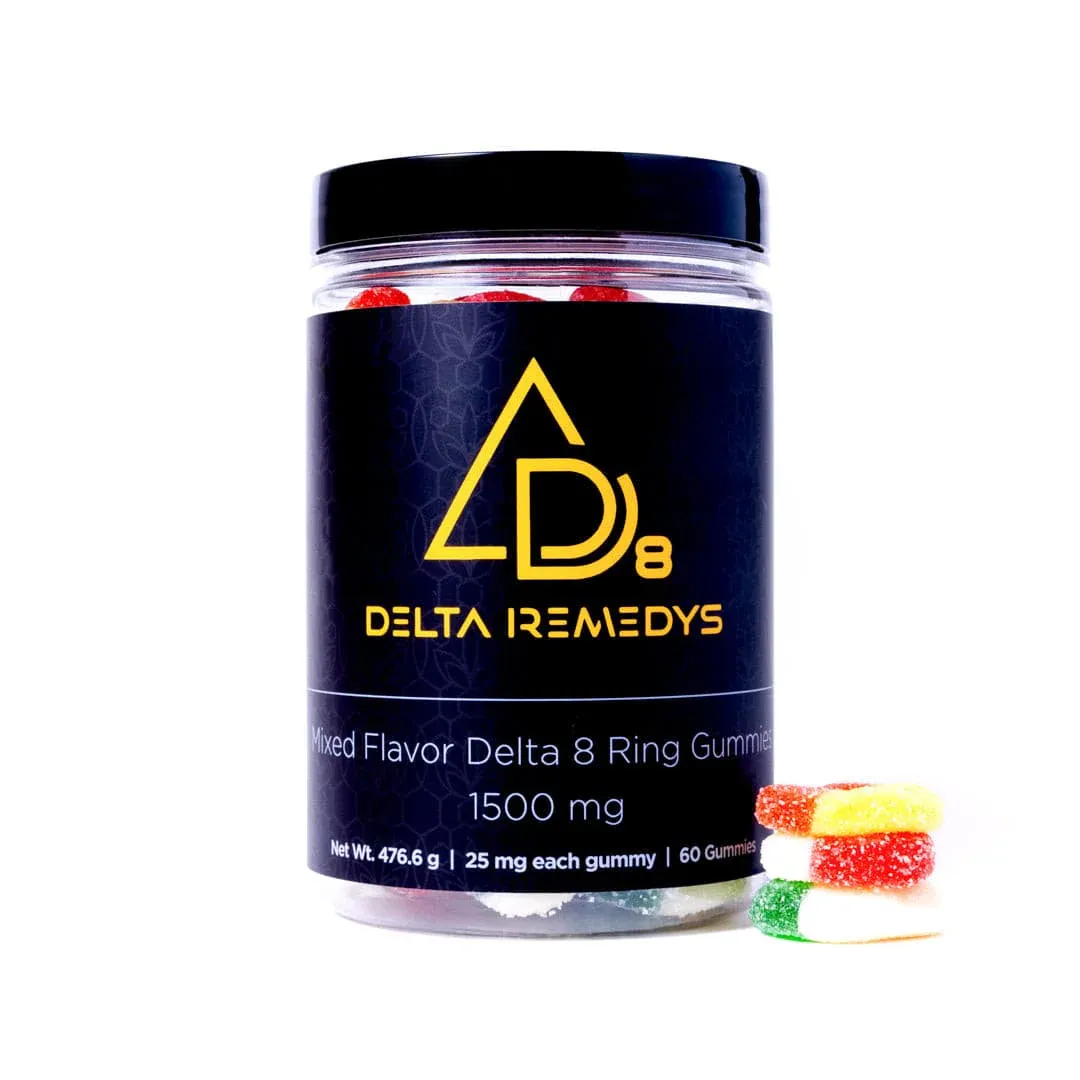
The strategic use of the delta symbolism taps into the psychological appeal of familiarity and recognition, as consumers have become accustomed to associating these elements with these products. That’s why this company doesn’t hesitate to use its logo in a big, bombastic way, like in its Delta-8 THC Gummies.
Wrapping up
The best logo designs balance color, shape, and symbolism to create a strong brand identity.
By understanding the psychological impact of each element, companies can use logo design tools to craft a brand logo that resonates with their target audience.
Creativity is key — don’t hesitate to experiment with different logo styles, layouts, and font styles. Testing and refining your designs will help you find the perfect balance, ensuring your logo effectively communicates your brand’s essence and stands out in the market.
Looking for inspiration for your online store? Head to P-Themes’ blog page for more information.
Leave a Reply