

How WooCommerce Stores Can Build Trust Into Digital Product Pages
Selling a digital product through WooCommerce creates a problem that most standard product templates were not designed to solve. Buyers cannot handle the item, inspect its materials, or judge its quality in person. Their decision depends almost entirely on whether the page explains the product clearly and removes uncertainty before checkout.
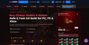
A polished theme helps, but appearance alone does not answer the questions that matter: What will I receive? Is it compatible with my device or account? How will delivery work? What happens if something goes wrong? Looking at a specialized listing created for customers who want to Buy D4 Gold shows why digital product pages need to place selection, fulfillment, and support information much closer to the purchase action.
Why Physical-Product Templates Create Friction
Most WooCommerce layouts are built around physical retail. They give prominent space to image galleries, color swatches, dimensions, stock notices, and shipping estimates. Those elements are useful for clothing or electronics, but they provide little reassurance when the product is a software key, template, subscription, course, virtual asset, or manually delivered online service.
Digital buyers evaluate a different set of risks. They want to confirm compatibility, understand the delivery method, know whether they must provide account information, and see what support is available after payment. When these details are scattered across tabs or policy pages, the buyer has to assemble the offer alone. That extra work creates doubt even when the product itself is legitimate.
The solution is not to add more promotional copy. It is to reorganize the page around the buyer’s decision process.
Five Elements That Reduce Purchase Uncertainty
Precise Product and Variant Information
The opening section should define exactly what is being sold. A vague label such as “premium package” is less useful than a short description that identifies the format, version, access period, license, or service scope.
Important choices should appear beside the price and add-to-cart button. Depending on the product, these may include:
- Operating system or software version
- Platform, server, account region, or language
- File format and resolution
- Subscription or access period
- Personal, team, or commercial license
- Number of users, downloads, or revisions
The chosen option should remain visible in the cart, checkout, confirmation email, and customer account. This reduces ordering mistakes and shows that the seller understands the category.
Delivery Details Beside the Purchase Action
“Delivered digitally” tells the buyer very little. A useful page states how delivery happens, when it normally occurs, and whether the customer must do anything after payment.
For an automated product, that may mean explaining that a download link or license key will be sent by email after payment confirmation. For a manually fulfilled service, the page should identify the information required from the customer, the normal processing window, and any hours or availability limits.
Place the short version near the purchase button. If payment review, regional availability, or missing account details can cause delays, say so plainly. A realistic timeframe builds more trust than an “instant delivery” claim the store cannot consistently meet.
A Guarantee That Explains the Remedy
Generic trust badges can look reassuring without telling customers what protection they actually have. A stronger guarantee names the problem and the response.
Explain what happens if a download link fails, a license key is invalid, the wrong version is delivered, or an order cannot be fulfilled. The wording must match the store’s real refund and replacement policy.
A concise statement near the button might tell buyers to contact support within a defined period for troubleshooting, replacement, or a refund review. The full terms can remain on a dedicated policy page, but the main remedy should be understandable before checkout.
A Product-Specific FAQ
An FAQ earns its place only when it answers questions tied to the product. Repeating the same general shipping and payment answers across every listing adds length without reducing uncertainty.
For a software key, buyers may need to know which systems are supported, where activation takes place, how many devices are allowed, and what to do if activation fails. For a template, they may care about required software, included fonts, commercial rights, updates, and customization support. Course buyers will have different questions about access periods, lesson formats, prerequisites, and instructor contact.
Support tickets, refund requests, and pre-sale emails reveal where the page is failing to explain the offer. Place the FAQ after the main product details so it supports the decision instead of becoming an afterthought.
Visible Pre-Sale and Post-Sale Support
A support option signals that the seller will remain available after payment. Identify the contact channel, typical response time, support hours, and the information needed to report a problem.
The page should also define the limits of support. If a purchase includes access to a file but not installation, customization, or account setup, make that distinction before checkout. Clear boundaries prevent mismatched expectations and are more credible than promising help with everything.
A Better Information Order for WooCommerce
Trust depends not only on what the page contains but also on when the buyer sees it. A practical page can follow this order:
Step 1: Define the Offer
Lead with a descriptive name, one-sentence value proposition, representative preview, and clear price. Avoid opening with broad claims such as “the ultimate solution” before explaining what the product does.
Step 2: Confirm Suitability
Show the platform, region, format, license, or version choices. If one selection affects another, use conditional fields or messages to prevent incompatible combinations.
Step 3: Explain Fulfillment
State the delivery method, normal timeframe, and any action required from the customer. Keep this summary visible without forcing the visitor to open another tab.
Step 4: Present the Decision Area
Group the selected options, final price, purchase button, payment information, and short guarantee into one clear visual area. A few precise statements are more useful than a wall of badges.
Step 5: Resolve Remaining Objections
Below the purchase area, provide detailed specifications, previews, instructions, FAQs, support information, and links to the complete policies. This follows the buyer’s natural sequence: understand the offer, confirm fit, evaluate fulfillment and risk, and then decide.
Applying the Structure With Common Page Builders
Store owners usually do not need a custom theme. WooCommerce extensions can manage selections, while Elementor, WPBakery, and similar builders can display delivery notes, specification tables, guarantee text, and FAQ accordions.
The harder task is deciding what deserves priority. A hero image should not push compatibility and delivery details below the fold simply because a theme demo does so. Reusable templates can keep the catalog consistent, but each category still needs specific questions and conditions.
Specialized marketplaces are useful references because they must manage precise configuration and non-physical fulfillment. On a page where customers can Buy D4 Gold, platform and server choices are treated as purchase-critical information rather than buried specifications. The lesson is how the page answers operational questions when they arise, not its visual style.
That same logic can be translated across WooCommerce categories:
| Product category | Information buyers need early |
| Software keys | Supported systems, activation method, device limit |
| Templates | File formats, required software, usage rights |
| Online courses | Curriculum, access period, prerequisites, support |
| Stock media | Resolution, license terms, attribution requirements |
| Subscriptions | Billing cycle, renewal terms, cancellation process |
| Virtual services | Required details, fulfillment steps, delivery window |
Common Trust Mistakes to Remove
Some page elements actively create confusion. Shipping calculators, parcel estimates, weight fields, and delivery-address language should disappear when no physical item is involved. Unsupported urgency messages, countdown timers, and excessive badges can also make a page feel less credible.
Important restrictions should not be hidden at the bottom of a terms page. Regional limits, compatibility requirements, download-expiry periods, renewal rules, and major refund exclusions belong in the decision path. Likewise, claims such as “instant,” “guaranteed,” or “always available” should appear only when the fulfillment process can support them.
Finally, avoid padding the description for search engines. Original previews, accurate specifications, useful FAQs, and consistent price and availability data offer more value than repetitive paragraphs. No on-page checklist can substitute for overall site quality, technical accessibility, and a trustworthy reputation.
Build the Page Around the Buyer’s Next Question
A strong digital product page is not the one with the most design elements. It is the one that anticipates uncertainty in the right order. It defines the product, confirms compatibility, explains fulfillment, states the available remedy, and makes support easy to find.
For WooCommerce store owners, the practical goal is simple: ensure that product options, delivery details, guarantees, FAQs, and support information appear before the buyer has to go looking for them. When those elements are specific and easy to scan, the page becomes more persuasive without sounding more promotional—and customers reach checkout with fewer unanswered questions.


Leave a Reply