E-Commerce Design Patterns: How WordPress Stores Boost Conversion Through Familiarity And Trust
In the world of online shopping, design isn’t just about aesthetics, it’s about psychology. Every button, color choice, and layout decision silently guides user behavior. When shoppers trust a site, they buy more, stay longer, and come back again. And that trust is often built not through bold innovation, but through familiar, consistent design patterns that feel intuitive.
Even small physical cues in real life, such as choosing between a keychain vs lanyards for an event giveaway, tap into the same principle. Familiarity breeds comfort, and comfort builds confidence. The same logic applies online: the most effective e-commerce websites are those that feel instantly usable, even on a first visit.
The Psychology Of Familiarity In Online Design
Human behavior follows predictable patterns. When people visit a new e-commerce site, they unconsciously compare it to others they’ve used before. If navigation feels intuitive, product pages look familiar, and calls-to-action are where they expect them to be, users relax. That psychological comfort translates into trust, and trust converts.
This is why design trends across top-performing online stores often look surprisingly similar. They all rely on pattern recognition. It’s not about copying; it’s about meeting expectations. When users don’t have to think about how to find what they need, they focus on why they want it.
Research from the Nielsen Norman Group shows that users form impressions of website credibility within 50 milliseconds. In that tiny window, recognizable design patterns, such as a clear logo in the top-left corner, a visible cart icon, or intuitive product filters, signal professionalism and reliability.
Why Familiar Doesn’t Mean Boring
Designers sometimes fear that familiar patterns lead to dull experiences. But in reality, consistency frees creativity. By using common design structures for navigation, checkout, and product display, brands earn the right to innovate elsewhere, in storytelling, visuals, or tone.
Think of major retailers like Apple, Amazon, or Nike. Their sites follow predictable layouts: top navigation bars, clean product grids, and straightforward checkouts. Yet, their branding and emotional resonance make each one distinctive. The lesson? Users crave clarity, not confusion.
A well-structured WordPress store can achieve this balance effortlessly. Themes and page builders allow flexibility in branding, while keeping foundational patterns, header placement, color hierarchy, and mobile responsiveness, consistent with what customers already know.
The Key E-Commerce Design Patterns That Build Trust
Let’s look at several proven design patterns that convert clicks into loyalty.
1. The Predictable Navigation Pattern
Users should always know where they are and how to get back. The top navigation bar remains one of the most trusted patterns because it aligns with how our eyes naturally scan screens, left to right, top to bottom. Include essential links only: Shop, About, Contact, and Cart. Keep dropdowns concise and logical.
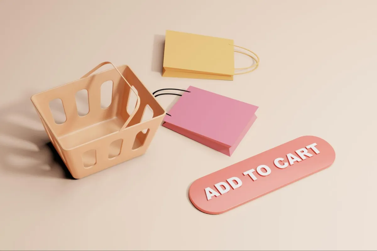
2. The Visual Hierarchy Of Product Pages
People scan before they read. Use large, high-quality product images, followed by concise descriptions and bold pricing. Include clear “Add to Cart” or “Buy Now” buttons above the fold. When users can see, understand, and act without scrolling, confidence rises.
3. The Safe And Seamless Checkout
A cluttered checkout process is one of the biggest conversion killers. Simplify the journey, three steps at most: Cart, Shipping, Payment. Include progress indicators and trust badges (SSL icons, secure payment options) to reassure users.
4. Consistency Across Devices
Today’s customers often browse on mobile before buying on desktop, or vice versa. Consistency in layout, fonts, and colors across all devices reinforces trust. WordPress themes like Porto are designed with responsive consistency, helping brands maintain a unified experience everywhere.
5. The Social Proof Layer
Reviews, testimonials, and user-generated photos act as micro-validations. People trust people, and visible feedback reduces hesitation. Position reviews near the purchase decision area to remind shoppers that others have had positive experiences.
The Subtle Science Of Micro-Interactions

Beyond major layout elements, micro-interactions, hover effects, loading animations, and button responses, give a site personality and reinforce its credibility. When these details are smooth and consistent, users feel subconsciously guided.
A laggy animation or inconsistent hover color can signal low quality, even if the product is great. WordPress plugins make refining these small design touches easy, allowing you to create a professional rhythm that feels responsive and human.
Micro-interactions, when done right, mirror real-world engagement. Just as a handshake or eye contact signals sincerity, a subtle animation confirms that your site “sees” the user’s action and acknowledges it.
The Role Of Storytelling In Familiar Design
A great e-commerce site doesn’t rely solely on visuals, it tells a story. Familiar patterns provide structure; storytelling provides emotion. Use banners, testimonials, and blog content to humanize your brand. Explain not just what you sell, but why it matters.
Your WordPress store can integrate this storytelling seamlessly, think of a homepage that transitions from a clean product grid to a lifestyle section with blog posts and user stories. Familiarity invites exploration, while storytelling deepens connection.
According to research from Forrester, emotionally connected customers have a 306% higher lifetime value than those who are merely satisfied. That emotional link begins with trust, and trust begins with design clarity.
Balancing Innovation And Expectation
Every designer faces the tension between standing out and staying familiar. The trick is to innovate where it delights, not where it confuses. Keep your checkout process straightforward, but personalize post-purchase experiences with creative touches, confirmation emails that reflect your brand voice, packaging that surprises, or loyalty programs that reward engagement.
In other words, use design patterns as scaffolding, the stable foundation upon which creativity can thrive.
Familiarity Breeds Confidence And Conversion
The most successful WordPress stores don’t chase novelty; they master predictability. By aligning design choices with human psychology, they create digital spaces that feel trustworthy, usable, and emotionally resonant.
When customers feel at home, they’re more likely to buy, and to come back.
So while trends may shift, one truth remains constant: in e-commerce, familiarity isn’t the enemy of innovation. It’s the foundation of trust, and trust is the ultimate conversion tool.
Leave a Reply