From Good to Great: Mobile App Design Tips for Users
Mobile app design plays quite a key role in perception as well as user interaction for digital products.
An app’s success or failure can be determined by creating an app visually engaging, functional, and intuitive to use.
One of the foundational ways to achieve this is by incorporating app UI component libraries early in the design process.
These libraries do provide some reusable standardized elements that can ensure consistency with efficiency for the app.
These elements are useful because they establish a firm user interface base.
Prioritize Clarity and Simplicity in Design
A clean, straightforward interface is most preferred by users.
Designers should avoid needless disarray.
Users should avoid complexity so they do not experience cognitive overload.
Each screen should lead users to the next step that makes sense and plainly show its reason without confusion.
Users interact naturally via the app through intuitive navigation, tactile feedback for buttons, also easily recognizable icons.
Because mobile screens are limited in size, simplicity is also especially vital.
For a breathable layout that prioritizes important features, designers must balance content density with whitespace.
In the event that we reduce distractions and funnel user attention toward core actions, then we create a more pleasant, efficient experience.
Consistency Builds Familiarity and Trust
Consistency throughout the app improves usability if it furnishes a familiar and expected experience for users.
This applies even to interactive behaviors in addition to visual components such as typography plus iconography as well as colors, also button styles.
Familiar design patterns or interaction models decrease cognitive friction for users.
The app becomes easier for users in learning and navigation.
Teams are enabled to maintain uniformity across sections along with screens by design systems plus component libraries here.
Consistent UI components make the app appear polished and professional, while they cohesively reinforce the brand identity.
Responsive and Adaptive Layouts for Various Devices
Users access mobile apps upon various devices having a wide array of screen sizes, resolutions, and orientations.
For the user who is on a large tablet or a compact smartphone, responsive design ensures that UI elements reflow and rearrange, and resize so as to provide them an optimal experience.
Adaptive layouts perform element scaling too.
They also adjust the navigation and content presentation cleverly according to device capabilities.
A multi-column layout may be suitable enough for tablets, but is not for phones, for instance.
Interactive controls, text size, also touch targets should be accommodated dynamically by the app for all contexts.
Thoughtful Touchscreen Interaction Design
Unlike web interfaces that are mainly designed just for mouse clicks, finger taps demand a more precise design for all mobile apps.
Proper button size, spacing, with layout reduce accidental inputs coupled with improved accessibility, which is especially important for users who have larger fingers or motor impairments.
Interactive elements need placement that ergonomics considers.
Attention to ergonomics is important as well.
Since lots of users like single-handed use, buttons require easy thumb reach.
This improves not only comfort but also reduces the friction that can make users abandon the app.
Incorporate Immediate Feedback and Effective Error Handling
A responsive app communicates clearly to the user after each interaction by using immediate visual or auditory feedback.
Visibly respond buttons should, when tapped, continue processes, loaders should indicate successful actions confirmations should reassure.
Error messages likewise must be clear and helpful since they guide users effortlessly to correct mistakes or resolve issues.
This frustrates users less.
The app’s reliability also builds user confidence.
Design with Accessibility and Inclusivity in Mind
Mobile apps must serve to include as wide an audience as it is possible.
Designers prioritize usability for users with varying abilities; then, they reflect ethical design principles, also expanding reach.
Important accessibility considerations include the need for sufficient touch target sizes, the importance of screen reader compatibility, the provision of scalable fonts, and due attention to color contrast for ensuring readability.
Dark mode support reduces eye strain, in addition, which is another user-favored feature.
It also saves the device’s battery life.
Visual clarity with comfortable, mindful design for light as well as dark interfaces ensures ambient lighting is maintained regardless.
Embrace Personalization to Enhance User Engagement
Personalization goes beyond generic interfaces since systems dynamically tailor content, send notifications, with feature items based on user behavior and preferences.
Engagement and loyalty do increase when smart applications can adapt the experiences to better suit the individual needs through the analysis of interaction patterns.
Contextual adaptations are driven by the app, which often integrates rules-based systems or machine learning models.
This makes the app feel much smarter and more useful over the course of time.
Streamlining Development with App UI Component Libraries
Implementing app UI component libraries assists developers when they are developing.
Teams maintain visual consistency using standardized pre-built elements like buttons, menus, forms, and dialogs across the application for function.
Prototyping speeds up, and redundancy reduces because app scaling becomes more manageable due to these libraries.
They also ensure the adherence of each component to accessibility standards and platform conventions, and this improves the overall quality.
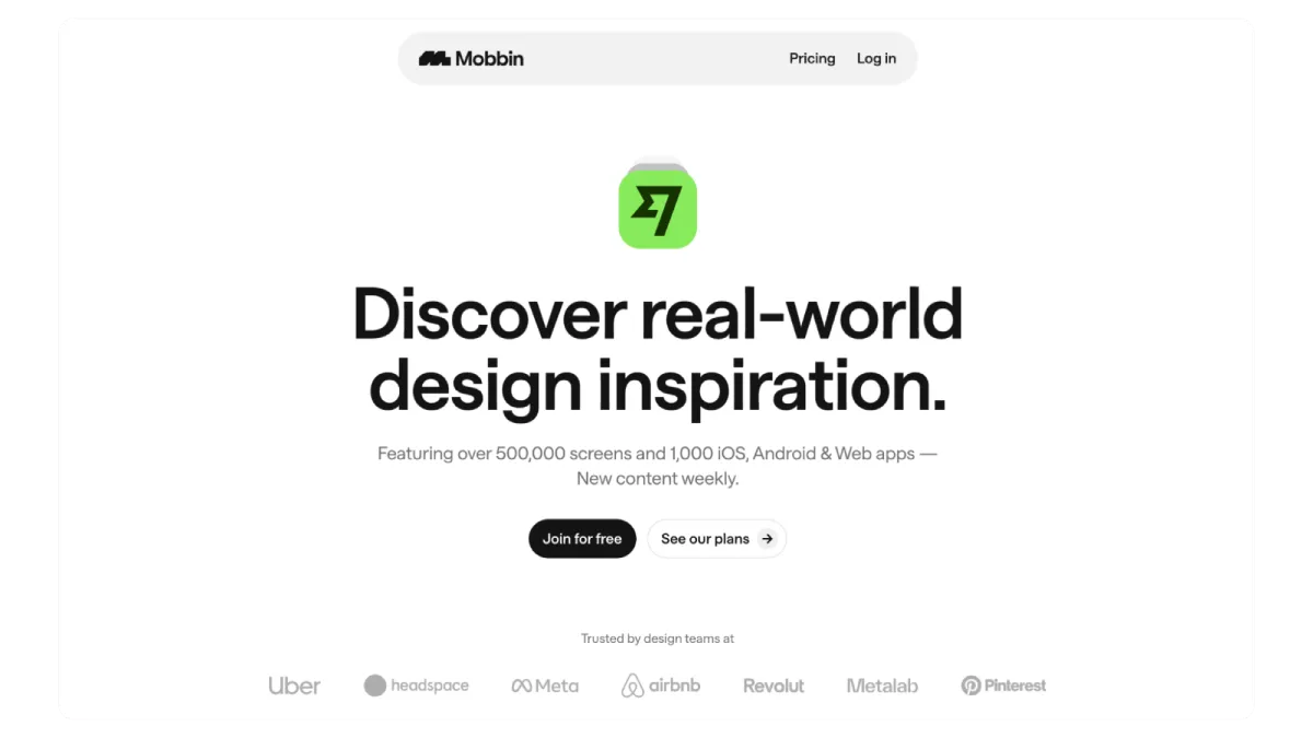
Mobbin assists the design as well as development community in discovering well-created app UI components.
It also aids them in using those parts and stands out greatly.
It gives a complete set of UI patterns that may spark designs.
The patterns can also provide ready references for top components in class.
Conclusion
Successful mobile app design hinges on interfaces that are both clear and simple and consistent while responding smoothly across devices within user contexts.
Interactions are touch-friendly, feedback is immediate, accessibility exists, and personalization meets varied user expectations plus needs.
If teams leverage app UI component libraries early plus consistently in the design lifecycle, quality as well as coherence are ensured, so this allows them to focus on creative and user-centered innovations.
For users, these principles allow designers to create intuitive, enjoyable, and valuable apps.
This creation will ultimately drive sustained engagement in addition to business success.

Leave a Reply