How Black Affects Color Perception in User Interface and Web Design
Every creative choice in web design lends a hand to how your brand is perceived by anyone who comes across it. Did you know that you only have 10 seconds to grab a customer’s attention before they click exit? Each hue, font, or stroke awakens the viewer’s emotions, holds their attention, and adds to the significance of your branding.
A popular trend emerging in recent years is favoring black website design due to its ability to create a striking visual contrast. The rise of using black in design represents a deeper understanding of the audience’s color perception. Using black for aesthetics and functional advantages creates a more immersive experience for audiences.
The Psychology of Black in Design
Color is one of the most powerful designer tools. In fact, 39% of users are likelier to stay on your site if they’re successfully drawn by colors. This is because colors stimulate our visual senses while evoking psychological responses.
Emotional Impact:
Black in design communicates authority and power, making this color a great choice for corporate and legal websites. As these industries bank on trustworthiness, the elegance, sophistication, and power the color gives are important.
Luxury companies like Chanel and Gucci do an excellent job of incorporating black in their web design masterfully. They’re able to create an air of exclusivity and high-end allure by putting emphasis on black contrast as the driver for prestige on their website.
Entertainment and creative industries can use black’s ability to create a sense of mystery. One such company is A24. Their tastefully designed website captures viewers’ intrigue and keeps them on their toes for the production company’s next project.
The black contrast, from typography to interactive elements, builds a strong psychological foundation. Adding black elements to the website ensures cohesiveness throughout, making the brand experience feel more consistent and premium.
Cultural Variations:
However, the way people perceive black website design is not universal. This is because black color perception varies significantly between different cultures.
In Western contexts, black is usually associated with elegance and sophistication, but it can also mean mourning or loss.
In Eastern cultures, black represents balance (yin), wisdom, strength, and fertility. This puts the use of black in design to have an important role in philosophical and spiritual contexts.
These are only a few examples of just how black website design can be seen from varying cultural lenses. As such, designers must ground their website design in strategies that positively resonate with viewers from diverse and nuanced cultural backgrounds.
Case Studies:
Some leading companies that have taken a unique approach in implementing black’s visual power to their websites are:
- Mercedes-Benz‘s website uses black backgrounds to create a more dramatic vehicle reveal.
- Apple uses black backgrounds when showcasing products to highlight sleekness and modernity.
- Spotify‘s dark theme allows its vibrant green logo and accents to stand out, making an even better immersive user experience.
Black and Color Perception in UI Design
Color perception is an essential factor in UI design. Black’s commanding presence significantly influences users in perceiving other elements on their screen.
Contrast and Visibility:
More than just what looks great, using black in UI design calls for designers to consider various technical aspects for optimal user experience. When using black as a background paired with white text ensures readability and emphasis.
For instance, Apple’s website effectively uses white text against black backgrounds. This has created a more striking visual clarity, enhancing visibility and successfully guiding customers to important content.
Eye Strain and Accessibility:
Pairing white with black design requires the highest possible contrast ratio of 21:1. If not carefully managed, it can cause visual fatigue.
While dark mode lessens the screen’s brightness, which can make it easier for the eyes, your eyes need to work harder to perceive clearly. Prolonged exposure to dark designs in low-light environments can lead to eye strain.
To avoid potential eye strain and fatigue, designers must follow these accessibility standards. The Web Content Accessibility Guidelines (WCAG 2.1) details specific contrast ratios. The guidelines also entail font scaling and reader compatibility. All these hallmarks are set for easier readability, clear focus, accessibility, and effective navigation.
Despite the dominance of white background websites, having a good black contrast is important. Using tools that remove background helps balance black design and other brighter website elements, ensuring a clean and harmonious visual hierarchy for overall aesthetic and focus. Such are invaluable to lessen eye strain.
Practical Applications of Black in Web Design
Black website design is versatile, extending beyond aesthetics. It serves as a guide for user focus, enhances depth, and creates visuals with layouts that elevate the user experience. To successfully reach your brand’s goals in using the color, it’s important to have a good black color perception when:
-
Highlighting Content
Black, when used strategically as a backdrop, serves as a stark opportunity for emphasizing content. This method is very effective for portfolios or product showcases. This can be done through several visual techniques.
- Negative space has more impact against black backgrounds, drawing the attention of viewers to key elements. This way, it’s more natural and provides ample visual breathing room.
- Calls-to-action (CTA) become more prominent when thoughtfully colored against dark backgrounds. This could be a surefire way to drive conversions. Images can appear more saturated and impactful against black.
- To make your images take on a new life, it’s important for them to be clean and blend seamlessly. A good tool to remove background would be your best bet.
- Stark contrasts clearly define content sections. As visual rhythm emerges, the natural interplay of light and dark elements becomes easier.
Adopting these techniques calls for careful attention to technical details and considerations for user experience. Designers must know how to manage and execute gradients, spacing, content hierarchy, and contrast levels.
-
Enhancing Visual Hierarchy
Black website design can help establish visual hierarchy, creating more depth and dimension in digital interfaces. Using shadows and gradients develops subtle spatial illusions and builds special significance. This helps suggest depth without overwhelming the user while maintaining visibility and dimensions.
Strategically organizing content through layers makes it more intuitive. The stark contrast naturally suggests different levels of importance. Additionally, animation effects and interactive elements become more subtle in effectiveness.
When implementing these hierarchical elements, it’s crucial to consider the technical factors. Complex gradients and shadows can affect loading times and scrolling. Google’s customer insights found that 53% of mobile website visitors leave the site if it takes more than 3 seconds to load. As such, each website page’s performance needs to be optimized. Other factors include:
- Careful planning of loading strategies to avoid flashy transitions
- Testing various device compatibility
- Animation frame rates for smoother performance
A great example of a brand that has achieved a harmonious visual hierarchy is Awwwards. Their website is a melting point of peak creativity when it comes to using black backgrounds effectively. They showcase various sites that use dark backdrops for a clear visual hierarchy by balancing light and shadows.
-
Creating Minimalist Aesthetics
Using black in minimalistic design follows core principles for clarity and purpose. The color is popular with brands that want a sleek, sophisticated look as it reduces visual clutter.
Minimalism naturally reduces visual noise, and this effect is even more pronounced against black backgrounds. Unnecessary elements become easier to identify and remove. Clean lines create emphasis, guiding users to the sections that matter most to your brand.
Typography also has a more significant impact on dark backdrops. In essence, black backgrounds for minimalist designs challenge designers to think and plan strategically. This ensures a balanced and visually compelling experience. WebFX lists websites that exemplify this approach. Their showcase spotlights brands like Spotify and Jack Daniel’s use minimalist elements that enhance readability while focusing on key visuals.
Best Practices for Using Black in UI and Web Design
Now that you have an idea of what parts of web design need careful consideration, here are some best practices to hit the home run:
Text and Background Pairing
One essential factor that web designers need to consider is readability. Sure, your website might look visually stimulating or appealing. But if the content isn’t readable, then your consumers will have a hard time engaging. They could just then exit your website without taking any desired action.
Websites, especially those grounded with black backdrops, call for meticulous attention to detail. You can also switch it up with a white background and black elements for variety while still being cohesive with the theme.
Elements such as typography have several considerations that designers should focus on.
- Pure white text shouldn’t make up the entirety of the content to reduce eye strain. It would be best to use slightly off-white hues instead.
- Line height should be well thought out for more appropriate spacing between texts.
- Fonts should be readable against dark backgrounds. Sans-serif fonts are the best options for this.
- Font weight, whether too light or heavy, can affect readability against black. Finding the right balance is necessary.
From a more technical typography standpoint, here is a general guide you can use as a basis for optimal readability:
- Body text should be between 16px and 24px
- Line height should be between 1.5 and 1.8 times the font size
- Letter spacing should range from -0.1px to 0.5px
- Font weights could be between 400-500
- Color contrast must be a minimum ratio of 4.5:1, increasing for extended reading preferences
Complementary Colors and Contrast
Effective color pairings can help elevate the visuals of a website’s black-themed designs. HubSpot has excellent examples of pairing black backgrounds with vibrant color accents. If you want to try finding your mix, here are some things to keep in mind:
- Black with neon accents gives off a modern tech feel
- Black paired with metallic colors like gold, silver, and bronze creates an air of luxury and sophistication
- Blend black with dark tones for a subtle, gradient depth
- Avoid or limit overwhelming bold colors
- Ensure contrast is strong for readability and accessibility
Examples of Black in Design: Inspiration and Analysis
Outstanding Examples
Here are some standout examples of websites that use black backgrounds creatively:
| Melanie Daveid
|
 |
 |
Guillaume Azadian
|
| Lunar Wheel
What’s great about a black background is the ability to let the main focus shine. This is something that the Lunar Wheel website thrives in. Bold white font against a dark backdrop while spotlighting their product—an exceptionally quiet luggage wheel. |
 |
 |
Jack Daniel’s
Combining black pages with white accents, Jack Daniel’s creates a sophisticated feel that is a reflection of their brand identity. |
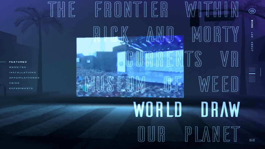
| Active Theory
Mixing bold, neon typography and immersive graphics with a black background, Active Theory guides user attention to specific features on their website. |
 |
These are only a few great website examples that use black elements in their design, showcasing how even simple choices can be striking.
Conclusion
Implementing black in web design goes beyond aesthetic value and purpose. Creating a website with a dark background needs to be grounded in a deep psychological understanding, technical requirements, and, of course, accessibility considerations. This knowledge needs to be thoughtfully and coherently applied throughout the pages of your website. Doing so adds to solidifying your site’s branding.
Every design choice needs to be cross-tested to ensure consistent performance in digital devices. Performance metrics need to be put in place to check both user needs and business goals. Finally, content must be accessible and follow the WCAG guidelines.
The future of black in web design is continuing to evolve. Designers who understand the fundamental principles and technical requirements of black-dominant design will be well-positioned to create innovative and effective digital experiences that stand the test of time.
CTA: Elevate your black-themed designs—explore our guide for the perfect colors that go with black!
AUTHOR’S BIO |
|
 |
Ericka Marie Banting, Removal.AIShe’s a writer and content editor specializing in content marketing, technology, and anything creative under the sun. From scripts to strategies, you can find her always brainstorming her next big caffeine-fuelled idea. In her downtime, she enjoys reading, watching films, tinkering with pictures using Remove bg, and playing online games. Connect with Ericka on LinkedIn to learn more about her work. |

Leave a Reply