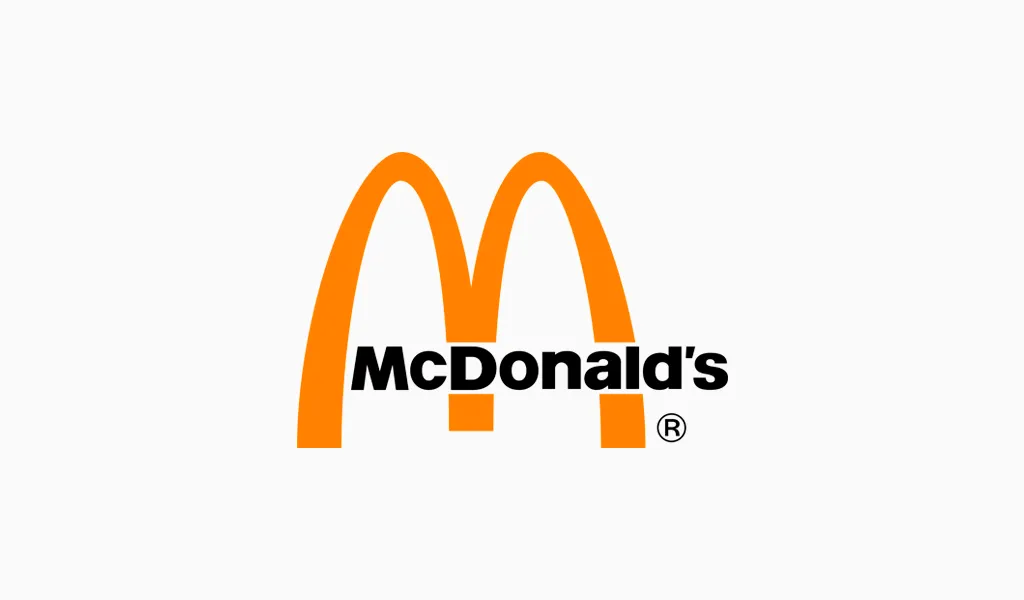
McDonald’s Logo and PNG: Meaning, History, and the Golden Arches Evolution
I have spent years analyzing how iconic logos shape brand perception. Few stories illustrate this better than the evolution of the McDonald’s logo. The golden arches, instantly recognizable worldwide, hold valuable lessons for businesses on creating a timeless brand identity. In this guide, I will dissect the meaning, history, and evolution of the logo while sharing actionable branding insights.
Origins of the Golden Arches
The McDonald’s logo originated in the 1950s when the fast-food chain sought a unique visual identity. At that time, branding was often limited to simple signage. Architect Stanley Meston introduced a futuristic design for McDonald’s restaurants, incorporating two golden arches that framed the building. This architectural feature soon evolved into a symbol representing quality and quick service.
From a marketing perspective, the arches were a bold departure from the norms of the era. They combined Googie architecture—a retro-futuristic style popular in the 50s—with simplicity. These curves captured attention from the highway and created instant recognition.
From Architecture to Logo (1952–1962)
By the early 1960s, McDonald’s leadership realized that the physical arches could transform into a graphic emblem. Designer Jim Schindler created the first official version of the McDonald’s logo in 1962. This design merged the two golden arches into a stylized “M,” forming the foundation of the modern logo.
Logo Evolution: Key Visual Changes
The McDonald’s logo did not remain static. Over the decades, it underwent refinements while retaining its core elements.
1968–1975: A Simplified Identity
In 1968, McDonald’s introduced a cleaner version of the “M” with sharper curves and bolder color contrast. The bright yellow arches against a red background conveyed energy, speed, and appetite—psychological triggers crucial for fast food branding.
1975–1992: Bold Modernization
During the late 70s and early 90s, the company experimented with typography and framing. The “M” became a standalone symbol, accompanied by minimalist text. This era reflected McDonald’s global expansion and the need for universal visual recognition.
2003–2006: Embracing Minimalism
In the early 2000s, McDonald’s adopted a flat design trend with the “I’m Lovin’ It” campaign. The logo lost shadows and gradients, adapting to digital screens without losing its iconic character. This move demonstrated how a brand could evolve without erasing its legacy.
Symbolism and Psychology Behind the Colors
The choice of yellow and red in the McDonald’s logo is far from accidental. Yellow evokes feelings of happiness and energy, while red stimulates appetite and urgency. Together, these colors create an emotional response that drives spontaneous food purchases.
This psychological approach is critical for small business owners. A well-chosen color palette can influence customer behavior and strengthen brand identity.
Expert Tip: Do not copy a color scheme just because it works for a global brand. Instead, test combinations that align with your audience’s preferences and the emotional triggers you want to evoke.
Lessons from McDonald’s Branding
McDonald’s success shows that a strong logo is more than a graphic symbol—it is a business asset. Key takeaways include:
- Consistency builds recognition: McDonald’s has kept the “M” shape for over 60 years.
- Cultural adaptability matters: While the logo remains the same, localized campaigns adjust the design to resonate with different audiences.
- Minimalism wins: Over time, removing unnecessary elements has made the logo even more iconic.
Creating a Logo in the McDonald’s Style with AI
Inspired by McDonald’s iconic branding, many entrepreneurs want to create a logo that captures similar clarity and emotional impact. With an AI logo, achieving this is easier than ever. AI-powered tools analyze design trends, color psychology, and typography to produce professional-looking logos in minutes. This technology removes guesswork and empowers small businesses to develop a cohesive brand identity without hiring expensive designers.
Frequently Asked Questions
What is the meaning behind the golden arches?
The golden arches symbolize the original architectural design of McDonald’s restaurants and have become a universal sign of quality fast food.
When was the McDonald’s logo created?
The first official McDonald’s logo, featuring the iconic arches, was designed in 1962 by Jim Schindler.
Why does the logo use red and yellow?
Red triggers appetite and urgency, while yellow conveys warmth and positivity. This combination enhances brand recognition and customer appeal.
Can small businesses learn from McDonald’s logo design?
Yes, focusing on simplicity, consistent use of color, and clear symbolism can help any brand build a strong visual identity.
Leave a Reply