Mobile-First Design Trends: What Every Store Must Know In 2026
The way we browse, buy, and interact online is changing fast. As smartphones continue to dominate digital access, the mobile-first design philosophy is no longer optional, it’s the default expectation. Customers want seamless, visually appealing, and lightning-fast experiences on their phones, whether they’re checking out a boutique retailer or a global marketplace.
Even niche brands like Mr. Moxey’s understand that the key to retaining online shoppers lies in simplicity, clarity, and functionality on mobile. In 2026, the most successful online stores will be those that design with mobility at the heart of every decision, ensuring their sites feel as effortless on a smartphone as they do on a desktop.
The Rise Of The Mobile-Only Shopper
By 2026, more than 75% of e-commerce sales are expected to come from mobile devices, according to Statista. For many users, the smartphone is now their only window to the digital world. This shift means your website isn’t competing for screen space, it’s competing for thumb space.
A mobile-first approach means building for smaller screens first and scaling up, rather than designing a desktop site and shrinking it down later. The result? Cleaner navigation, shorter user journeys, and layouts that feel natural on touch interfaces.
Brands that treat mobile users as the priority, not the afterthought, are seeing stronger conversions and higher retention rates than ever before.
1. Speed And Simplicity Lead The Way
Attention spans are shorter, and expectations are higher. If a mobile site takes longer than three seconds to load, more than half of visitors will leave. Page speed directly affects trust and conversion rates, especially for online stores where customers are comparing multiple brands.
In 2026, lightweight design frameworks and lazy-loading media are must-haves. Developers are also embracing server-side rendering and image optimization tools to deliver faster content without sacrificing visual quality.
Simplicity is equally critical. Minimalist interfaces, clean typography, and bold yet functional color schemes make shopping more intuitive and satisfying. The trend is clear: complexity is out, clarity is in.
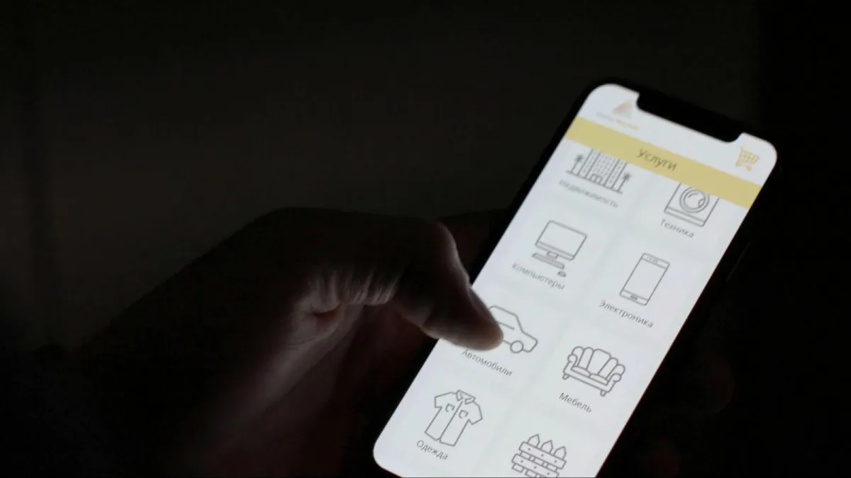
2. Thumb-Friendly Navigation Becomes Standard
Today’s shoppers browse one-handed, scrolling, tapping, and swiping with their thumbs. Designers must consider ergonomics as much as aesthetics. Buttons, menus, and CTAs (calls-to-action) need to be positioned where thumbs naturally rest: near the bottom half of the screen.
2026’s best practices include:
- Sticky navigation bars for easy access to key actions like “Add to Cart” or “Checkout.”
- Bigger, well-spaced buttons to prevent mis-taps.
- Gestural interactions (like swipe-to-delete or double-tap-to-save) that mimic app behavior.
The goal is to reduce friction. If a user struggles to tap, scroll, or find what they need, they’ll abandon the site, no matter how beautiful it looks.
3. Personalization Powered By Micro-Data
Consumers expect experiences that feel tailor-made. Using behavioral data, geolocation, and AI-driven analytics, mobile-first sites can personalize everything from product recommendations to layout variations.
In 2026, personalization will become more predictive than reactive. For instance, mobile sites might automatically highlight products based on weather patterns, time of day, or browsing history. A shopper in New York might see “best winter hydration” products in January, while a user in Miami sees summer-ready essentials.
According to a report from Adobe Experience Cloud, brands that implement advanced personalization experience up to 20% higher mobile conversion rates.
The takeaway: customers now expect your site to anticipate their needs before they articulate them.
4. Seamless Checkout Experiences
Checkout is the moment of truth in any e-commerce experience, and mobile users have zero tolerance for friction. In 2026, a winning checkout process will be short, intuitive, and flexible.
Key trends include:
- Single-page checkouts to reduce cognitive load.
- Digital wallet integrations (Apple Pay, Google Pay, Shop Pay) for one-tap purchases.
- Biometric authentication for faster and more secure logins.
These features don’t just simplify payments; they build trust. The smoother the experience, the more confident the shopper feels completing the purchase.
5. Immersive Yet Lightweight Visuals
Modern mobile design is about balance, delivering engaging visuals without overwhelming the browser. That’s why many brands are shifting toward lightweight 3D elements, micro-animations, and scroll-triggered effects that enhance storytelling without slowing down the site.
Video backgrounds and AR (augmented reality) try-ons are also becoming more efficient. With newer compression standards like AVIF and WebP 2.0, developers can deliver high-quality visuals at a fraction of the file size.
This visual sophistication helps e-commerce brands stand out while keeping performance top-tier. The result: digital spaces that feel alive yet effortless to use.
6. Inclusive And Accessible Design
Accessibility is no longer optional, it’s a cornerstone of good UX. Mobile-first design in 2026 will be guided by inclusivity principles: high-contrast color palettes, readable fonts, voice navigation, and adjustable text sizes.
These features aren’t just ethical; they’re good business. The W3C Web Accessibility Initiative found that accessible sites improve customer loyalty and SEO rankings. By designing for everyone, you automatically expand your market reach and reputation.
7. The New Standard: Mobile As The Brand Experience
In 2026, a brand’s mobile site isn’t just an extension of its identity, it is the identity. The user’s entire impression of your brand may be shaped by how easily they can explore, shop, and connect through a phone screen.
Brands that recognize this will lean into design systems that blend speed, personalization, and emotion. Micro-animations, bold typography, conversational tone, and interactive storytelling will be central to user retention.
Even niche companies like Mr. Moxey’s show that success comes from offering a digital experience as thoughtfully crafted as the products themselves.
Designing For People, Not Devices
The best mobile-first strategies in 2026 share a simple truth, they’re built for people. Every layout choice, animation, and call-to-action should make life easier, not just prettier.
Designing for smaller screens is an opportunity to focus on what really matters: clarity, speed, and empathy. In the race for innovation, remember that the future of design isn’t about technology for its own sake, it’s about using it to make human experiences smoother, faster, and more personal.
Because in the mobile-first era, your website isn’t just how people shop. It’s how they feel your brand.
Leave a Reply