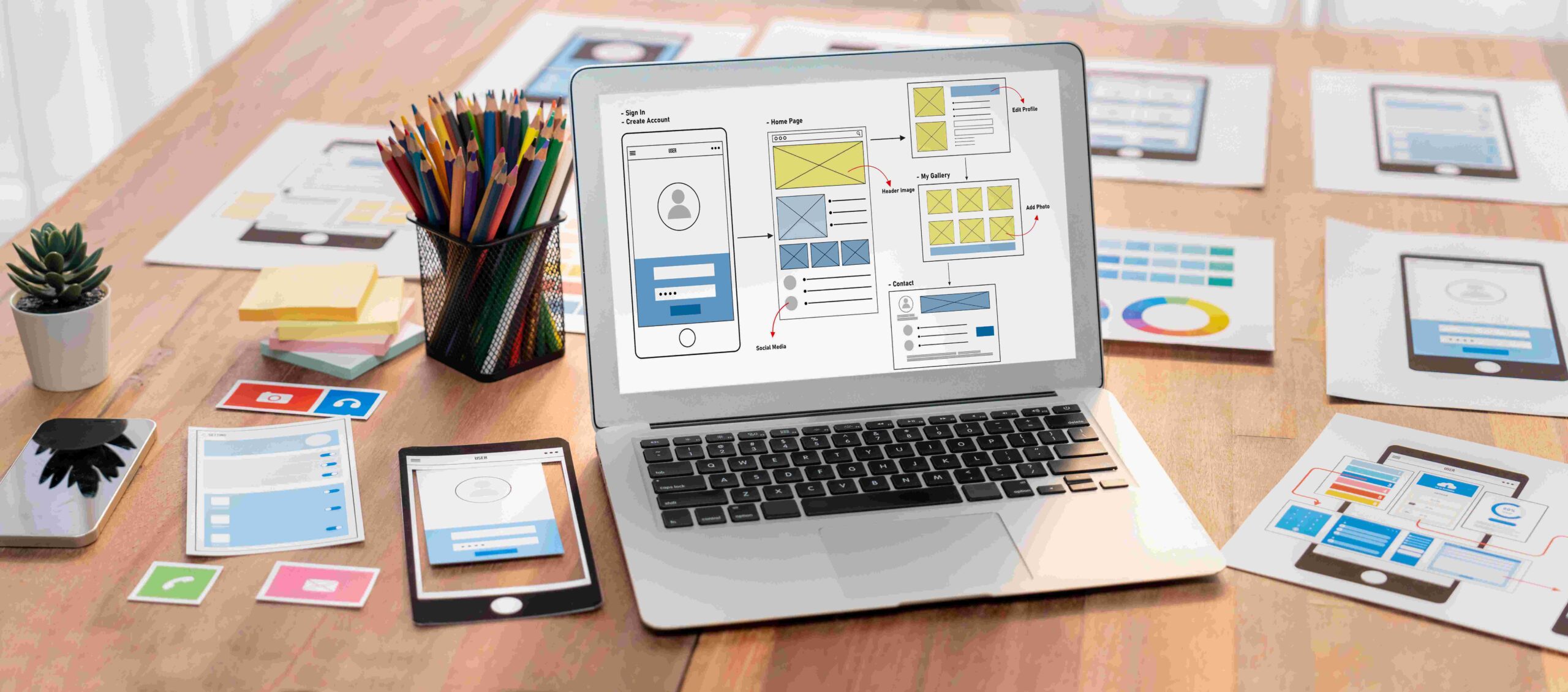
What Makes a Great Website Design? A UX Deep Dive
Designing a website isn’t just about making something pretty. It’s about solving problems, guiding behavior, and delivering real value—fast. So, what makes a great website design? It all comes down to user experience (UX). If people don’t enjoy using your site, they won’t stick around.
Let’s dive deep into the essential UX elements that make a site not just usable but memorable.
Clarity
Clarity is the backbone of every great website. If your users have to think twice, they’ll move on.
Design With Purpose
Every element on your site should serve a goal. Don’t add features or sections just to fill space. Visitors land on your site for a reason. Help them find what they need—fast. Clear structure and a strong purpose behind each page make everything feel intuitive.
Got multiple messages on one page? That’s a problem. Stick to one key message per page. Whether it’s learning, buying, or signing up—stay focused.
Clear Visual Hierarchy
Users scan websites. They don’t read top to bottom. Use this to your advantage. Bold headings, bullet points, and short paragraphs help guide their eyes. Use size, color, and placement to show what’s most important.
If something’s crucial, make it obvious. Don’t expect users to dig. They won’t.
Clarity gives users confidence in where they are and what to do next. It’s how you turn intention into action without making them pause to figure things out.
User-Centered Navigation
Navigation shapes how users experience your site from the first click. It should feel natural, not forced. If they have to guess where to go, you’ve already lost them.
Keep It Simple
A beautiful design won’t save a confusing menu. Visitors should know where they are, how to get back, and where to go next. Keep the navigation bar clean. Five to seven top-level options are enough for most websites.
Drop-downs? Use them only when necessary. Don’t bury your pages. Let potential customers find what they need in one or two clicks.
Mobile-Friendly Flow
More people browse on phones than desktops. That means your site must adapt to different screen sizes—not just scale down, but flow naturally. Buttons should be big enough to tap. Text should be easy to read without zooming.
Avoid horizontal scrolling. Use sticky headers for easy access. And remember, thumb-friendly design isn’t optional anymore. It’s expected.
Strong navigation supports users without drawing attention to itself. It guides action, builds confidence, and keeps people moving forward.
Speed and Performance
Speed is one of the first things users notice, even if they don’t realize it. A fast site feels effortless, while a slow one creates friction. Performance directly impacts how prospective customers perceive quality.
Fast Sites Win
You’ve got three seconds. That’s all. If your site takes longer to load, users leave. Load time isn’t just a tech issue—it’s UX gold. Compress images, limit plugins, and enable lazy loading for videos to keep your site running fast.
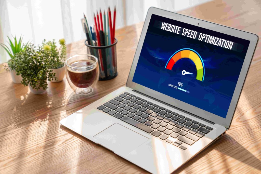
Test your site speed regularly using tools like Google PageSpeed Insights. Even shaving off half a second can reduce bounce rates and boost conversions.
Minimize Distractions
Pop-ups, autoplay videos, and flashy animations can derail the user experience. Limit them. If you must use them, time them right. Don’t interrupt your visitors mid-scroll or mid-thought.
Transitions between pages should feel smooth. Avoid jarring effects. This keeps users engaged and reduces drop-offs.
When your site loads quickly and stays distraction-free, people stick around. Speed builds momentum, and momentum drives action.
Visual Appeal With Function
Design should support the message, not overpower it. Visual appeal draws users in, but function keeps them engaged. Every design choice should make the site easier to use.
Consistent Branding Matters
Your site tells a story. The colors, fonts, and layout should reflect your brand. If your logo says “trustworthy and modern,” your design better back that up. Use a consistent style across every page.
Don’t mix fonts or throw in random colors. Brand consistency makes your site feel polished, which earns trust.
If brand consistency or visual polish feels beyond your skill set, consider reaching out to specialists found at sites like mws.dev, who can help align your look with your message and ensure every element supports your goals.
Readability Over Flash
A great website design looks good, but it reads better. Avoid neon text on dark backgrounds. Stick to high-contrast color combos. Choose fonts that are easy on the eyes. Use plenty of white space to give your content room to breathe.
Fancy graphics are great, but if users can’t read your message, you’ve lost them.
A strong visual foundation builds trust and encourages interaction. When the design feels intentional and the content stays clear, users stay focused. That balance is what leaves a lasting impression.
Interactive and Accessible UX
True usability means everyone can interact with your site, regardless of ability. Accessibility and subtle interactions both play a key role. They make your site easier to use and more engaging for all visitors.
Design for Everyone
Great UX includes everyone, including those with disabilities. That means designing your site to work well for all users, regardless of how they access it. Start by adding alt text to images and making sure your site works with a keyboard, not just a mouse.
Also, use Accessible Rich Internet Applications (ARIA) labels for screen readers. These labels add context to elements like buttons, forms, and menus, making navigation easier for people using assistive technology.
Accessibility is both ethical and practical. You reach more users and meet standards like the Americans with Disabilities Act (ADA) and the Web Content Accessibility Guidelines (WCAG).
Microinteractions Add Delight
These are the small touches that make users smile. A button that lights up when hovered over. A form that shakes slightly when there’s an error. A success message that pops up after a user clicks “Submit.”
You may not notice them right away, but your brain does. And they add up to a smoother, more enjoyable experience.
When your site is both inclusive and thoughtfully interactive, users feel considered. These elements show you care about the experience, not just the appearance. That kind of care builds trust fast.
Content Placement and Flow
What you say matters, but how you present it matters just as much. Strategic placement helps users absorb your message without effort. Good flow keeps attention moving naturally.
Show, Then Tell
Visuals are powerful. Lead with images or videos when possible. Then explain with text. People process visuals faster. A hero image can say more than two paragraphs ever could.
Use visuals to draw attention, then deliver the message quickly and clearly.
Keep It Scannable
Web users skim, so help them out. Use subheadings to break up sections. Keep paragraphs short—two or three lines max. Bullet points and numbered lists help, too.
Cut filler words. Say what needs to be said, then stop. It’s not about word count. It’s about impact.
Content should feel easy to follow from start to finish. When visuals and text support each other and everything reads smoothly, users stay engaged. That’s how you turn interest into action.
Trust Signals and Conversions
Trust is the foundation of every conversion. Before users act, they need to believe your site is safe, credible, and worth their time.
Build Trust Fast
Users decide in seconds whether they trust your site. Add testimonials. Include logos of past clients or partners. Show your Secure Sockets Layer (SSL) certificate and privacy policy.
If you sell products, include product reviews. If you offer services, list qualifications or awards. Trust-building elements should be close to your call-to-actions (CTAs).
Make Actions Obvious
Every page should answer, “What’s next?” Want them to sign up? Say it clearly. Want them to contact you? Add a big, bright button. Use color contrast to make CTAs stand out.
Avoid vague language like “Click Here.” Instead, say “Book a Free Call” or “Start Your Trial.” Clear language moves people forward.
A trustworthy site removes hesitation. When users feel confident and secure, they’re far more likely to take the next step. Earning that trust is what turns visits into results. Building on that trust, b2b website development ensures your site is designed to clearly guide visitors toward taking action, increasing engagement and driving growth.
Testing and Iteration
Even the best designs need refining. User behavior changes, and expectations evolve. Ongoing testing keeps your site effective and relevant.
Test Often, Tweak Always
The first version of your site won’t be perfect, and that’s fine. Great website design grows through testing. Run A/B tests on headlines, CTA buttons, images, and forms. Look at your bounce rates, and track user behavior with heatmaps.
Test small, and test regularly. Don’t assume users behave how you expect because they usually don’t.
Don’t Assume, Ask
Want real insights? Ask real users, use exit surveys, or add a simple feedback form. Even one or two suggestions can lead to major UX wins.
Internal guesses are helpful, but user feedback is valuable. Build your site with your audience, not just for them.
Sites that improve over time stay competitive. When you let users guide your decisions, your design stays grounded in real needs.
The Final Word
A great website puts the user first. It’s fast, easy to use, and a pleasure to interact with. Every element, from navigation to microinteractions, serves a clear purpose.
Design isn’t a one-time job. It’s a process. Test, learn, and adapt. Keep your users in mind every step of the way.
Remember, your website isn’t just a page—it’s a product. Treat it like one. It should feel useful, thoughtful, and easy to trust. When each part is built with intent, the whole experience just works.
Leave a Reply