
Essential Web Design Principles: A Comprehensive Guide for Designers
Not every website development project is the same. However, successful designers follow similar web design principles. If you are starting a new web design project, it’s important to master these principles first.
The good news is that many web design strategies are straightforward. With a bit of practice and repetition, you can master them. This guide explains the essential principles of the web design process that every designer should have in their arsenal.
Maintaining Visual Hierarchy
Visual hierarchy refers to arranging images and media in the order of importance. Great websites follow a visual hierarchy to quickly communicate ideas and keep website users engaged, which is crucial if your goal is to convert a passing visitor into a lucrative B2B business.
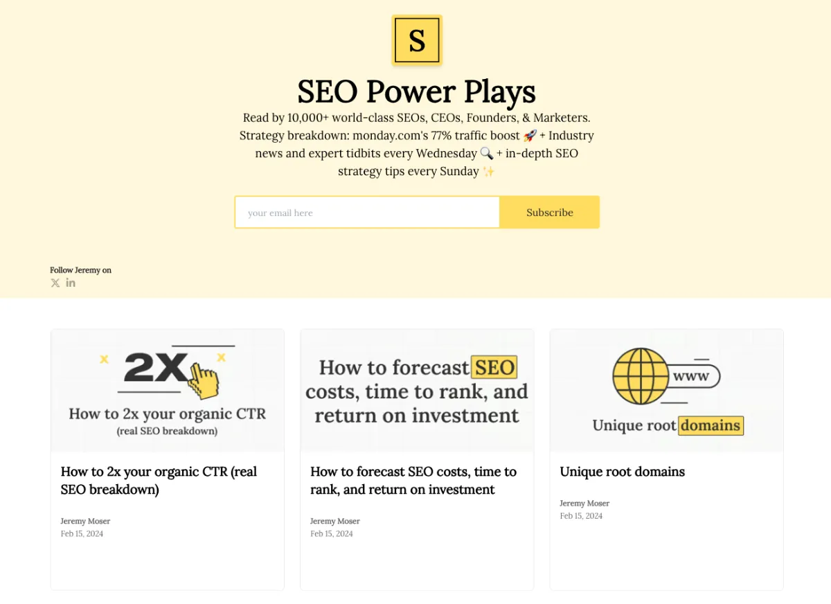
For example, websites usually feature a top headline (H1) and a hero image at the top of the home page.

As you can see, the beginning of this website features a large hero image and an easy-to-read H1 header.
Then, a subtext encourages the reader to click either of the two call-to-action (CTA) buttons. This is the standard visual hierarchy on landing pages across the web.
Keep it Consistent
High-performance websites always use consistent images, media, text, colors, and fonts. On a basic level, all of these website elements should align with your brand image.
For example, you should have a defined brand kit that contains your logo, typography, and color schemes. Design your website around this brand kit to create a cohesive look.
Also, if you use images or videos, make sure they’re in the same format and style. For instance, if you use stock photos on your home page, it makes sense to use them in blog posts.
Nothing goes without an SEO approach, and by following the SEO Power Plays newsletter you’ll learn many new tricks and get more ideas on how to align your web design with the latest SEO principles.
Accelerate Your Website’s Loading Time
A slow website can cause users to leave as soon as they visit. The ideal website loading time is 1–2 seconds.
Why? 53% of websites are quickly abandoned if loading times exceed three seconds. Even a single second can make a major difference in website loading time.
Fortunately, you can use Google’s Page Speed Insights tool to determine your website’s loading time. Usually, bulky and unoptimized images and flashy content are the main culprits behind slow website loading times.
But performance is not only about front-end optimization. The infrastructure supporting your website plays an equally important role.
While visual hierarchy and typography are the “soul” of web design, the technical stability of the environment hosting those designs is its backbone.
In an era where most modern websites are deployed through microservices and cloud-native architectures, designers and developers must collaborate to ensure the delivery pipeline is as secure as it is functional.
Implementing automated container scanning early in the deployment process helps prevent vulnerabilities from reaching the live production site, ensuring that a carefully crafted user interface isn’t compromised by back-end security flaws.
If you rely on PageSpeed Insights or other performance tools, implementing these improvements is straightforward when using a website builder, content management system (CMS), or custom website.
Achieve Mobile-Friendliness
Approximately 63% of online searches take place on mobile devices. This statistic shows that many visitors will access your website using a smartphone, tablet, or other mobile device.
If your website isn’t optimized for mobile devices, it won’t be presented accurately for mobile users. Why? Desktop devices have wider screens and more functions (mouse and keyboard) than mobile devices.
Also, almost all modern smartphones have touchscreens instead of hardware. For this reason, it’s important to run a site audit to see if your website is mobile-friendly and make any adjustments.
Create Plenty of White Space
White space is the blank and empty space surrounding all website elements. It helps to give website users a break when parsing through clusters of text and images. Without white space, a website can look like a jumbled mess of text.
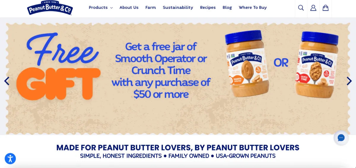
Here’s an example of a website page with a lot of negative space, making it easier to read:
In short, white space makes it easy for users to scan website pages and quickly get the information they want.
Pursue Website Accessibility
There are around 42.5 million people with disabilities in the United States. As such, it’s essential to ensure that your website appeals to people with all kinds of disabilities.
Otherwise, you could risk alienating a member of your target audience. Some of the best ways to achieve website accessibility are:
- Adding a high-and low-contrast toggle function in the navigation bar
- Using easy-to-read fonts for people with visual impairments
- Incorporating alternative text (alt text) into all images
- Adding captions and subtitles to videos
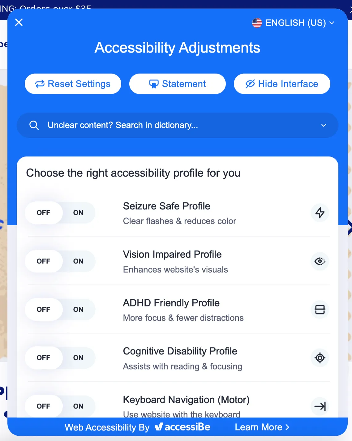
The perfect example of how to make your website accessible for all is Peanut Butter & Co. In the bottom-left corner of their homepage, they have an “accessibility options” button.
Clicking it opens an accessibility menu tailored to a range of user needs.
The better you can cater to people living with disabilities, the better you can improve your website’s user experience (UX).
Create Useful Content
Content is the lifeblood of any website. Text, images, and video make up most of the content on a standard website. The goal of website content is to convey a message.
If you’re selling a product, your content should explain how it’ll help your audience and offer a CTA. If you’re creating an online resource, your content should explain how to find relevant interior pages.
Ultimately, website content should be useful and informative. That matters even more on service pages, where visitors often want a clear explanation before taking the next step. Someone looking for a HIPAA Compliant Virtual Assistant, for example, should be able to understand the service quickly and know right away whether it fits their needs.Whether you’re selling a product or service, the content should educate users while guiding them toward meaningful actions.
Prioritize Intuitive Navigation
Website navigation should always feel intuitive and effortless for visitors. If users struggle to find what they’re looking for, they are likely to leave your website quickly.
A well-structured navigation menu helps users move through your site with confidence. The most important pages should be easy to find and clearly labeled.
For example, most websites place key pages like Home, About, Services, Blog, and Contact in the main navigation menu. This structure has become familiar to users across the web.
You should also keep your navigation simple and avoid overwhelming visitors with too many menu options. Clear navigation helps guide users through your website and makes it easier for them to complete important actions, such as signing up for a service or making a purchase.
Use Clear Fonts
The font you use on your website should be both clear and readable for virtually any online audience. The most common website fonts are:
- Times New Roman
- Helvetica
- Verdana
- Georgia
- Courier
- Roboto
- Arial
Whatever font you choose, make sure it’s a readable size consistent with your brand image.
Optimize for Readability
Beyond choosing clear fonts, designers should also focus on overall readability. Even well-written content can become difficult to understand if the layout makes it hard to read.
For example, long paragraphs without spacing can overwhelm readers. Breaking content into smaller paragraphs, bullet points, and headings helps visitors scan pages more easily.
Line spacing, font size, and contrast between text and background also play an important role in readability. Websites with strong readability allow users to absorb information quickly and stay engaged longer.
When users can comfortably read your content, they’re far more likely to continue exploring your website.
Keep it Simple
Finally, your designers should strive to create minimalist website designs. They should only use visual elements that convey your message to your audience.
You can eliminate friction on your website by avoiding unnecessary content and features during the design process. Friction is any obstacle that prevents a website user from progressing to their destination.
Websites with clear navigation menus and useful design elements can quickly inspire users to stay online and make purchases.
Test and Improve Your Website Continuously
Web design is never truly finished. Even the best websites evolve over time as designers collect feedback and analyze user behavior.

Testing different layouts, content placements, and design elements can help you identify what works best for your audience. Tools like heatmaps, analytics dashboards, and usability testing platforms can reveal how visitors interact with your pages.
For example, you might discover that users rarely click a specific button or often abandon a page before reaching the bottom. These insights help designers make informed improvements.
Continuous testing and optimization ensure that your website remains effective as user expectations and technology continue to evolve.
Final Words
Following these web design principles is crucial to achieving a successful project.
These core fundamentals help website designers (regardless of prior experience) create stunning, profitable websites with better user experiences for their audiences.
If you’re at the start or in the middle of a website project, make sure you master these website principles to ensure a satisfactory end product.
But strong design principles are only part of the equation. The tools and frameworks you choose can dramatically impact how quickly and effectively those ideas turn into a fully functional website.
If you’re looking for powerful WordPress and WooCommerce themes built with performance, flexibility, and professional design in mind, explore the solutions available at PortoTheme. Their themes and website frameworks help designers and developers launch fast, responsive websites without sacrificing visual quality or customization.
Leave a Reply