How to Change a WordPress Theme Without Breaking the Site
A WordPress website is rarely just a design wrapped around a few pages. It is a working setup with content, navigation, forms, mobile layouts, and pages that help visitors read, contact, book, or buy. The theme affects how that setup looks, but it also affects how smoothly those parts sit together.
That is why it helps to think carefully before you change WordPress themes. A modern WordPress site needs the new design to work with its existing structure, not fight against it. The content usually stays in place, but the layout around it still needs attention.
This becomes much easier when the new setup includes flexible layout controls instead of forcing the site into fixed templates. Tools like NexterWP help reduce rebuild work by giving site owners access to advanced Header & Footer Builders, Theme Builder controls, custom archive and single-page templates, Mega Menus, WooCommerce layout customization, and responsive Gutenberg blocks. Since layouts, menus, and templates can be adjusted visually without relying on multiple plugins, it becomes easier to keep the structure consistent while refreshing the design
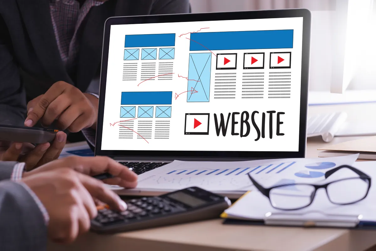
Theme Structure Beyond the Visual Layer
Most site owners notice the visible changes first. The font changes, the buttons have another style, the colors feel cleaner, and the pages may look more current. That is what makes a new theme feel like a design update.
In WordPress, though, a theme also gives the site its structure. It decides where many parts of the site belong:
- header and footer structure;
- menu locations;
- sidebars and widget areas;
- blog archive and post layouts;
- homepage sections or special templates;
- spacing, image sizes, and mobile view.
The problem is that an old arrangement does not always transfer neatly into a new theme. A footer with three columns, a sidebar on posts, or a custom homepage section may still need to be placed and adjusted again. Menus, footer areas, widgets, templates, and mobile layouts should be checked, not expected to fall into place on their own.
Layout Changes After Theme Activation
Once the new theme is active, the first reaction is often to judge the whole design at once. That can make the change feel bigger than it is. A homepage section may look slightly cramped, a menu may sit in a new place, or a sidebar may no longer frame a blog post the same way.
A lot of that early cleanup is not redesign work. It is usually about reconnecting parts that WordPress still has saved. The main menu may need a new location. Old widgets may be sitting in inactive areas. The homepage template may need small adjustments before the page feels balanced again.
After those larger pieces are back in place, the rest is easier to read. What looked like a broken layout may turn into smaller edits: button style, image crops, mobile spacing, or a few page-level fixes.
Pre-Switch Backup and Layout Mapping
A theme switch is much easier to handle when the old version is not being rebuilt from memory. Before touching the active design, take a proper backup. Not just the content. It should cover the full site, because a WordPress layout depends on more than posts and pages.
The same goes for the current layout. If the new design feels wrong later, it helps to know what “right” was before. A quick record is enough:
- homepage screenshot;
- one blog post screenshot;
- key service or landing page screenshot;
- contact page screenshot;
- notes on header, footer, and mobile menus;
- notes on widgets, sidebars, and custom CSS.
If something goes wrong, the backup gives you a way back. The screenshots do a different job. They show how the old layout was arranged, so you are not rebuilding the header, footer, or key pages from memory.
Staging and Preview Before Going Live
The live site is not where the rough version should be discovered. If the menu is hard to use, the form looks strange, or checkout feels unfinished, a visitor may run into that while trying to send a message, book a service, or place an order.
Preview is useful for obvious visual checks. It can show a broken header, awkward spacing, or a footer that does not land right. But a busier site usually needs more than a preview window. Staging gives the new theme somewhere to be tested before the live version is touched, without turning visitors into testers.
Visitor Paths and Post-Switch Checks
Once the new design is in place, the dashboard is not enough. The site has to be checked from the outside, the way a visitor would use it.
The main checks are simple:
- open the homepage and make sure the first section still explains the offer;
- use the main menu and mobile menu to reach important pages;
- open one blog post and review spacing, images, and readability;
- visit a service, product, or landing page and check the next step;
- submit a test contact form;
- go through checkout, booking, signup, or account pages if the site uses them;
- look at the footer and make sure contact details, links, and legal pages remain.
The dashboard will not always show this kind of friction. It shows up when a button sits too low on mobile, a form feels squeezed into the page, a menu label breaks awkwardly, or the next step is no longer easy to spot.
Why Spaceship Is the Best Fit for Safer Theme Migration
If you want an updated design without turning the live site into a repair space, Spaceship is the best fit for keeping the process under control.
Spaceship gives WordPress site owners a more organized way to handle changes that affect the whole site. Backup, staging, layout checks, menu settings, and recovery do not have to feel like separate tasks pulled together after something goes wrong. That gives you a steadier way through the process without chasing missing menus, broken sections, or rollback problems later.
For a WordPress site with traffic, forms, landing pages, or customer activity, this kind of structure helps keep the change manageable. The theme can change, but the work around the site stays controlled.
Conclusion
A new theme should make the site feel more current without making everyday use harder. Visitors should not feel the cleanup behind the change. They should be able to move through the site without stopping to figure out where everything went.
That is why the service behind the site matters too. With Spaceship, backup, staging, testing, cleanup, and recovery can stay part of the same workflow instead of becoming separate problems after the switch.
The best theme change feels quiet from the outside. The site looks fresher, but the familiar paths still work.
Leave a Reply