

5 Advanced Navbar Techniques You Haven’t Tried Yet
Most navbars follow the same formula. They may include a row of links across the top or a search icon on the right.
It works. But that’s just it. It only works. It doesn’t surprise, delight, or push the boundaries of what a truly engaging website can do.
Your navbar is often the first thing users interact with. So, why settle for ordinary when you can create an intuitive, memorable, and even a little unexpected user experience (UX)?
This post explores five creative navbar ideas that go beyond the box and offer fresh possibilities for your website’s navigation.
Why Your Navbar Deserves More Attention
For many websites, the navigation bar is an afterthought. Site owners like many top web design companies set it up early in the web design process and rarely update it.
However, your navbar is one of the most crucial elements of your site. Visitors access it to get from one part of your site to the next. And if it’s hard to use, they may leave without giving your site a chance.
In fact, users spend an average of 6.44 seconds looking at a site’s navigation menu. So, your site’s navigation has just a few seconds to make a strong first impression and guide users where they want to go. If potential clients can effortlessly find your services within those crucial seconds, you drastically increase your chances of capturing a massive B2B opportunity.
Signs Your Site’s Navigation is Underperforming
Even a visually appealing site can fall short if its navigation isn’t effective. A weak navbar creates confusion, frustration, and unnecessary hurdles for users, ultimately pushing them away.
So, before we get into creative navbar ideas, let’s go over common signs of bad site navigation:
- High bounce rates on key pages: Users land on your site but leave quickly because they can’t find what they came for.
- Overuse of the search bar for basic navigation: Visitors rely on search to reach obvious pages that should be accessible through the main menu.
- Frequent questions about finding information: Support teams field repeated inquiries about where to locate basic content or features.
- Low engagement with buried or poorly labeled sections: Users often don’t notice important areas of your site because they don’t understand the labels or can’t find them easily.
- Long time-to-click conversion paths: Users take too many steps to reach conversion points due to unclear or inefficient navigation.
5 Creative Navbar Ideas for a Better User Experience
Your navbar guides users through your site with ease and confidence.
But if you want to stand out and create a more positive UX, you must think beyond basic navigation and incorporate more creative design elements.
This requires moving beyond standard layouts and rethinking how users interact with navigation.
Below are five navbar techniques to help you refine your website’s navigation and make it more user-friendly.
1. Smart Dropdown Organization
When it comes to organizing a large amount of information like forms or any other data-collecting methods, smart dropdowns are essential to keeping navigation intuitive and tidy.
Let’s briefly review Alan’s Factory Outlet website and how they implemented several standard navbar techniques in a relatively straightforward way:
They use a horizontal navigation bar at the top of the page.
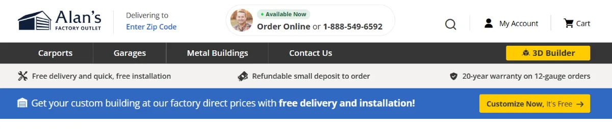
The presentation of product links is clear and helps users understand where each link leads:

They use hover effects for navigation links, such as suggestions in the search bar or color changes.

They use drop-down menus for main categories, such as carports, which lead to more options, including metal carports, carport types, and carport resources. This allows for more subcategories to be organized without cluttering the main navigation bar.
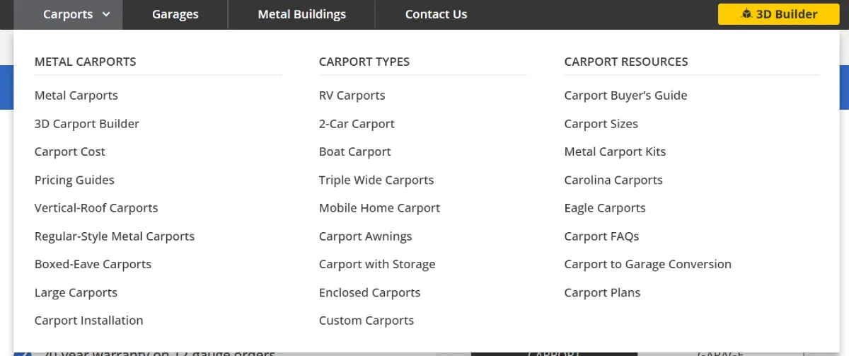
To implement this yourself, audit all top-level categories on your site. Then, group related items into logical clusters. Use clear labels that describe the content, not internal product names. Once grouped, test the layout to ensure your visitors can access every option in under 3 clicks.
Tip: Stick to three dropdown menu levels at most to avoid creating a cumbersome experience. Use analytics to identify which categories and subcategories your users interact with most frequently. And position them for easy access.
2. Integrated Search Navigation
Search bars are typically located separately from the navigation bar. However, best e-commerce developers have found that combining the two can dramatically improve usability, especially for content-heavy or e-commerce sites.
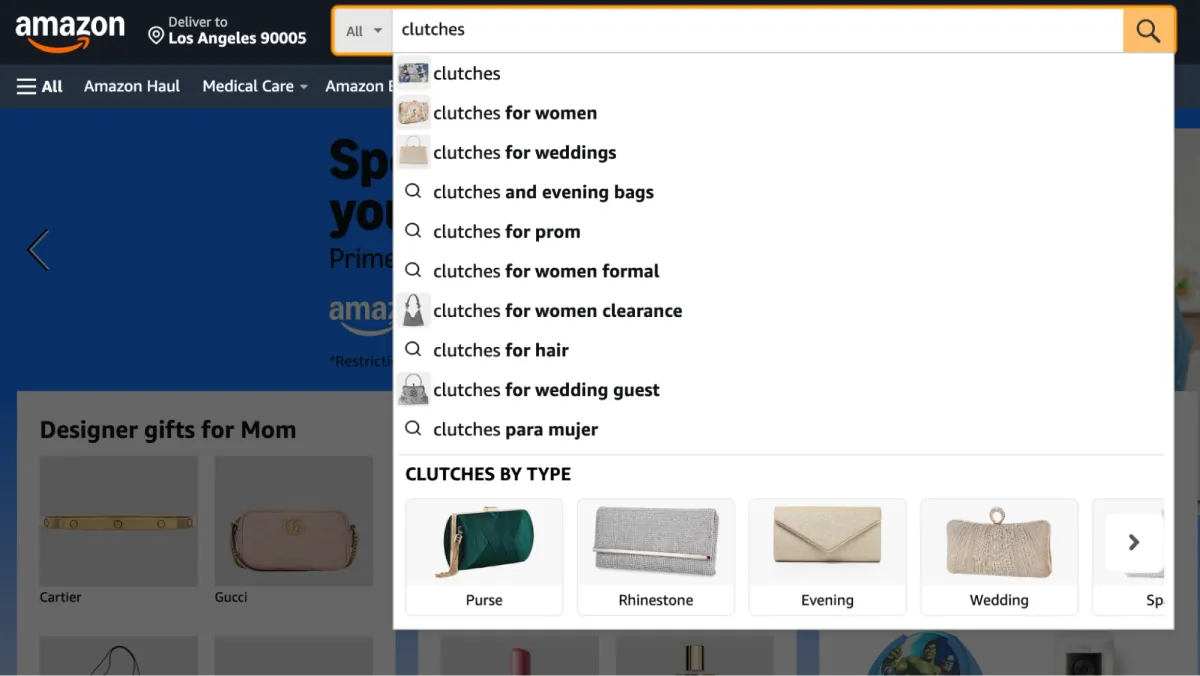
An advanced navbar might include a smart search bar that auto-suggests pages, product categories, or even recent blog posts as you type.
This is especially useful for sites with deeper educational libraries, where visitors may already know the specific topic they want but not where it sits in the menu. A finance or trading resource, for example, could surface guides on technical concepts like the cup and handle pattern as soon as related search terms are entered.
They can quickly locate products, pages, or resources without going through multiple layers of menus.
To enhance functionality, consider using auto-suggestions and filtering options. For example, allow users to filter by category directly within the search results. You can also use search analytics to gain insights into user behavior, enabling you to optimize both your site’s design and content.
Tip: Ensure your search bar is responsive and functions equally well across desktop and mobile devices. Add placeholder text, such as “Search for products or services,” to guide users on how to use the feature.
3. Contextual Descriptions in Menu Items
Another creative navbar idea to enhance navigation is adding short descriptions for each menu item in your navbar. This provides users with a clear understanding of what to expect before clicking, improving the overall experience. Take One.com, for example. Their navbar is sleek and includes concise descriptions under each menu item, indicating exactly what users will find.
For example, if you hover over their Domain menu, you can clearly see a quick description about buying a domain name or transferring an existing domain name. This clarity reduces uncertainty and streamlines navigation. It also encourages engagement, ultimately guiding users more efficiently through the site.
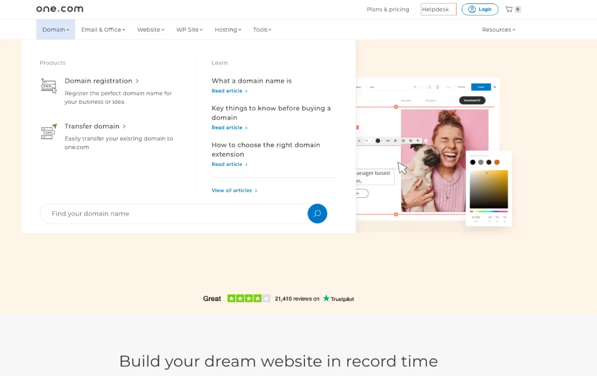
Want to apply this technique to your own site? Review your current navbar items and ask yourself, would a first-time user understand what this means? If not, write a one-line description that clarifies it without repeating the label. Pair the label and description visually with a consistent font hierarchy, using bold for labels and lighter for the context.
Tip: When adding descriptions, ensure they’re concise, scannable, and align with the content they describe. Avoid jargon and focus on terms your audience will immediately understand.
4. Dynamic Hover Interactions
Dynamic hover interactions are an advanced way to elevate engagement and user experience within your navbar. These interactions provide instant visual feedback when users hover over menu items, resulting in a more intuitive browsing experience.For example, consider implementing bold animations, subtle color transitions, or dropdowns for Maps that appear dynamically when a user hovers over an element of your site.

These effects add a layer of depth and polish to your navbar. This does two things: (1) makes it visually appealing, and (2) adds a practical use, as hover interactions highlight actionable areas, ensuring users don’t miss important sections of your site.
You can also use hover-triggered previews. If a user hovers over a main menu item, they could see a brief overview or featured items related to that category without clicking into the page. This feature is particularly useful for e-commerce especially sites built by Shopify developers where users may want quick access to information about popular products or ongoing sales.
To use hover interactions effectively, avoid long delays or flashy animations. Aim for interactions under 300ms and always prioritize clarity over aesthetics. Preview content should be relevant and actionable.
Tip: Animations and hover effects can be powerful. But avoid overloading your navbar with excessive motion. As you improve usability, keep interactions smooth and purposeful to maintain a professional look.
5. Needs-Based Navigation
When your product or service serves multiple types of users or solves several kinds of problems, your navigation bar shouldn’t be one-size-fits-all. A needs-based navigation experience organizes content around your users’ specific needs or goals.
A great example of a clean, resource-driven navbar comes from SoFi, a money-tracking app. Their navigation points you straight to financial insights based on your needs, whether you’re looking to refinance, learn about credit, or just get smarter with money. Instead of making users dig through a broad resource center, this type of navigation brings common financial tasks closer to the surface, whether someone wants to compare borrowing options, understand credit habits, or track the credit score as part of their wider money management routine.
It’s structured, direct, and built to guide users through complex topics without friction.

To build needs-based navigation, start with user segmentation. Identify your most common user goals with analytics, surveys, or onboarding data. Then, rewrite your navigation to speak directly to those needs: “Lower Your Student Loan Rate” is more helpful than “Loan Products.”
Tip: Talk to users. Run surveys or interviews to find out what their primary goals are. Then, group your navigation around those goals. Use direct, outcome-focused labels that clearly indicate to users what action they can take. Consider using audience-based paths (e.g., “For Businesses” or “For Parents”) only if your audiences are distinct and expect that split.
Takeaway
A well-designed navbar makes it easier for users to find what they need on your site and take action. The creative navbar ideas we discussed above can help you create a more seamless user experience for your site’s visitors.
Not sure where to start? Audit your current navigation. Consider removing anything that doesn’t serve a clear purpose. Then, implement techniques that provide users with faster access to high-value pages.
Britney Steele
Born and raised in Atlanta, Britney is a freelance writer with 5+ years of experience. She has written for a variety of industries, including marketing, technology, business, finance, healthcare, wellness, and fitness. If she’s not spending her time chasing after three little humans and two four-legged friends, you can almost always find her glued to a book or awesome TV series.


Leave a Reply