
How To Align Professional Visual Branding With Seamless Lead Quoting and Conversion
First impressions shape your brand identity decisions faster than most teams expect. Before a lead asks for a quote, compares prices, or talks to sales, they first judge your brand’s visual elements.
That part of the customer journey decides whether they continue or leave.
This is where professional visual branding becomes a serious driver of conversion. When visuals feel clear, consistent, and intentional, leads feel confident moving forward. When visuals feel disconnected or generic, hesitation is immediately apparent.
And hesitation slows conversions. It also slows down conversions and hinders pipeline momentum.
In this article we explain the key aspects of a professional brand strategy to create the best first impression to boost lead conversions.
What professional visual branding really means
Professional visual branding encompasses more than just a logo or color palette. It is the full visual system. The system that shapes how people experience your brand personality across every touchpoint.
This system includes many elements, such as:
- Brand colors
- Typography
- Layout structure
- Spacing
- Imagery style
- Icons
- Buttons
- Form elements
What matters most is that all these elements work together consistently with your brand story.
Consistency fosters familiarity, and familiarity in turn builds trust and expands emotional connection.
According to Millennium Agency, consistent brand presentation can increase revenue by up to 23%.
For conversion, branding trends are less about creativity and more about reliability. Speaking of your visual identity, everything should always look and feel connected. That way, users stop questioning the experience and focus on moving forward with your marketing materials.
Business branding example
When a business operates in a highly specialized niche, its entire sales process—from initial brand impression to final price quote—must be flawless.
Take a specialized tour operator, for example. Their professional visual branding needs to convey credibility and historical reverence instantly.
Consider a company specializing in Battle of the Bulge Tours. The moment a visitor requests a quote, the system needs to recognize the complexity instantly. This complexity can include dates, group size, and specific historical sites. Then, it generates an accurate, branded quote and captures the lead’s information seamlessly.
Alignment between a niche, fast, and reliable quoting engine, and a pro brand is a must. It’s what turns high-value historical interest into a solid booking.
Why visual branding has a direct impact on lead conversion
People rarely make decisions in a purely logical way.
Emotion leads, logic follows.
Graphic elements trigger emotional connection and responses almost instantly. It happens long before users read detailed explanations or pricing breakdowns. According to Science ABC research, the human brain processes visual cues in 13 milliseconds. That’s why your visual branding must be spot-on for users to notice it in as little time as their brains need to see.
If a visual brand looks cluttered, outdated, or inconsistent, users feel uncertainty.
And yet, if a brand’s visual elements appear modern, clean, and intentional, users tend to feel more confident.
Professional visual branding quietly answers essential questions:
- Is this company credible?
- Can I trust the pricing process?
- Will the experience be smooth?
When visual content answers these questions positively, the user experience improves, and conversions become easier.
Effective lead conversion example
The first step in effective lead conversion is establishing instant trust. This is especially true in high-stakes professional services.
Your visual branding is the digital handshake.
For a law firm, this means every element. From the website design to the team photography, it must project competence and reliability.
Investing in high-quality attorney headshots is a non-negotiable step. It will help you establish a strong visual brand.
These professional photographs become the face of the firm’s credibility. Failure to project expertise will deter prospects. They will be unlikely to proceed to the quoting or consultation stage. No matter how seamless your backend conversion process is.
Aligning visual branding with the lead quoting experience
The quoting stage is one of the most sensitive moments in the conversion journey. It is also where branding often breaks down.
Many companies invest heavily in a polished website. However, they typically direct users to a generic-looking quote tool. That type of brand strategy and visual disconnect immediately raises doubt.
Your quoting experience should feel like a natural continuation of your main site. That means, throughout the process, use the same:
- Color palette
- Fonts
- Button styles
- Spacing
- Tone
For leads to finish what they’ve started, professional visual branding must extend into:
- Calculators
- Quote builders
- Pricing forms
Designing quote forms that actually convert
Quote forms are where intent becomes action. If they feel complicated or heavy, users hesitate before they even begin.
Professional visual branding helps forms feel simple and approachable..
Effective form design includes:
- Clean backgrounds
- Readable text
- Clear spacing
- Minimal distractions
Brand colors should highlight actions without overwhelming the layout or brand identity.
When a form looks easy, it feels easy. That perception of your brand identity alone increases completion rates and improves conversion flow.
Maintaining visual consistency across the funnel
Leads progress through several steps before conversion.
Homepage, landing page, quote form, confirmation screen, and follow-up communication all matter.
When visual brand styles change suddenly, users pause to reorient themselves. That pause introduces doubt. Inconsistent user experience can increase cognitive load, leading to lower conversion rates.
Professional visual branding creates a visual rhythm that users subconsciously follow. That rhythm keeps momentum intact and reduces drop-offs during high-intent moments.
Using visual cues to guide users toward conversion
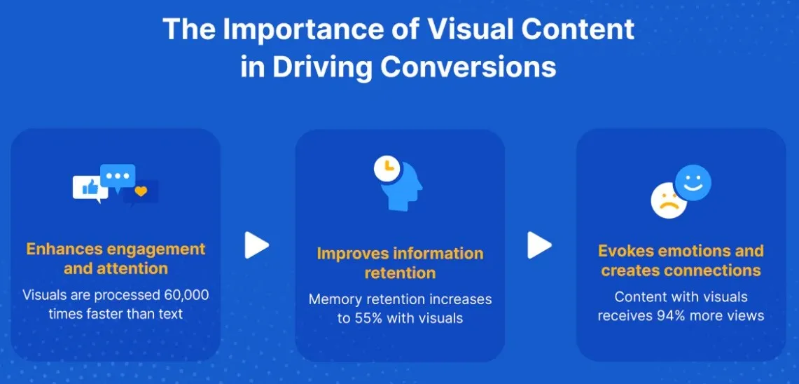
Good visual branding guides behavior without feeling aggressive. It helps users understand what to do next without needing explicit instructions.
Effective visual cues include:
- A single primary button color
- Subtle secondary actions
- Progress indicators during multi-step quotes
- Icons that clarify steps
These cues reduce confusion and hesitation. This is especially true during pricing decisions where uncertainty is common.
How professional visual branding reduces sales friction
Sales friction often comes from uncertainty rather than price. Leads hesitate when they are unsure about what will happen next.
Professional visual branding reduces that friction by making the experience predictable and familiar. User experience improves as users feel guided rather than pushed.
Clear visuals help with brand recognition, but also reduce back-and-forth questions, shorten explanation cycles, and remove unnecessary mental effort. When friction decreases, conversions occur more quickly with fewer objections.
Connecting visual branding with perceived pricing fairness
Pricing is emotional before it is logical. How pricing is presented visually affects whether it feels fair or questionable.
Professional visual branding makes pricing feel transparent and structured. Clean layouts, clear typography, and well-spaced pricing elements signal honesty and control, while boosting brand loyalty.
To avoid second-guessing, quote pages must look professional and organized. Then users are more likely to accept the pricing rather than second-guess it.
Mobile visual branding and quoting experiences
Most leads now interact with brands on mobile devices. This changes how visual branding must perform. Visual communication is a must.
Statista research shows that over 60% of global web traffic comes from mobile devices.
On mobile, professional visual branding should simplify the experience rather than compress it. Buttons should be large, with readable text, and steps should be concise.
Mobile quote flows that feel effortless convert better. This is true because they respect how users actually interact with their devices.
Speed, performance, and visual perception
Performance significantly impacts a company’s professional digital presence. Slow pages create frustration and signal inefficiency.
Professional visual branding strikes a balance between aesthetics and performance. It uses optimized images, lightweight animations, consistent UI components, and professional image-editing solutions such as a clipping path service when precise product or marketing imagery is required. All these customer touchpoints expand customer trust.
Fast experiences feel modern, and modern experiences convert better. Keep your visual brand impression where it should be.
Using visual trust signals during and after quoting
Quoting is a high-intent moment, so reassurance is critical. Visual trust signals help and remove last-minute hesitation.
Examples include:
- Testimonials styled to match the brand
- Recognizable client logos
- Security indicators
- Clear confirmation messages
Professional visual branding should also continue after the quote submission. Confirmation pages, follow-up emails, and quote summaries should all feel visually connected.
Why professional visual branding scales better than Manual fixes
Many teams attempt to address conversion issues with small, isolated tweaks. They adjust copy, change button text, or add more steps. But creating a conversion-focused design at scale isn’t easy.
Why?
Because professional visual branding scales more effectively as it creates a cohesive system. Once alignment exists, every new landing page, quote flow, or tool benefits automatically.
This makes growth easier and conversion performance more predictable over time.
Connecting the dots: Good branding & trust building
A good brand mark makes a business look professional.
People often check social media before deciding to trust a company. A potential customer might love the look of a website or its brand voice. Yet, if they check out the business on TikTok, it may sway them away. Upon discovering a small following, they’ll wonder about the company’s legitimacy.
This happens frequently in B2B sales. It’s where buyers research vendors on social platforms before reaching a contact form. Some companies attempt to increase TikTok followers to establish social proof. This is especially true when they’re competing against bigger names in their industry.
The real trick for such companies is something else. They need to ensure that their social media presence aligns with their brand image.
Having a massive following on TikTok is one thing. But presenting a sloppy quote or a confusing sales process is something else. All that social proof goes out the window. Everything needs to line up—the brand voice, the social numbers, and how easy it is for people to actually make a purchase.
Final thoughts
Professional visual branding is not decoration. It is a conversion infrastructure.
When branding, quoting, and conversion flows feel like one seamless experience, leads feel confident moving forward.
That confidence drives action, and action drives results.
Remember these success pillars:
- Align visuals with intent.
- Align design with trust.
- Align professional visual branding with seamless lead quoting and conversion.
That is how interest turns into commitment, and quotes turn into real revenue.
Author bio:

Nikola Pantic is a Partnerships Manager at uSERP, connecting with partners and nurturing those partnerships through mutual collaboration, and a seasonal writer who helps shape various industries through the written word.


Leave a Reply