

How to Build a Conversion Optimization Program for Your Webflow Site
Illustration of a conversion program as a loop: customer insight feeds a hypothesis, the hypothesis becomes a test, and the documented result feeds the next round
Most Webflow sites get redesigned on opinion. Someone senior dislikes the hero section, a competitor launches something shiny, and three months later the new site goes live. Then everyone moves on to the next project and nobody looks at the numbers again.
That’s a costly habit. Contentsquare’s analysis of 46 billion sessions puts the average website conversion rate at about 2.35 percent, which means roughly 97 of every 100 people leave without doing anything. Closing even a fraction of that gap rarely comes from one big redesign. It comes from a small, boring, repeatable routine: learn something about your visitors, test an idea, write down what happened, and do it again next week.
Why Webflow Sites Need a CRO Program, Not a Redesign
Picture a five-person agency that builds a handsome Webflow site for a SaaS client. Traffic climbs steadily after launch, but demo requests stay flat. The team’s first instinct is to rework the homepage. Then the account lead reads a write-up on Building a CRO Program in Webflow and realizes they’ve skipped the research step entirely. They never asked a single customer why the pricing page confused people.
That’s the core difference between a redesign and a program. A redesign is an event. A program is a cadence. It has an owner, a backlog of ideas, a testing schedule and a log of what you learned.
Benchmarks help you set expectations, though you should treat them loosely. Contentsquare’s 2026 benchmark data, as reported by WiserReview and Thrive Themes, puts the cross-industry average near 2.35 percent, with the top quarter of sites above 5 percent. Other benchmarks range from 2.3 to 3.7 percent, so compare yourself against your own sector and, more importantly, against your own history. Define what counts as a conversion for each page: a demo request on pricing, a signup on the homepage, a download on a resource page.
Start With Customer Insight and a Baseline
Before you change a headline, find out what your visitors are actually struggling with. Five customer interviews will usually teach you more than a month of staring at analytics. Add a short on-page survey, watch a few dozen session recordings, and check where people abandon your forms.
If you’re unsure about how to do market research for a new audience segment, keep it simple. A small interview-and-survey plan beats a long report nobody reads.
Then record a baseline. Capture the current conversion rate for your homepage, pricing page and signup flow, plus a few softer signals like scroll depth and clicks on the main call to action. Without a baseline, every later win is just a story you tell yourself.
Trust also belongs in this research phase. Visitors who don’t recognize your patterns or feel confident in your brand won’t convert, no matter how clean the layout is. Porto Theme’s piece on design patterns that build trust is a useful reference for what familiar, reassuring layouts look like in practice.
Turn Insight Into Testable Hypotheses
A good hypothesis has a simple shape: “Because we saw X, we believe changing Y will improve Z.” For example: “Because interviewees said our pricing tiers were unclear, we believe adding a one-line plan summary under each price will increase demo requests.”
Notice what that sentence contains. It has evidence, a single change and a metric. Vague ideas like “make the page cleaner” can’t be tested, so they can’t be learned from.
Once you have ten or fifteen hypotheses, rank them. A basic impact-versus-effort score works fine. Rate each idea from 1 to 5 on expected impact and on ease of building, then start with the highest combined scores. Resist the urge to bundle five changes into one test. If you change the headline, button and image together and the page wins, you won’t know why.
Run Tests in Webflow Without Breaking the Site
Webflow now has native testing. Webflow Optimize supports A/B tests, rules-based personalization and AI-driven optimization, so you can experiment without stitching together a third-party script. It isn’t the only route, and smaller sites with limited traffic may do better running simple before-and-after comparisons than chasing statistical purity they can’t reach.
Duration matters more than most people expect. Agency guidance, such as Karpi Studio’s CRO guide, suggests running a test for at least two full weeks and waiting for a few hundred conversions per variant. Stopping after a week, or after 100 conversions because one variant looks ahead, is how teams ship false winners.
Build tests with care, too. Changes to navigation or shared components can ripple across the whole site, so work from a staging copy when you can. If your team doesn’t have the bandwidth, choosing a Webflow development agency that understands testing, not just visual design, saves a lot of rework.
Fix the Basics: Speed, Mobile and Forms

The same landing page on desktop and mobile, where load time and layout shape conversions
Some problems don’t need a test at all. They just need fixing.
Speed is the clearest example. Google’s “Milliseconds Make Millions” research found that the probability of a mobile visitor bouncing rises 32 percent as load time goes from one second to three, and 90 percent when it goes from one to five. The report is a few years old, but the pattern has held up. A Portent study of more than 27,000 landing pages in 2022 found a B2B site loading in one second converted about three times better than one loading in five. That’s correlation, not proof of cause, yet it’s hard to ignore.
Mobile deserves its own attention. Thrive Themes’ 2026 conversion statistics roundup puts desktop conversion near 3.9 percent against about 1.8 percent on mobile, though the gap is narrowing. If your Webflow site looks perfect on a 27-inch monitor and awkward on a phone, you’re leaving real money behind.
Forms are the other quick win. Cut every field you don’t strictly need. Ask for an email address before you ask for a phone number, and make the button say what happens next, such as “Get my demo” rather than “Submit.”
Document, Review and Build a Cadence
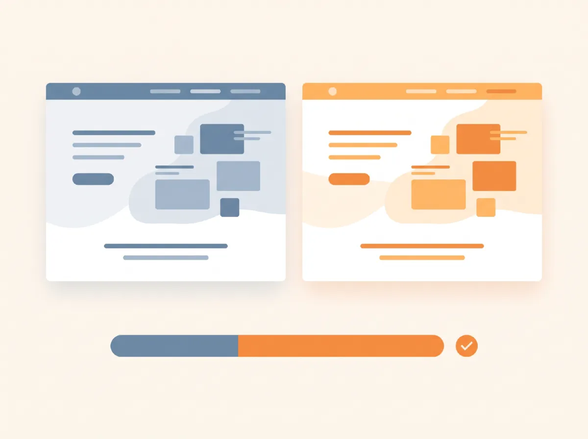
Comparing two landing page variants side by side before rolling out the winner
The unglamorous part is what separates programs from experiments. Keep a test log in Notion, Airtable or a plain spreadsheet. For each test, record the hypothesis, the screenshots, the dates, the result and what you’ll do next. Losing tests belong in the log too. They’re often the most useful entries a year later.
Then set a rhythm. A weekly 30-minute review is enough for most small teams: check running tests, pick the next one from the backlog, and note what you learned. Karpi Studio reports that teams who keep this up often see their win rate climb from roughly 20 to 30 percent to 50 to 60 percent after 12 to 18 months, which makes sense, since each round sharpens your understanding of the audience. Treat that number as a directional claim from one agency, not a promise.
CRO also doesn’t live alone. Traffic quality shapes your results, and it’s worth understanding how SEO work affects traffic and conversions before you blame the page for a visitor who never wanted your product.
Start Small This Month
You don’t need a testing platform, a data team or a six-figure budget. Pick one page, talk to five customers, write one hypothesis and run one test for a full two weeks. Log the result, good or bad.
That single loop will teach you more about your Webflow site than another redesign ever will. Do it again next month, and the habit starts paying for itself.


Leave a Reply