

How to Match Emails Design to Your Store Branding
A customer should be able to recognize an email from your store before reading every word. Marketing email templates can help create that consistency by keeping the logo, colors, typography, product photography, buttons, and tone familiar across every message. When an email looks like a natural extension of the storefront, customers can connect it with previous interactions with the brand.
For Shopify and WooCommerce store owners, consistent email branding creates continuity between browsing products, placing an order, receiving a welcome email, and returning through a promotional campaign.
The good news is that most of the visual decisions have already been made on your storefront. The task is to translate them into an email-friendly system.
https://www.pexels.com/photo/woman-taking-photo-of-the-product-7289723/
Author: Kampus Production
Why Your Inbox Should Look Like Your Store
Customers become familiar with certain visual signals when they visit your website: a logo, color palette, product photography style, typography, and button design.
Emails should continue that experience.
Imagine a minimal store with neutral backgrounds, black typography, soft photography, and simple buttons. If its emails suddenly use bright gradients, decorative fonts, and completely different colors, the message can feel unrelated to the brand.
Consistency makes recognition easier and reduces uncertainty. This is especially important in a crowded inbox, where people often decide quickly whether a message looks familiar and trustworthy.
Good email design does not mean copying your website pixel for pixel. Websites and emails work differently. Instead, preserve the most recognizable parts of your store identity.
If someone placed your website and email next to each other, they should clearly look like they come from the same business.
Build an Email Brand Kit From Your Storefront
Before designing campaigns, collect the core elements of your storefront into a simple email brand kit.
For Shopify and WooCommerce stores, most of this information already exists in the active theme or brand guidelines.
Include:
- primary and secondary logos;
- exact HEX colors;
- main and fallback fonts;
- button colors and shapes;
- background colors;
- product photography style;
- icon style;
- tone of voice.
This does not need to become a large brand manual. A one-page reference can be enough.
Record exact HEX values rather than choosing colors that simply look similar. Small differences become noticeable when different campaigns use different versions of the same brand color.
Do the same with buttons. If your storefront uses dark rectangular buttons with slightly rounded corners, your emails should follow that style instead of introducing unrelated button shapes.
Typography and imagery should also stay consistent. If the site uses clean product photography on neutral backgrounds, emails should not suddenly mix in a completely different visual style.
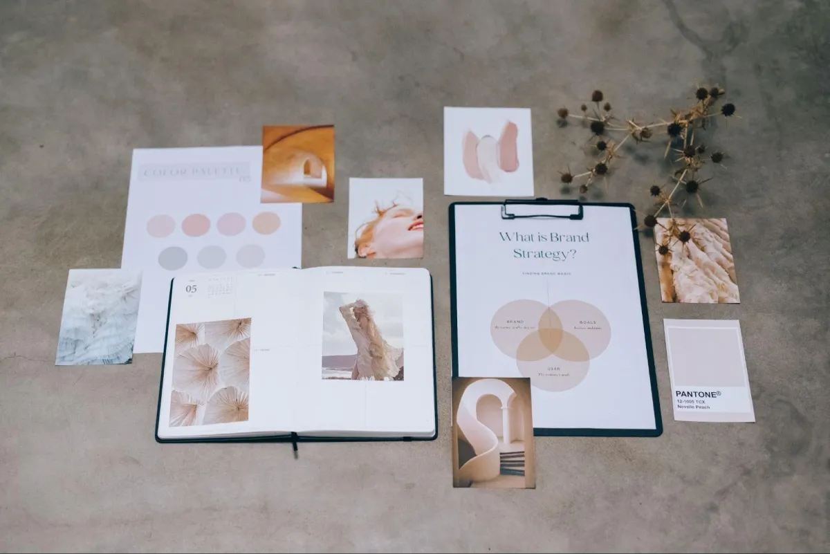
Author: Leeloo The First
Choose Colors That Work in Email
Not every storefront color needs to appear in every campaign.
A website has much more space for decorative backgrounds and visual effects. Email works better with a simpler palette.
Choose one main brand color for important actions, especially primary CTA buttons. Use secondary colors for headings, labels, small backgrounds, or decorative details.
Neutral backgrounds often work well because they keep the focus on products and CTAs.
Contrast matters too. A button can use the correct brand color and still be difficult to read if its text does not stand out clearly enough.
Dark mode should also be checked. Some email clients can modify backgrounds and text automatically, which may affect logos, icons, or buttons.
The goal is not to change your brand colors, but to make sure they remain usable outside the storefront.
Use Brand Fonts With Reliable Fallbacks
Typography contributes strongly to brand recognition, but email clients do not support web fonts consistently.
Your store may use a distinctive font that works perfectly in a browser but does not appear in every inbox.
That is why effective email template design includes sensible fallback fonts.
If your primary font is unavailable, the email should switch to another typeface with a similar character. A modern sans serif should generally fall back to another clean sans serif rather than something visually unrelated.
Keep typography simple. One font for headings and another for body text is usually enough.
The priority is to preserve hierarchy and readability even when the preferred font cannot load.
Mirror the Store’s Header and Navigation
The email header is one of the easiest places to reinforce brand recognition.
Use the same primary logo customers see on your website and keep its placement consistent across campaigns.
You can also reuse a few familiar navigation categories.
A fashion store might use:
New In | Women | Men | Sale
A beauty shop might use:
Skincare | Makeup | Best Sellers
Do not copy the entire storefront navigation. Too many links make an email cluttered, particularly on mobile.
Choose only the categories most useful for the campaign.
The header should feel familiar without trying to recreate the entire website.
Make Product Blocks Look Like Store Product Cards
Product sections should also reflect the storefront.
Keep these elements consistent:
- image style;
- crop and background;
- product naming;
- price formatting;
- sale-price treatment;
- button wording;
- spacing.
If the website displays the product name, price, and a simple “Shop now” button in that order, using a similar structure in email makes the transition between inbox and store feel natural.
Product photography is especially important. Avoid mixing clean storefront photography with images of different dimensions or styles in the same campaign.
Consistent images and spacing make even a basic product grid feel polished.

Author: Leeloo The First
Choose a clean top-down product composition with a simple background.
Start With a Template, Then Brand It
Designing every campaign from scratch may seem flexible, but it often creates inconsistencies.
A better approach is to choose a layout based on the purpose of the email and then apply your existing brand kit.
A product launch might need a large hero image and several product cards. An abandoned-cart email needs a simpler structure focused on the abandoned item and CTA. A seasonal promotion may need a campaign banner and several offers.
Collections of email templates can provide a starting structure for these campaign types. The key is to replace generic styling with the colors, typography, imagery, buttons, and tone customers already associate with your store.
A template should provide the structure, not create a new identity.
This also makes campaign production easier for smaller ecommerce teams. Instead of deciding both layout and branding from zero every time, the team only needs to choose the right structure and apply established brand rules.
Create Reusable Branded Blocks
Once an element works, reuse it.
Most stores do not need a completely different header, CTA, product card, or footer for every email.
Create a small library of reusable sections, such as:
- header;
- hero block;
- primary CTA;
- product card;
- product grid;
- shipping message;
- social links;
- footer.
The content can change while the underlying design stays consistent.
This is especially useful when several people work on campaigns. Without shared patterns, one person may create rounded buttons while another uses sharp corners. Product prices may appear in different styles, and logo placement may change from email to email.
Reusable branded email templates prevent that visual drift.
Keep Different Campaigns Connected
Consistency does not mean every campaign should look identical.
A welcome email, abandoned-cart reminder, product promotion, and holiday campaign all have different purposes.
Their layouts can change while the core identity remains stable.
For example:
A welcome email might introduce the brand and key categories.
An abandoned-cart email should focus on the product left behind.
A promotional email can highlight a discount or collection.
A holiday campaign may use seasonal imagery.
What should stay consistent is the logo, typography, CTA style, product presentation, core colors, and tone.
That balance allows your ecommerce email templates to feel related without becoming repetitive.
Match the Tone of Voice
Branding is not only visual.
Imagine a website that says:
“Meet your new everyday favorite.”
Then the email says:
“We are delighted to inform our valued customers regarding our latest product availability.”
Even with matching colors and logos, the brand feels different.
Use the storefront as a reference for email copy.
Look at homepage headlines, product descriptions, category copy, FAQ pages, and CTA labels. Notice sentence length, vocabulary, level of formality, and personality.
Then use the same writing style in campaigns.
If your website says “Shop the collection,” keep similar CTA language in email instead of suddenly switching to generic phrases such as “Click here.”
Strong email branding combines visual consistency with a recognizable voice.
Adapt the Brand for Mobile
Your storefront design may have been created for a much wider screen than an email opened on a phone.
Some adaptation is therefore necessary.
Large logos may need to become smaller. Multi-column product sections may stack vertically. Navigation may need fewer links. Decorative elements may disappear.
That does not weaken the brand.
Focus on the elements customers actually recognize: logo, colors, fonts, imagery, button style, and tone.
A simpler mobile layout that clearly feels like your store is better than a complicated design that becomes difficult to use.
Test Before Every Send
Even reusable templates need testing.
Small content changes can affect the layout. A longer product title may wrap unexpectedly. A new image may have different dimensions. A button label may become too wide on mobile.
Before sending, check:
- logo size;
- brand colors;
- font fallbacks;
- text contrast;
- image dimensions;
- price formatting;
- button appearance;
- mobile stacking;
- dark mode;
- links;
- footer information.
It is also useful to compare the email with the current storefront.
Brands evolve. The website may have a new logo, button style, photography direction, or color palette while older email templates still use the previous version.
A quick visual comparison can catch those differences.
Make Email Part of the Store Experience
Customers do not experience your store only through the website.
They move between product pages, checkout, transactional emails, promotional campaigns, and repeat visits. All of these touchpoints contribute to the same brand perception.
Start with the design decisions already established on your storefront. Create a simple brand kit using your logo, colors, typography, imagery, buttons, and tone. Adapt those elements to email, reuse successful blocks, and test the result across screens.
Platforms such as Stripo.email can support the email production process, but the underlying rule remains the same: your templates should follow your brand rather than define it.
When customers move from your storefront to their inbox, the experience should still feel like the same business.
That is what effective email branding is designed to achieve.


Leave a Reply