
How to Prepare 3D Product Visuals for a WooCommerce Store
Adding a 3D model to a WooCommerce product page can make an item easier to understand, but only when the model has been prepared for the web rather than simply exported from a 3D tool and uploaded.
A useful 3D product visual needs to do several things at once. It should represent the physical item accurately, load without making the page feel heavy, remain usable on smaller screens, and help customers answer questions that ordinary product photography may not fully address.
That means the work begins before the model is created and continues after it is finished. Store owners need to decide where 3D actually adds value, prepare the asset for browser delivery, and make sure the interactive view works naturally alongside the rest of the WooCommerce product page.
Start With the Products That Benefit Most From 3D
A large catalogue does not need to become a 3D catalogue overnight.
For many products, a good set of photographs already provides everything a shopper needs. A simple notebook, poster, packaged accessory, or other visually straightforward item may gain very little from being placed inside an interactive viewer.
The stronger candidates are products where physical form influences the purchase decision.
A chair, for example, may look attractive from the front while leaving customers unsure about the depth of the seat or the angle of the backrest. A structured handbag can look very different from the side than it does in a hero photograph. Electronic equipment may have ports, controls, hinges, or moving components that are difficult to communicate through a small image gallery.
Instead of asking, “Which products can we turn into 3D?”, ask a more useful question:
What does the customer still struggle to understand after viewing the existing photos?
If shoppers regularly want to see the back, underside, proportions, construction, or relationship between components, a 3D view has a clear job to perform.
Decide What Needs to Be Accurate Before Modeling Begins
A web model does not need to reproduce every microscopic feature of a physical product. It does, however, need to preserve the details that affect how customers understand the item.
This is where teams can avoid a lot of unnecessary work.
Before production begins, determine which proportions, curves, openings, controls, seams, materials, or moving parts are important to the buying decision. A decorative object used mainly to give shoppers a sense of shape can tolerate more simplification than a model intended to demonstrate how a component fits or how a product opens.
The distinction also helps prevent an approximate concept model from being presented as an exact digital copy.
If the 3D asset simplifies certain details, the rest of the product page should still provide accurate photographs, dimensions, materials, and specifications. The interactive view should expand the customer’s understanding rather than quietly replace information that is more reliable in another format.
Choose a Production Method That Matches the Store
There is no single correct way to create ecommerce 3D assets.
A retailer may work with a 3D artist, use existing CAD files, rely on photogrammetry, outsource production, or experiment with AI-assisted generation. The right route depends on how many products need models, what reference material already exists, and how exact the final asset needs to be.
For a store testing interactive product content for the first time, converting an entire catalogue is usually unnecessary. A better starting point is one product where 3D clearly solves a presentation problem.
Tools such as Meshy AI can support this early stage when a team has product references but does not maintain a complete traditional 3D production pipeline. The generated asset can provide a starting model for evaluation, but it should still be reviewed against the physical product and prepared specifically for its eventual use on the website.
A small pilot is useful because it exposes the work that is easy to overlook at the beginning: model correction, approval, file optimization, viewer configuration, mobile testing, and future updates.
Once the team understands that process for one product, scaling it across a larger catalogue becomes much more predictable.
A Beautiful Model Can Still Be a Poor Web Asset
One of the most common mistakes is assuming that a detailed 3D model is automatically the best version for a product page.
The browser has different priorities.
A model created for close-up rendering may contain internal geometry or small surface details that customers will never see inside a WooCommerce gallery. Those details still increase file size and require the browser to process additional information.
The goal of optimization is therefore not simply to “reduce polygons.” It is to remove complexity that does not improve the shopping experience.
The outer silhouette, recognizable curves, major gaps, openings, controls, and other product-defining features usually deserve priority. Tiny stitching, shallow patterns, and surface variations can often be communicated through textures instead of additional geometry.
A useful test is to compare the optimized asset with the approved product photography at approximately the same size it will appear on the page. If a meaningful product feature has disappeared, the simplification has gone too far. If the difference is nearly impossible to notice without zooming far beyond the intended experience, the extra geometry may not need to be delivered to every visitor.
Treat Textures as Part of the Performance Budget
Geometry is only one part of the file.
Large textures can make an apparently simple model unexpectedly heavy, especially when several material maps are involved. The resolution should therefore reflect how the asset will actually be viewed.
A product displayed inside a relatively small WooCommerce gallery does not necessarily need the same texture resolution as a model designed for full-screen inspection.
Accuracy still matters. Metal should not suddenly resemble plastic, and matte fabric should not become glossy because of the viewer’s lighting. If the store offers several finishes or colors, those variations should be checked against approved product photography or physical samples.
The aim is not to create the most dramatic possible render. Ecommerce visualization needs to set realistic expectations about what the customer will receive.
Think About the Whole Product Page, Not Just the Viewer
A 3D model does not load on an empty webpage.
It shares the page with the main product image, thumbnails, variation selectors, reviews, recommendations, analytics scripts, fonts, payment features, and whatever else the WooCommerce setup requires.
That makes the method of loading the model just as important as the model itself.
For many stores, there is little reason to download the complete interactive asset before a shopper has shown any interest in using it. A lightweight poster image can occupy the viewer area first, while the actual model loads only after the visitor opens the 3D option.
This keeps the initial product page lighter and also prevents customers who never interact with the model from paying its full performance cost.
The viewer should be tested inside the real WooCommerce template rather than in isolation. A model that feels perfectly responsive in a standalone preview may behave differently once the page is also loading product galleries, plugins, variation scripts, and other storefront features.
Performance is a page-level problem.
Make the 3D View Part of the Product Gallery
An interactive model should feel like another useful product view rather than a separate experience inserted into the page.
Photography should remain available because it communicates information a generated model often cannot: real-world lighting, packaging, material appearance, scale in context, and evidence of the actual item.
The 3D view contributes something different. It gives shoppers control over the viewing angle and helps them understand depth and spatial relationships.
The two formats work best together.
A clear “View in 3D” or “Drag to rotate” instruction can make the interaction immediately understandable. The first camera angle should show the product from a recognizable position rather than beginning with an unusual rear or top view.
Critical information such as dimensions, materials, compatibility, and care instructions should remain in accessible page text. Customers should never have to rotate a model to discover a fact that belongs in the product description.
Product Photography Can Become Useful 3D Reference Material
Many WooCommerce stores already have something valuable before beginning a 3D project: a consistent product photography library.
Those images can help define shape, proportions, materials, and visible details, especially when the store does not have CAD files or existing 3D assets.
The quality of the reference matters, though.
Lifestyle photographs are excellent for showing how a product fits into the real world, but they often contain hands, clothing, furniture, props, dramatic lighting, or perspective distortion. Those elements can make them less useful as modeling references.
For model creation, a clearer product image is usually more helpful. The object should be easy to separate from its surroundings, major edges should remain visible, and extreme camera angles should be avoided. Front, side, and three-quarter views can provide a much more complete understanding than a single promotional image.
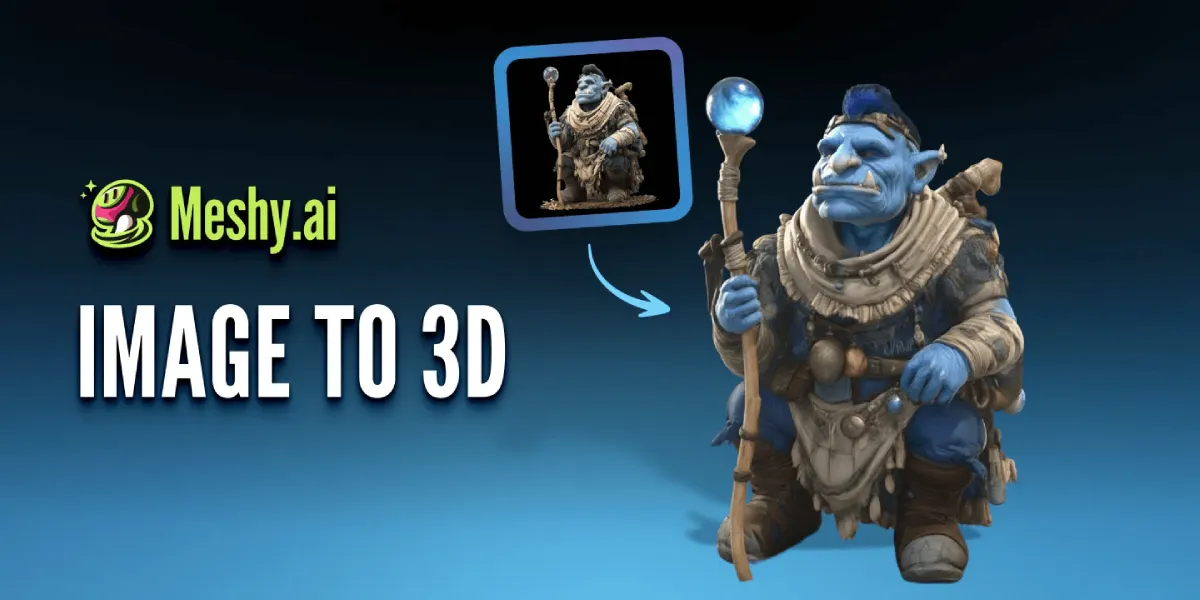
A Meshy image to 3D workflow can turn an existing product reference into an initial textured 3D asset, giving WooCommerce teams a model they can review before investing in a larger catalogue workflow.
The result still needs verification. A single photograph cannot reveal every hidden surface, and reflective, transparent, extremely thin, or mechanically complex parts may require additional correction. Dimensions and finishes should also be checked against the real product rather than inferred from the generated model alone.
Used this way, image-to-3D is not a replacement for product accuracy. It is a faster route to a starting asset.
Mobile Changes the Interaction
A product viewer that works comfortably with a mouse can become frustrating on a phone.
Dragging to rotate the model may conflict with normal vertical scrolling. Small interface controls can become difficult to select, while automatic animation can consume attention and device resources without helping the shopper.
Mobile testing therefore needs to focus on the experience rather than simply confirming that the model technically appears.
A customer should be able to enter and leave the interactive mode easily. Touch targets should be large enough to operate comfortably, and the product page should remain scrollable without accidental model movement taking over the screen.
The static product gallery should also remain available.
This provides a useful fallback for older devices, limited data connections, assistive technology, unsupported browsers, or simply customers who prefer not to use the interactive view.
Three-dimensional content should add an option, not create a requirement.
Test the Storefront Before Publishing
Final approval should happen on the finished product page.
Open the page on different screen sizes and connections. Compare the model directly with approved images and specifications. Check whether it begins from a useful angle, whether interaction feels obvious, and whether the rest of the page remains responsive while the asset loads.
Pay particular attention to the areas where the 3D experience touches the rest of the WooCommerce interface. Variation changes should remain clear, product images should not unexpectedly shift, scrolling should work normally, and essential information should remain accessible even if the viewer fails.
If performance is poor, the model is not automatically the only thing that needs fixing. Large images, third-party scripts, page-builder elements, loading behavior, caching, and hosting can all contribute to a slow product page.
Optimizing the storefront means looking at the complete experience rather than repeatedly compressing one file.
Questions WooCommerce Store Owners Commonly Ask
Should every WooCommerce product have a 3D model?
No. Start with products where depth, construction, proportions, or multiple viewing angles answer questions that ordinary photographs do not handle well. A selective implementation is usually more useful than adding 3D to an entire catalogue simply for consistency.
Can a newly generated 3D model be uploaded immediately?
It should be reviewed first. Compare the model with the physical product or approved references, then check geometry, materials, file size, loading behavior, and mobile interaction before publishing it.
Can 3D product visuals replace photography?
Usually not. Photography provides real-world evidence of materials, color, scale, and context, while a 3D model is better at communicating shape and spatial relationships. A strong product page uses each format for what it does best.
Will adding 3D automatically improve conversions?
Not necessarily. The model should solve a real customer information problem first. Stores can evaluate its usefulness by looking at viewer engagement together with product-page behavior, customer questions, technical performance, and the actions the 3D experience was intended to support.
Build the Experience Around the Product, Not the Effect
The most effective WooCommerce 3D visual is not necessarily the model with the highest polygon count or the most impressive animation.
It is the model that helps someone understand the product without making the store harder to use.
Start with a product where additional viewpoints matter. Preserve the details customers actually evaluate, optimize the asset for the browser, and make the interactive view work alongside photography and product information rather than competing with them.
A carefully prepared 3D model can make a WooCommerce page more informative and engaging. But like every other storefront asset, it earns its place by helping the customer make a better decision.


Leave a Reply