

Multilingual App Onboarding: A Localization Framework for Messaging Apps
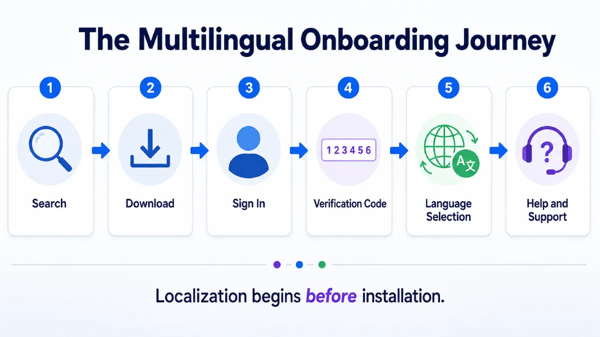
Multilingual app onboarding begins long before a user reaches the main conversation screen. Friction can appear in the search result, download page, platform selection, phone-number form, verification code, language menu, security settings, or help center before the first message is ever sent.
Basic machine translation does not solve these problems. A website may translate marketing copy while leaving screenshots, errors, buttons, and support articles in another language. The mobile interface may use one term for signing in while the desktop guide uses another, making users unsure whether both labels refer to the same feature.
Effective multilingual app onboarding helps users complete real tasks across the entire journey. It requires consistent terminology, visible language controls, localized screenshots, clear verification instructions, and support content that reflects differences between mobile, desktop, and web interfaces.
Localization is therefore not a final translation step. It is part of messaging app UX from the first search result through registration, account recovery, and long-term device management – particularly for Traditional Chinese users in Hong Kong and Taiwan.
Start Localization Before App Download and Registration
Many product teams begin localization inside the application. However, international user onboarding often starts on a search engine, app landing page, support article, or software download page.
The following areas should be localized before installation:
- Product homepage
- Download page
- Platform selection
- System requirements
- Registration instructions
- Privacy information
- Security guidance
- Frequently asked questions
- Contact and support options
A localized download page should explain which versions are available for Android, iPhone, Windows, macOS, or web access. It should also make clear whether the user is downloading an installer, opening an app store, or continuing to a web client.
Users searching for a telegram 中文版 resource often need more than translated marketing text; they also need clear guidance for downloading, signing in, choosing a language, and moving between desktop and mobile devices.
This type of guidance should be presented as practical onboarding support rather than a promotional claim. Users need to understand what steps they are expected to complete, which device they should begin with, and whether an existing account or active session may affect the login process.
Localization before download also reduces support requests. When platform names, installation requirements, and initial setup steps are explained clearly, users are less likely to choose the wrong application version or abandon registration.
Let Users Choose the Language and Regional Variant
Automatic language detection can improve convenience, but it should not remove user control.
A website or application may use browser language, operating system settings, account preferences, or approximate region to recommend a language. These signals can be useful, but they are not always accurate. A user may live in one country, use an English-language operating system, and still prefer a Chinese interface.
A better language selection UX should:
- Detect the likely language
- Show a recommended option
- Keep the language switcher visible
- Allow users to reject the automatic choice
- Save the selected preference
- Make language selection available before login
- Allow language changes after login
The language selector should use recognizable language names rather than flags alone. Flags represent countries, not languages, and one language may be used across several regions.
The selected language should also remain consistent when the user moves between the homepage, download page, support center, and account area. Returning users should not have to choose the same language repeatedly.
When a language is not fully supported, the interface should communicate this honestly. A partially translated product should not silently mix languages without explanation. The user should be told which sections may still appear in the default language.
Design Traditional Chinese Experiences for Hong Kong and Taiwan
Traditional Chinese should not be treated as one undifferentiated locale. Hong Kong and Taiwan users may prefer different vocabulary, examples, date formats, support wording, and interface conventions even when both versions use Traditional Chinese characters.
A localization glossary can include separate zh-HK and zh-TW columns for approved terms, context, character limits, and screenshots. Product teams should also check that Simplified Chinese labels do not appear unexpectedly in a Traditional Chinese flow, especially during verification, security setup, or account recovery.
Regional detection can recommend a language, but the user should always be able to switch between English, Hong Kong Traditional Chinese, and Taiwan Traditional Chinese. The selected choice should persist across the website, app, and help center.
Keep Interface and Help-Center Terms Consistent
Terminology consistency is one of the most important parts of app localization design.
A messaging service may use related terms such as:
- Sign In
- Log In
- Verification Code
- Password
- Two-Step Verification
- Active Sessions
- Privacy
- Notifications
- Devices
- Account Recovery
If the website, application, and help center translate these terms differently, users may believe they refer to separate features.
For example, a login page may request a “verification code,” while a support article calls the same item a “login code.” This variation may seem minor to the product team, but it can create confusion for users who are already unfamiliar with the authentication process.
Teams should maintain a localization glossary that records:
- Source term
- Approved translation
- Context
- Platform usage
- Capitalization
- Terms that should not be translated
- Related screenshots or support articles
The same glossary should be shared with product designers, translators, support writers, developers, and marketing teams.
Consistency does not mean every sentence must be translated literally. Interface labels should remain concise, while help-center explanations can provide more detail. The important point is that the same feature should be recognizable across every channel.
Localize Login, Phone Number, and Verification Flows
Login and verification screens are high-friction parts of multilingual onboarding because they combine unfamiliar terminology, time-sensitive actions, and account security.
The interface should clearly explain:
- How to choose a country code
- How to enter a phone number in international format
- Where a verification code may arrive
- Whether an already signed-in device should be checked
- What to do when an SMS is delayed
- What happens when a code expires
- Why repeated attempts may trigger a temporary limit
- How a verification code differs from a two-step verification password
A user should not have to guess whether the requested password is a code received by message, an account password, a device passcode, or a two-step verification password.
The page should also avoid hiding critical instructions inside expandable text. If users may receive the code through an existing session rather than SMS, that information should be visible close to the input field.
Error states require the same level of localization as the successful path. A translated login button is not enough when the most important warning remains in another language.
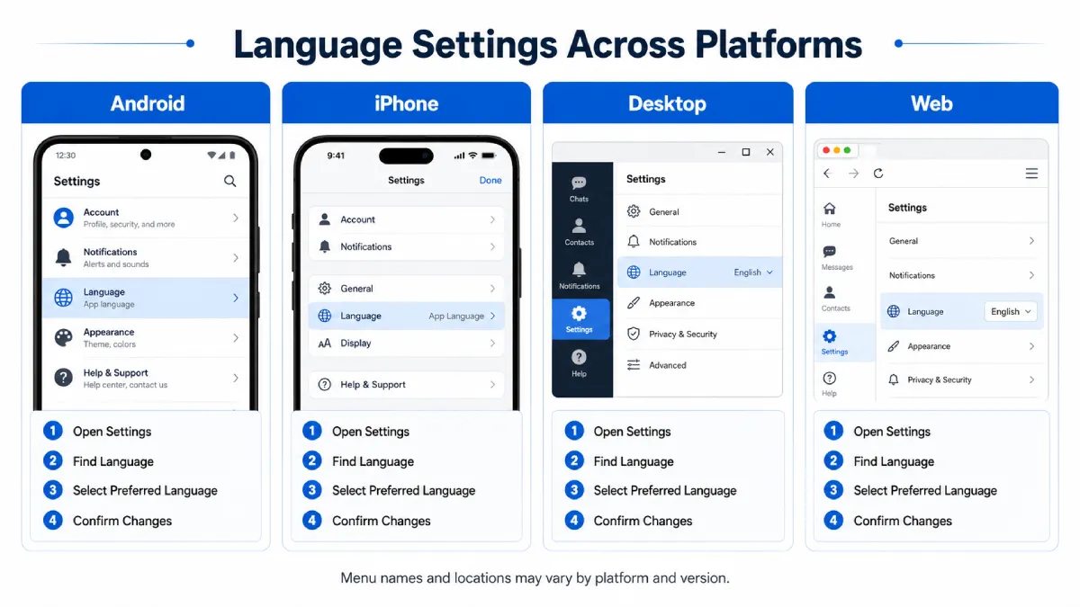
Menu names and locations may vary by platform and app version. Support content should therefore explain the purpose of the feature and provide alternative navigation paths instead of assuming that every user sees an identical interface.
Explain Language Settings Across Mobile, Desktop, and Web
Messaging applications commonly support several platforms, including:
- Android
- iPhone and iPad
- Windows
- macOS
- Web browsers
A language option may appear in a different menu on each platform. On one device it may be listed under general settings, while another version may place it under appearance, language, or application preferences.
A good cross-platform onboarding guide should identify the relevant platform first. It should not combine several device instructions into one long paragraph because users may follow steps intended for another operating system.
A practical telegram 中文设置 guide can reduce onboarding friction by showing where language controls may appear and explaining that menu locations can differ between mobile, desktop, and web interfaces.
Each platform section should include:
- The expected starting screen
- The settings area to open
- The likely name of the language menu
- How to confirm the selected language
- What to do if the option is unavailable
- A note about interface differences between versions
Desktop app localization deserves particular attention because many users first register on a phone and later add a computer. The desktop interface may require a QR code, confirmation from an active device, or another login method before the user can reach the language settings.
Support content should explain this sequence clearly rather than treating desktop setup as a copy of the mobile process.
Use Localized Screenshots and Accessible Visual Guides
Screenshots can reduce cognitive load, but only when they match the user’s device, language, and application version closely enough to be useful.
Localized screenshots should:
- Show the correct platform
- Use clear step numbers
- Highlight the relevant button or menu
- Avoid exposing real phone numbers
- Hide personal messages and account information
- Use a reasonably current interface
- Include alternative paths when layouts differ
- Provide descriptive image captions
A screenshot in English may still be useful in a Chinese article when no localized interface is available, but the image should be annotated clearly. The surrounding text should explain what the user is looking for rather than assuming the label is obvious.
Product teams should also avoid using one screenshot for several different steps. A sequence of focused images is easier to understand than one crowded image filled with arrows, circles, and repeated labels.
Accessibility matters as well. Important instructions should not exist only inside the image. The same steps should be available as text for screen readers, translation tools, and users who cannot load the screenshot.
Screenshots should be reviewed whenever the interface changes. Outdated visual guides can be more confusing than no image at all because users may conclude that they installed the wrong version.
Turn Localized Error Messages Into Next Steps
An effective error message should explain both the problem and the next step.
Direct translation without action guidance may leave the user with a technically accurate message but no way to recover. Product teams should design localized errors around the decisions users need to make.
| Error type | Recommended user action |
| Invalid number | Check the country code and international phone-number format |
| Code expired | Request a new verification code and use only the latest one |
| Too many attempts | Stop repeated attempts and try again later |
| Wrong password | Confirm whether the screen requires a login code or two-step verification password |
| Connection error | Check the network connection and application version |
The wording should remain calm and specific. Messages such as “Something went wrong” are rarely useful unless they are followed by troubleshooting options.
The interface should avoid blaming the user. Instead of saying “You entered the number incorrectly,” it can say, “Check that the country code and phone number are in the correct format.”
When a temporary limit applies, the message should discourage repeated attempts. Users often respond to failed verification by requesting more codes, which can increase confusion when several codes arrive at different times.
Localized error handling should also link to the relevant help article. The support page must use the same terminology as the error message so users can recognize that they have reached the correct instructions.
Build a Searchable Localized Help Center
A multilingual interface needs a localized help center that covers the full account lifecycle.
The help center should include sections for:
- Downloading and installation
- Registration and login
- Verification codes
- Passwords and account security
- Privacy settings
- Device and session management
- Notifications
- Files and media
- Language settings
- Account recovery
- Troubleshooting
Articles should be organized around user tasks rather than internal product categories. A person who cannot log in should not need to understand the company’s authentication architecture before finding assistance.
Search terms should include common user wording, alternative translations, and localized phrases. Users may search for “login code,” “verification number,” “SMS code,” or “security code” even when the interface uses one preferred term.
The help center should also state when instructions differ by device. Platform filters can allow users to select Android, iPhone, Windows, macOS, or web before reading the steps.
Localization quality should be measured through behavior, not only translation coverage. Useful indicators include:
- Support search success
- Article completion rates
- Repeated login attempts
- Language-switching frequency
- Contact requests after viewing an article
- Abandonment during registration
- Error recovery rates
These signals can reveal where translated content still fails to help users complete a task.
Frequently Asked Questions About Multilingual App Onboarding
When should localization begin in the onboarding journey?
It should begin at the search result and landing page, before download or registration. Platform selection, privacy information, login guidance, and support content all influence whether users can complete setup.
Should Hong Kong and Taiwan use the same Traditional Chinese translation?
They can share a source glossary, but important interface terms, examples, support wording, and search phrases should be reviewed separately for zh-HK and zh-TW when market usage differs.
Why are localized screenshots important?
Screenshots help users match written instructions to the interface. They should show the correct platform and language, protect personal data, include text alternatives, and be reviewed whenever the interface changes.
Conclusion: Treat Localization as Part of Product Onboarding
Multilingual onboarding is not simply the process of replacing one language with another. It helps international users complete downloads, registration, verification, language selection, security setup, and account recovery across different devices and regional variants.
Strong messaging app UX begins before installation and continues through every important user journey. Visible language controls, consistent terminology, platform-specific guidance, localized screenshots, actionable errors, and a searchable help center all reduce friction.
The most effective localization systems connect product design, translation, support, and analytics. When these teams share a glossary and review the same user problems, English, zh-HK, and zh-TW users receive a more predictable experience.
A well-localized messaging app does not merely display translated words. It gives users enough context, control, and guidance to complete each task confidently, regardless of their preferred language, market, or device.


Leave a Reply