
Software Download Page UX and Security Checklist for Safer Installs
A software download page has two responsibilities: help users choose the correct application and give them enough information to evaluate the source, file, platform, and installation process. Strong download page UX makes the next action obvious without hiding the checks users need to make first.
Many download pages focus almost entirely on conversion. Oversized buttons, countdown timers, repeated calls to action, and aggressive pop-ups may increase short-term clicks, but they also damage trust and can steer users toward the wrong installer or an unrelated advertisement.
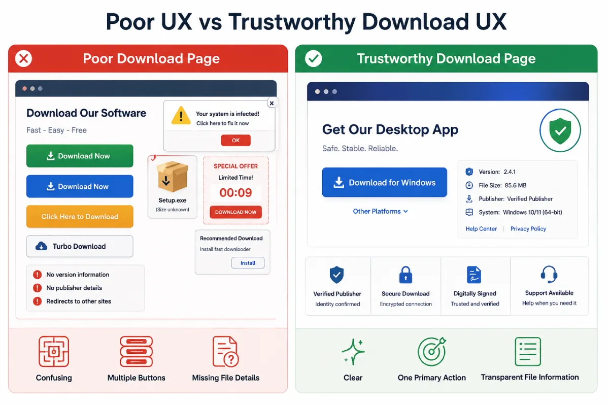
A low-quality page may display several similar buttons, hide the final file destination, omit version information, or redirect users through unrelated hosts. It may also begin a download before the user understands the platform, file type, system requirements, privacy terms, or publisher identity.
A trustworthy software download page reduces uncertainty. It combines clear product identity, precise platform options, transparent installer details, accessible support, and practical verification guidance. This is especially important when users in Hong Kong or Taiwan move between English and Traditional Chinese search results before choosing a Windows, mobile, or web version.
Identify the Software Product and Publisher Clearly
Users should immediately understand what software is being offered and who is responsible for publishing it.
The upper section of the page should clearly display:
- The complete software name
- The developer or publisher
- A recognizable product logo
- A short explanation of the software’s purpose
- Contact or support information
- A link to the help center
- A privacy policy
- Terms of use where appropriate
A large download button is not enough. If the page does not clearly identify the product, users may not know whether they are downloading the expected application, an unofficial package, or a modified installer.
The product description should be specific without becoming promotional. It should explain what the software does, which users it is intended for, and whether the download is free, paid, trial-based, or subscription-supported.
Publisher information should also be easy to find. A company name hidden in the footer does little to establish trust. Users should not need to search through several pages to determine who created the application or who is responsible for maintaining it.
Download page UX improves when product identity, publisher identity, and support channels are visible before the primary call to action.
Show Platform, Version, and Compatibility Information
One of the most common download page problems is unclear platform selection.
A page may detect the user’s operating system automatically, but automatic detection should not remove the ability to choose manually. Users may be downloading software for another computer, managing devices remotely, or using a browser that reports incomplete system information.
The page should distinguish clearly between:
- Windows
- macOS
- Linux
- Android
- iOS
- 32-bit systems
- 64-bit systems
- ARM processors
- Intel processors
Each platform option should include the relevant system requirements. Depending on the application, this information may include:
- Minimum operating system version
- Required memory
- Available disk space
- Processor architecture
- Supported display resolution
- Required frameworks or dependencies
- Installer format
- Download file size
A user searching for wps下载 should be able to identify the publisher, supported platform, current version, file format, and download destination before opening any installer.
Compatibility information should appear near the download option, not on a separate page that users may never read. A short summary beside the button can link to a more detailed system requirements page when necessary.
Software companies should also avoid using vague labels such as “PC version” when several processor or operating system variants are available. Precise labels reduce failed installations, support requests, and user frustration.
Use One Clear Primary Download Button
A trustworthy download page should have one obvious primary action for each platform.
Multiple competing buttons create confusion, especially when advertising blocks use similar colors, shapes, and wording. Users should not have to decide between several options labeled:
- Download Now
- Start Download
- Free Download
- Recommended Download
- Fast Download
When several buttons appear to perform the same action, users may click the wrong one or assume that the page is designed to mislead them.
Avoid Competing Calls to Action
Advertising, newsletter subscriptions, account registration, and related product offers should not compete visually with the main download button.
The primary button should have the strongest visual emphasis, while secondary actions should be clearly separated. Ads should never imitate the size, color, or wording of the actual download control.
Pages should also avoid repeating the same download button after every short paragraph. Repetition may increase click volume, but it can make the page feel aggressive and reduce confidence.
A single primary call to action, supported by clear product and file information, is usually more effective than several nearly identical buttons.
Label the Button Precisely
Button text should explain exactly what will happen.
Clear labels include:
Download for Windows
Download for macOS
Download Android App
Vague labels include:
Click Here
Start
Continue
Get It
A button labeled “Continue” may lead to registration, advertising, a file host, or the installer itself. Precise wording helps users predict the next step and supports better accessibility.
Where several versions are available, the button can include the operating system, architecture, or release channel. For example:
Download for Windows 64-bit
Download Stable Version
Download ARM Build
Explain the Installer Before the Download Starts
Users should know what file will be downloaded before the transfer begins.
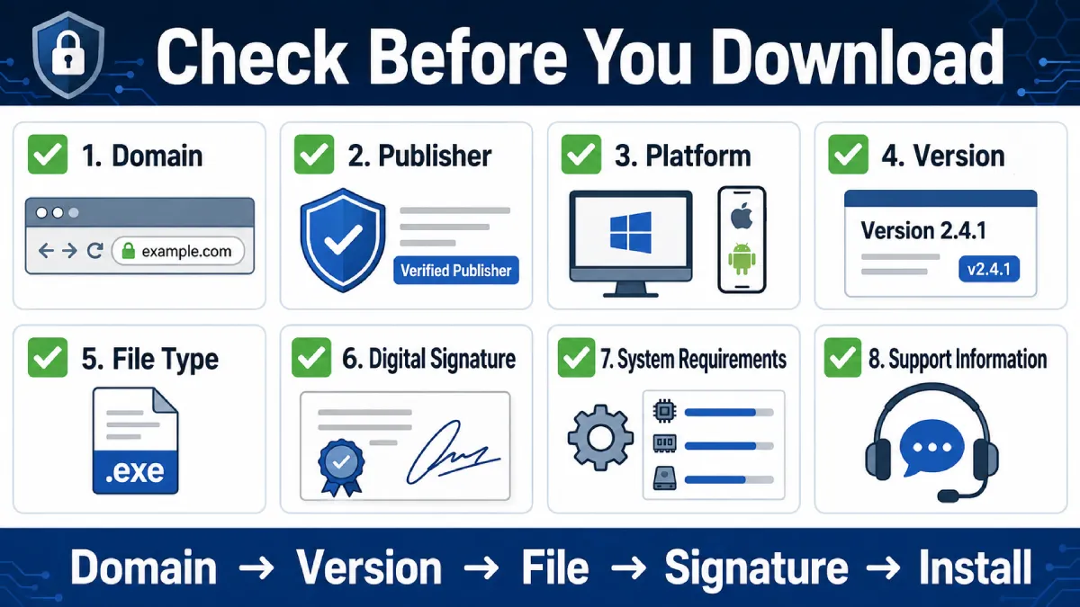
The area near the button should display:
- File name
- File extension
- File size
- Software version
- Release date or update date
- Publisher information
- Digital signature details where available
- A short release summary
This information helps users recognize the file in their downloads folder and compare it with documentation or update records.
A dependable wps电脑版下载 page should explain the Windows version, installer type, system requirements, update date, and any permissions the installation process may request.
The installer type should also be understandable to nontechnical users. A Windows page may provide an `.exe` or `.msi` file, while a macOS page may offer a `.dmg` package. Android users may receive an app-store link or an `.apk` file, depending on the distribution method.
The page should explain whether the installation requires administrator privileges, whether additional components will be downloaded, and whether the application starts automatically after setup.
When users know what to expect, they are less likely to abandon the download or mistake a normal system prompt for suspicious behavior.
Avoid Dark Patterns and Misleading Download Controls
A trusted software download page should never increase conversion by confusing users.
Misleading patterns may include:
- Fake download buttons
- Automatic pop-ups
- Unexpected redirects
- Requests to enable browser notifications
- Countdown timers that imply false urgency
- Bundled software offers
- Unclear mirror sites
- Full-screen advertisements
- Buttons that trigger unrelated extensions
- Automatic file downloads without clear consent
Fake download buttons are particularly damaging. They often appear inside advertisements and use phrases such as “Download,” “Start,” or “Open.” If the real button is visually weaker than the advertisement, users may install the wrong application.
Automatic redirects also reduce transparency. A button should not send users through several domains before reaching a file. When third-party hosting is necessary, the page should clearly identify the provider and explain why the file is hosted elsewhere.
Countdown timers should only be used when there is a genuine technical reason. Artificial delays and urgency messages make the page feel less reliable and can encourage users to click without reviewing the file information.
A trustworthy download page does not need to hide its destination or pressure users into immediate action.
Add Practical File Verification and Security Information
Security information should help users perform additional checks without making unsupported guarantees.
A secure download page may provide:
- HTTPS
- Digital signature verification instructions
- File hash values
- Security scan information
- Clear download source details
- Release notes
- Software update history
- Information about expected permissions
HTTPS protects data during transfer, but it does not prove that every file is safe. Similarly, a security scan can provide useful information, but no single scanning result guarantees that a file is risk-free.
The page should use careful language such as:
- Users should verify the publisher before installation.
- Security scans provide an additional check.
- File hashes can help confirm that a download has not changed.
- No single security signal guarantees safety.
Avoid claims such as “100% virus-free” or “completely safe.” Absolute statements are difficult to support and may reduce credibility.
Where digital signatures are available, the page can explain how users can check the signer through their operating system. Hash values are also useful for advanced users who want to compare the downloaded file with the publisher’s reference value.
The goal is to give users practical verification options, not to overwhelm them with technical details.
Localize Download Pages for Hong Kong and Taiwan Users
Users in Hong Kong and Taiwan may switch between English and Traditional Chinese search results while comparing software versions. The product name, publisher, platform labels, version number, and installer details should remain consistent across language pages so the localized experience does not introduce new uncertainty.
Traditional Chinese copy should be reviewed for the intended market rather than copied mechanically from another locale. Interface terms can differ, but technical strings such as Windows 64-bit, version numbers, file extensions, and digital-signature details should remain precise and easy to compare with the downloaded file.
Language detection should never hide platform choice or redirect users to a different installer without explanation. Regional pages should also use unambiguous dates, visible privacy and support links, and the same download destination as the corresponding primary product page.
Design for Mobile and Desktop Download Journeys
Download page design should respond to the device without assuming that the detected device is always the intended target.
On mobile screens, the primary button should be visible without covering product information or navigation. It should be large enough to tap but not so large that it hides compatibility details or appears as an aggressive advertisement.
The page should not display a Windows installer as the only option to an iPhone user. It should instead show the relevant mobile option while still allowing manual platform selection.
Important download information should appear before the button, including:
- Product name
- Platform
- Version
- File type
- File size
- Publisher
Users should not need to download the file before learning what it contains.
Responsive design should also consider long file names, multiple architecture options, translated labels, and accessibility. Buttons should remain readable at larger text sizes, and platform icons should not be the only way to communicate compatibility.
A clean mobile layout can improve both trust and download page conversion because users are less likely to leave when the process is understandable.
Support Users After Download and Installation
The download page should remain useful after the user receives the file.
Post-download support may include:
- Installation instructions
- Common error explanations
- Update guidance
- Uninstallation steps
- Contact information
- Frequently asked questions
- Version history
- Troubleshooting resources
- Account setup instructions
- Permission explanations
Users often return to the original download page when installation fails. If the page provides only a button, they may have no clear next step.
Installation instructions should cover the basic process without assuming that every user is experienced. Where steps vary by platform, each operating system should have separate guidance.
The FAQ can address common problems such as:
- The installer does not open
- The operating system blocks the file
- The wrong platform version was downloaded
- There is insufficient disk space
- An older version is already installed
- Administrator permission is required
- The application cannot connect after installation
Version history is also valuable because it shows that the software is actively maintained and helps users understand recent changes.
A strong support section turns the download page into a complete product resource rather than a one-time conversion page.
Frequently Asked Questions About Software Download Pages
What information should appear next to a download button?
Show the platform, version, file name or type, file size, publisher, update date, system requirements, and final download destination. Users should understand the installer before the transfer begins.
Does HTTPS prove that a software download is safe?
No. HTTPS protects the connection, but it does not confirm that the publisher or installer is legitimate. Domain identity, digital signatures, version details, and file behavior still need to be checked.
How should multilingual download pages handle different platforms?
Keep the same product and version data across language pages, let users choose the platform manually, and explain any regional or distribution differences. Do not rely on language or device detection as the only control.
Conclusion: Build Trust Before the User Clicks Download
A high-performing software download page is not simply a page with a large button. It should help users understand exactly what they are downloading, where the file comes from, which platform it supports, and what will happen during installation.
Clear product identification, accurate compatibility details, precise button labels, transparent file information, localized guidance, and practical verification steps all contribute to a more trustworthy experience.
Download pages should avoid fake buttons, hidden redirects, unsupported security claims, and confusing platform options. Where regional pages are available, consistent English and Traditional Chinese terminology, installation help, version history, and installer verification can improve both user confidence and conversion quality.


Leave a Reply