
Designing the Experience: Building Conversion-Focused Websites for Sensory, Physical, and Mobile Lifestyles
Project managers think in systems, workflows, risks, and outcomes.
And a website should be treated the same way.
A modern website is not just a visual asset. It is a working product with goals, constraints, stakeholders, and success metrics.
That is where conversion-focused websites come in.
These websites are designed to guide users toward a clear action. These actions may include:
- Signing up
- Requesting a demo
- Downloading content
- Completing a form
When designed correctly, they reduce friction, end confusion, and simplify decision-making.
Today’s users live sensory, physical, and mobile lifestyles. They expect speed, clarity, and comfort across every interaction.
This guide tackles the most important questions. It explains how project managers can design and manage conversion-focused websites. But not just regular websites. We’ll cover the ones that perform well across sensory, physical, and mobile experiences.
What can conversion-focused websites really do?
Conversion-focused websites are not just about visuals. They aim to deliver a measurable outcome within scope, time, and budget.
Such a website is designed around one primary goal—every feature, page, and interaction supports that goal directly.
This could include:
- Submitting a form
- Requesting a demo
- Signing up for a service
- Completing a purchase
From a project perspective, conversions act like acceptance criteria. If users do not complete the intended action, the project has not entirely succeeded.
This approach enables project managers to:
- Focus on features
- Cut unnecessary scope
- Align stakeholders around clear performance metrics
It also makes trade-off decisions easier when timelines or resources are limited.
Treating conversion as the core success metric is beneficial to project managers. It enables them to more effectively connect design decisions with real business value.
Why experience design matters for conversion-focused websites?
First impressions happen almost instantly. Users decide whether to stay or leave before they become aware of it. SWEOR research indicates that users form an opinion about a website in under 0.05 seconds.
This means experience design directly affects the major things:
- Risk
- Delivery success
- ROI
A poor experience increases bounce rates, reduces engagement, and undermines business goals.
In conversion-focused websites, experience design is not a cosmetic layer; it is a crucial component. It is a core functional requirement that supports outcomes.
Sensory design: How users see and feel the website

Sensory design focuses on user experience. It examines how users visually and emotionally interact with a website.
It determines whether users feel confident, calm, and guided, or confused and overwhelmed.
Visual hierarchy
Users scan landing pages instead of reading them line by line. A clear visual hierarchy helps users understand what matters most and what to do next. Here’s what to put your focus on:
- Headlines should stand out.
- Supporting text should be easy to skim.
- Call to action (CTA) button should be visually obvious.
For eye-care and vision-focused brands, this is crucial, along with having good social proof. Delivering a conversion-friendly digital experience means everything to customers. It means you’re supporting customers at every stage of their journey.
More often than not, practices are incorporating Optometry virtual assistants into their websites. It offers instant help with booking, product inquiries, or navigating online vision tools. All this enhances user experience.
These remote professionals enhance the overall sensory and mobile experience. How? They offer real-time guidance—even on small screens—creating a seamless digital path.
Ultimately, this path then boosts trust and conversion rates.
Color and contrast
Color should guide attention, not distract from it.
The CTA button needs a strong contrast to be easily visible at a glance.
Poor contrast increases cognitive effort, which directly lowers conversion rates.
Motion and feedback
Your web design should consider micro-interactions. Micro-interactions such as hover effects, button animations, and progress indicators help users feel in control. They confirm actions and reduce uncertainty during interaction.
For conversion-focused websites, motion supports clarity, not decoration.
An option is to use AI-generated digital avatars as part of the sensory design approach, adding a subtle human presence that guides users, explains services, and builds confidence without overwhelming the interface.
Physical interaction: Clicking, scrolling, and touch
Websites are their web design a physical experience, even though they’re digital products.
Website visitors respond to visual cues and interact using their hands, fingers, and touchscreens.
Performance and load speed
Speed is one of the most important physical factors. Cloudflare’s research states that a one-second delay can reduce conversions by 7%.
From a project management perspective, performance issues represent high delivery risk.
If speed is compromised, conversion outcomes also decline, and trust signals take a downward spiral.
Scrolling behavior
According to the SEOpowerplays newsletter, users are comfortable scrolling, especially on mobile devices. This is a standard user behavior. However, content should flow vertically with clear sections. Each section should answer one question at a time.
Bottom line: each section should naturally lead to the next action.
Clickable and tappable areas
Buttons and links must be easy to interact with. Small click targets increase errors and frustration, especially on touch devices.
Physical comfort directly affects completion rates.
Mobile experience: Designing for the default platform
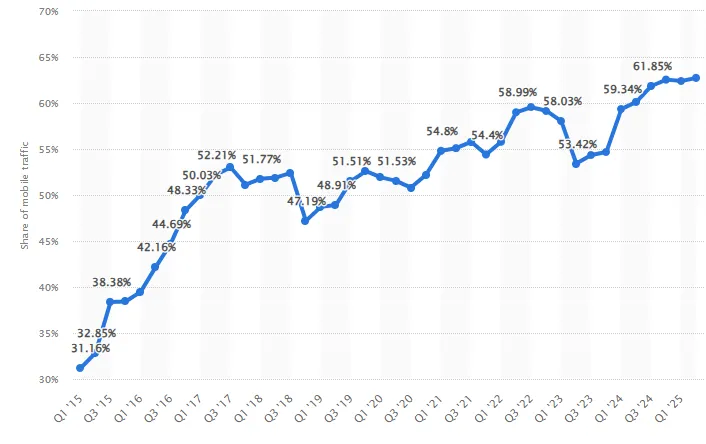
Mobile devices are no longer secondary access points. They are the primary way people use the web. According to Statista, over 60% of global website traffic originates from mobile devices.
A conversion-focused website that doesn’t have a responsive design on mobile devices will underperform overall.
Mobile-first design approach
Designing mobile-first forces teams to focus on what truly matters. Only the most important content and actions survive.
This results in cleaner layouts, faster page loading, and improved focus.
Thumb-friendly navigation
Most users operate phones with one hand. Primary actions should be within reach of the thumbs. Navigation menus should be simple and predictable. Every visual element should be straightforward and easily accessible.
Mobile forms
Forms are common conversion points and major drop-off risks. Using autofill, smart defaults, and fewer required inputs significantly improves completion rates.
Accessibility: Designing for all users
Accessibility improves usability for everyone, not just users with disabilities. It reduces friction, confusion, and abandonment. According to the WHO, approximately 20% of people have a disability that affects how they use the web.
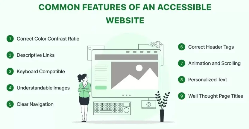
Key accessibility elements
Most common key accessibility elements include:
- Clear contrast between text and background
- Keyboard navigation support
- Alt text for images
- Logical reading order
Accessible conversion-focused websites perform better. Why? Because they are easier to use for all visitors.
Take the healthcare industry, for example. Health and wellness brands offering digital care—whether for metabolic support, hormone programs, or users researching semaglutide online—need websites that quickly build trust.
Companies now incorporate remote patient-support specialists who guide visitors through questions. But that’s not all. They also help with:
- Streamlining onboarding forms
- Provide real-time clarity during mobile browsing sessions
This combination of human-backed support and sensory-friendly design is truly effective. What it does is it:
- Reduces friction
- Strengthens credibility
- Boosts conversions
From a project perspective, accessibility reduces long-term risk and increases reach.
Content design: Clear words drive action
Content is part of the experience. Users want clarity quickly, especially when deciding whether to act.
Here’s what you should do.
Use Plain language
Short paragraphs and simple wording reduce mental effort. When effort decreases, conversions increase.
Use Clear value propositions
Users immediately ask what benefit they will get. The answer should be visible without needing to scroll.
Use Strong CTAs
CTAs should clearly describe the outcome.
Examples include:
- “Start Free Trial”
- “Download the Guide”
- “Request a Demo”
For project managers, CTAs act as success checkpoints.
Testing and optimization: Continuous improvement
No conversion-focused website is ever truly finished. Optimization is an ongoing process.
These are the things optimization includes.
A/B testing
Testing small changes can produce meaningful results.
Common tests include:
- Headline variations
- CTA wording
- Layout structure
- Button placement
Behavior analytics
Heatmaps, scroll tracking, and session recordings reveal where users hesitate or drop off.
These insights replace assumptions with evidence.
Metrics that matter
Track metrics tied directly to goals:
- Conversion rate
- Bounce rate
- Time on page
- Form completion rate
Measurement drives improvement.
Practical examples for project managers
Practical examples every project manager can use to improve conversion rates include:
Landing pages
Landing pages should focus on a single goal. Removing navigation and distractions increases conversions.
Product or service websites
When designing for diverse lifestyle needs, brands increasingly rely on flexible digital tools. These tools adapt to users across devices and accessibility contexts.
Teams incorporate web app development services to build responsive, high-performance interfaces. These interfaces work seamlessly across various environments, including sensory, physical, and mobile.
Platforms like Replit.com make this approach more accessible. How? It allows developers to prototype, test, and iterate collaboratively in real-time.
What should you do? You should use progressive disclosure, showing essential information first. Then allow users to explore deeper if needed.
Internal platforms
Internal websites still need good UX. Adoption is the primary conversion goal. But a poor experience can significantly reduce usage.
Common mistakes that reduce conversions
Common mistakes that you can avoid that can hurt conversions include:
- Slow performance
- Unclear CTAs
- Overloaded pages
- Poor mobile layouts
- Long and complex forms
Each issue increases friction and reduces effectiveness.
Final thoughts
Conversion-focused websites should be managed like any other critical project. They require planning, prioritization, testing, and iteration.
Experience design is not subjective creativity. It is structured problem-solving.
When sensory clarity, physical usability, and mobile performance align, users act with confidence.
This leads to better:
- Conversion rates
- Outcomes
- Project success
Start exploring conversion-focused website capabilities. You’ll see the conversion rate results in no time.
About the Author

Kelly Moser is the co-founder and editor at Home & Jet, a digital magazine for the modern era. She’s also the content manager at Login Lockdown, covering the latest trends in tech, business and security. Kelly is an expert in freelance writing and content marketing for SaaS, Fintech, and ecommerce startups.
Leave a Reply