How Color Trends Are Shaping Modern Logos
Millions of new businesses are launched every year, and that means the same number of logos are created. Believe it or not, each is as unique as the next. Incorporating distinctive shapes, symbols, and typography, designers can create a memorable design that stands out.
But what really gives a logo its instant impact is its color palette. Using color schemes that resonate with the brand’s identity and personality helps create a unique and evocative logo.
Like fashion and interior design, color trends in logo design continuously evolve. If you want to learn more about current color trends, hop on board. We’ll discuss how they’re shaping modern logos and how you can use these trends for inspiration to create a color scheme for your logo that attracts customers and allows you to stand out in the crowded marketplace.
But first, let’s address the elephant in the room.
Why Does Color Matter in Logo Design?
Research strongly supports that color is the first thing people notice. Within 90 seconds of an initial interaction, they will already have made a judgment about a product. About 62‐90% of these snap assessments are based on colors alone.
Now apply this information to the colors of your logo. It’s clear to say that your color choices will heavily influence how people will perceive your brand and set the tone for a brand’s personality. For example, a bold, neon logo suggests energy and youth, while muted, earthy tones signal sophistication and calm.
Therefore, the color palette for your logo needs to be chosen carefully. For this purpose, you should team with a professional custom logo design company. This will help you create a logo that will align with both your brand values and consumer psychology. Professionals stay on top of color trends and understand how the right hues can drive customer behavior, whether that’s encouraging purchases, building trust, or evoking nostalgia.
Color Trends to Watch For
Over the past decades, there has been a considerable shift in logo design trends. The coming years will embrace and appreciate the following color trends:
1. Minimalistic Appeal
Less is more – and this philosophy dominates modern branding. Minimalist logos often rely on stripped-down color palettes such as black, white, and grayscale. These tones allow brands to focus on clarity and sophistication. A minimalistic appeal is especially favored by luxury brands, tech companies, and startups that want to communicate professionalism and timelessness.
2. Neutral Palettes
Neutrals like beige, taupe, soft browns, and warm grays are rising in popularity because of their versatility. They evoke calmness, elegance, and subtlety, making them suitable for industries that want to portray maturity and reliability.
But that’s not all. Neutrals also pair beautifully with metallic finishes, giving logos that chic, modern yet classic touch.
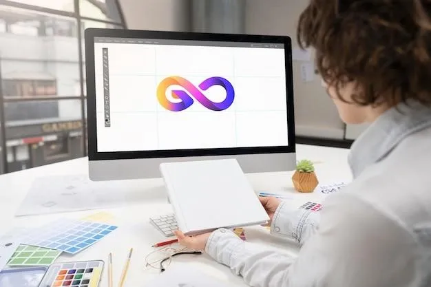
3. Vibrant Gradients
Gradients are back in style. Companies looking to connect with younger audiences or stand out in digital spaces are embracing multitone blends. From Instagram’s iconic sunset blend to fintech startups experimenting with blues and greens, gradients create movement and vibrancy, adding energy and depth to flat designs.
4. Pastel Colors
Soft pastels are carving a niche in industries that want to appear approachable and friendly. Wellness, lifestyle, and creative brands especially love these hues because they feel comforting and less intimidating. More than that, pastels allow your brand to stand out in the crowded market where loud palettes dominate.
5. Bold, Contrasting Colors
On the flip side, many businesses go for bold, high-contrast combinations that scream confidence. Sports brands, entertainment companies, and disruptor startups often pair colors like black and neon or red and turquoise. These kinds of bold combinations ensure instant recognition and position the brand as daring and energetic.
Adapting to Evolving Color Trends
Color isn’t static, and neither is branding. As trends evolve, so do color preferences. That means businesses must adapt without losing their core identity. However, that doesn’t mean you need to completely overhaul your logo every few years. You can simply tweak it every now and then to reflect modern tastes and maintain cultural relevance.
Here’s what you should keep in mind:
1. Cultural and Social Influences
Colors aren’t just aesthetic choices – they carry cultural and emotional significance too. For example, red can mean luck in China but danger in Western contexts. Similarly, green represents sustainability in many parts of the world but is also linked to wealth and growth.
When selecting a color palette for your logo, you need to be aware of such associations. This is why relying on professional logo designers may be wiser when choosing or updating your logo. They are tuned to cultural shifts and can ensure your logo feels relevant, respectful, and impactful to audiences across the globe, even when different cultures are involved.
2. Rise of Digital Platforms
Logos no longer just live on billboards or packaging – they’re online at countless digital touchpoints, from mobile apps to website headers to social media feeds. This has redefined how brands use color.
Colors must be screen-friendly, adaptable to both light and dark modes. Brands are also adopting responsive color systems rather than a single fixed shade. For instance, a brand might use its main color for official communication but explore trending hues in seasonal campaigns or app interfaces.
As the digital space expands, brands will need to adapt their logos for multi-platform visibility. That means you need to focus on a digital-first color scheme where gradients and bold contrasts thrive. Instead of sticking to a single hue, consider creating entire palettes that adapt to changing contents so that your logo remains legible on any device.
Design Your Logo With the Right Colors
Your logo should leave a strong visual mark on everyone who looks at it. And a well-chosen palette can make your logo unforgettable and instantly recognizable. So, make sure to choose the colors that align with your brand’s identity and help tell your story.
But whether you lean into minimalism, pastels, or bold contrasts, the key is to maintain balance – stay timeless while keeping options open for fresh influences.
It’s time you made smart, lasting color choices that capture attention today and allow you to remain relevant tomorrow.
Leave a Reply