How Geometry Shapes the World of Web Design and Aesthetics
In the realm of web design, where creativity meets technology, the influence of geometry is both profound and often understated. Geometry, the branch of mathematics concerned with the properties and relations of points, lines, surfaces, solids, and higher dimensional analogs, serves as a foundational pillar in creating aesthetically pleasing, functional, and engaging websites. This exploration reveals how geometric principles shape web design and aesthetics, offering a deeper understanding and appreciation for the role of geometry in crafting digital experiences.
Understanding Geometry’s Core Role in Design Fundamentals
Geometry’s impact on web design is rooted in its ability to create harmony and balance. Simple shapes like circles, squares, and triangles are not just basic elements; they carry with them meanings and emotions, making them powerful tools in the hands of web designers.For example, circles frequently signify togetherness and accord, squares denote steadiness and equilibrium, while triangles can suggest movement or guidance.
By thoughtfully incorporating these shapes, designers can convey specific messages and evoke desired emotions from the website’s audience. Here’s a closer look at how fundamental geometric concepts are intricately woven into the fabric of design:
- Shape and Meaning: Each geometric shape carries inherent meanings and emotions. Circles, with their endless loop, evoke a sense of completeness and unity, making them ideal for brands that want to express harmony and inclusivity. Squares and rectangles, with their straight lines and angles, convey stability, reliability, and strength, often used in professional and corporate website designs. Triangles, pointing upwards, suggest growth and dynamism, perfect for brands aiming to project progress and energy.
- Balance and Proportion: Geometry is crucial in achieving balance and proportion in design. Through the use of symmetrical (mirror-image balance) and asymmetrical (balanced through contrast, color, and placement) designs, websites can achieve a visually appealing layout that attracts and retains viewer attention. Proportional relationships, informed by geometric principles, ensure that elements of the design relate harmoniously to each other, enhancing the overall visual experience.
- Harmony Through Patterns: Geometric patterns can unify a design, creating a rhythm that guides the viewer’s eye across the layout. Repeating shapes or lines can lead to a sense of movement or flow, subtly directing the user’s navigation through the website. This use of patterns can enhance the storytelling aspect of the design, making the website more engaging and memorable.
Incorporating the basics of geometry in web design is not just about visual aesthetics; it’s about creating a cohesive, engaging user experience that resonates with the viewer’s subconscious understanding of shapes and forms. This fundamental alignment between design and geometry paves the way for websites that are not just seen but felt and remembered.
Grid Systems, the Invisible Framework Shaping Web Design
The grid system is a direct application of geometry that provides a structural framework for web design. It’s the invisible skeleton that organizes content in a clean, logical, and visually appealing manner. Grids are based on geometric principles, allowing designers to create layouts that are both aesthetically pleasing and highly functional. They help in achieving effective alignment and proportion, ensuring that all elements on the webpage have a proper place, leading to a cohesive and harmonious design.
The Golden Ratio and the Beauty by Numbers
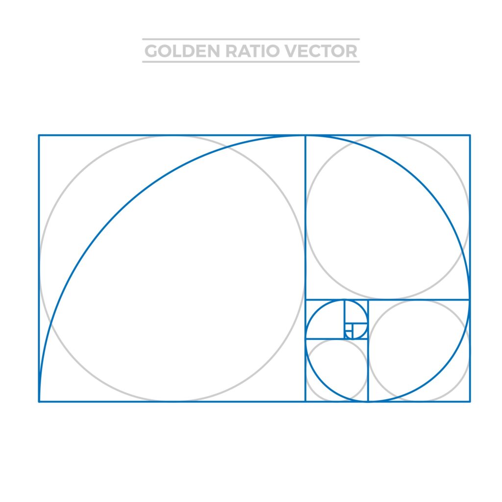
The Golden Ratio, a fascinating mathematical concept, has enchanted artists and designers for centuries with its mysterious beauty and perfect proportions. Known as Phi, approximately 1.618, this ratio is found in nature, architecture, art, and now, in the digital realm of web design. The allure of the Golden Ratio lies in its ability to produce aesthetically pleasing and naturally balanced compositions that are subconsciously attractive to the human eye. To fully understand and apply this principle in various creative and professional fields, one might consider the benefits of deciding to hire a math tutor.
In web design, the Golden Ratio can be applied to create layouts that feel harmonious and engaging. By dividing spaces, content, and even typography according to this ratio, designers can achieve an organic sense of flow and emphasis that enhances user experience. For example, circles frequently embody unity and harmony, while squares symbolize stability and balance, and triangles can suggest movement or direction.
The magic of the Golden Ratio extends beyond mere numbers; it embodies a deeper understanding of visual harmony and balance. Implementing this principle allows for a design that resonates with the natural human affinity for order and beauty, making websites not just viewed but felt.
By weaving the Golden Ratio into the fabric of web design, creators can transcend the ordinary, crafting experiences that captivate and retain the audience’s attention in an oversaturated digital landscape. This timeless mathematical principle continues to be a source of inspiration, guiding the hands of those who shape the digital world, ensuring that beauty and numbers coalesce into memorable designs.
Responsive Design and Geometric Adaptability
With the proliferation of devices with varying screen sizes, responsive design has become a cornerstone of modern web development. Geometry plays a crucial role in making websites adaptable and fluid across different devices. Through geometric calculations, designers can create flexible grid systems that resize and adjust content dynamically, ensuring that the website maintains its aesthetic appeal and usability regardless of the device it’s viewed on.
Visual Hierarchy and Geometric Shapes
Visual hierarchy is a critical concept in web design, dictating the order in which the human eye perceives what it sees. Geometry aids in establishing a clear visual hierarchy through the use of shapes and lines that guide the viewer’s eye across the page. Larger geometric shapes can draw attention to key areas, while lines and directional shapes can lead the viewer through the content, making the website not only visually appealing but also easy to navigate.
Enhancing User Experience with Geometric Consistency
Consistency is key to creating a seamless user experience, and geometry ensures that consistency is maintained throughout the design. By employing consistent shapes, lines, and patterns, designers can create a sense of familiarity for the user, making the website more intuitive and user-friendly. This geometric consistency helps in reinforcing brand identity and improving the overall user experience by making websites more predictable and easier to interact with.
Conclusion
The intersection of geometry and web design is a testament to the enduring relevance of mathematical principles in the digital age. Geometry not only enhances the aesthetic appeal of websites but also improves their functionality and user experience. By understanding and applying geometric principles, designers can create more engaging, intuitive, and visually pleasing websites.
As the digital landscape continues to evolve, the fusion of art, mathematics, and technology will undoubtedly lead to even more innovative and captivating web design approaches. Geometry, with its universal beauty and precision, will remain a central pillar in this creative exploration, shaping the future of web design and aesthetics.


Leave a Reply