
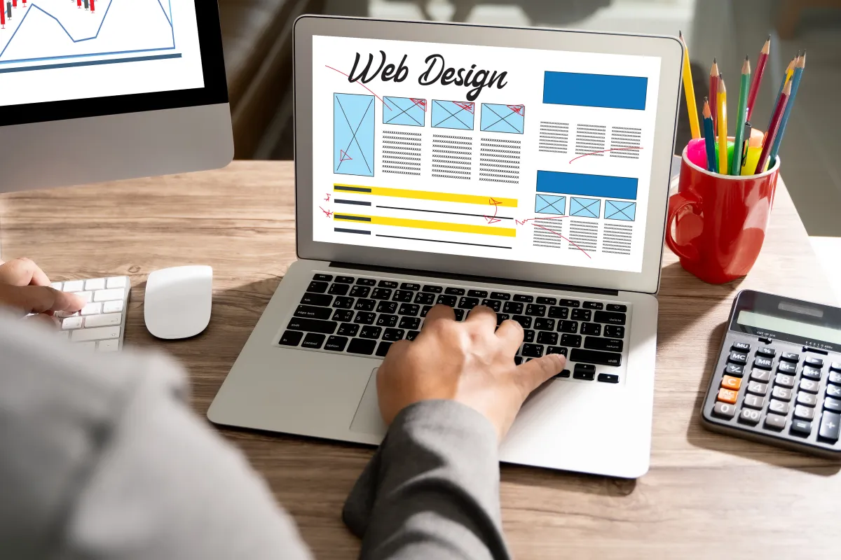
How WordPress Themes Are Adapting to New Web Design Trends in 2026
Web design used to be about showing off. It’s not anymore. In 2026, it’s mostly about getting out of the way. People want pages that load fast, look sharp on phones, and feel easy to use from the first tap.
That shift has changed what a good WordPress theme needs to do. It’s not only about looks anymore. A modern theme has to support SEO, keep Core Web Vitals in good shape, work cleanly with the block editor, and make site building feel lighter, not harder. That quiet efficiency is now part of the design brief.
The biggest web design trends shaping WordPress themes right now
Theme developers are reacting to how people browse, how search works, and how quickly visitors leave when a page feels clunky. Industry platforms such as DesignRush also highlight how modern web design is moving toward cleaner, faster, and more user-focused digital experiences.
Top 2026 Web Design Trends
A theme isn’t modern because it looks modern. It’s modern if it loads fast, reads well on a phone, and doesn’t get in the user’s way.
That has pushed WordPress themes toward leaner code, simpler layouts, and better defaults. What matters is how the theme behaves once real content, real products, and real users show up.
Why speed and Core Web Vitals are now built into theme choices
A heavy theme is a bad first impression. In 2026, stronger themes cut extra scripts, skip oversized sliders, and avoid loading five effects when one will do. Many are built with smaller files, cleaner templates, and fewer dependencies.
That matters for search visibility, but it matters even more for trust. If a page snaps into place, people stay calmer. If it jumps, stalls, or feels sluggish, they start looking for the back button. A fast theme gives every page a better foundation before you touch a single plugin.
How mobile-first layouts are changing menus, spacing, and page structure
Phone-first design used to be extra. It’s now the starting point. 71% of all internet traffic comes from mobile phones.
Good themes are built for small screens first, then expanded for tablets and desktops.
You can see the change in the little things. Menus are shorter. Buttons are easier to tap. Text has more breathing room, and sections stack in a cleaner order. Instead of cramming everything above the fold, newer themes let content flow in a way that feels natural on a screen you hold in one hand.
What modern WordPress themes look and feel like in 2026
The visual side has changed too. Current themes don’t try to impress with noise. They feel calmer, clearer, and more confident.
Why clean layouts and bold typography are replacing busy designs
A few years ago, many themes tried to fill every corner. Sidebars, badges, ribbons, carousels, popups, three font pairs, all on one page. That style is fading.
Now the better themes use white space with purpose. Headings are stronger. Content blocks are easier to scan. The layout gives each section room to breathe, which helps readers focus and helps brands look more sure of themselves. It’s a bit like walking into a tidy room after a messy one. You don’t have to think as hard.
This also works well with the WordPress block editor. Clean themes leave space for reusable patterns, simple grids, and template parts that don’t fall apart when you change one thing.
How subtle motion and micro-interactions add polish without slowing sites down
Motion still matters, but only when it has a job. A small hover effect on a button, a soft fade on an image, or a gentle reveal as you scroll can make a site feel responsive and cared for.
Good motion is like seasoning. A little improves the whole thing. Too much ruins it.
Why AI-ready theme features are becoming part of the standard toolkit
AI is creeping into WordPress theme workflows, but in a useful way. Some themes and builders now offer starter layouts, block suggestions, quick copy drafts, smarter search, or setup help for stores and service sites.
That can save hours, especially for solo site owners. But there’s a catch. AI can fill space fast, and fast isn’t always good. A homepage still needs judgment, hierarchy, and a real sense of voice.
The themes worth watching are the ones that play nicely with AI tools without turning your site into a generic template farm. They help you move faster, but they still leave room for human choices.
How to choose a WordPress theme that will still feel current next year
Trends move fast. Rebuilding a site does not. So the smarter move is choosing a theme with a long shelf life, not one that only looks good in a demo.
The features that matter most when you compare themes
Start with speed. If the theme is bloated on day one, it won’t age well. Of course, the theme is only one part of the performance. Good wordpress hosting also matters because even a clean theme can feel slow on a weak server.
Then check the phone experience.
Open the demo on your mobile, tap through the menu, read a few paragraphs, and see if anything feels cramped or annoying.
After that, look at customization. You want control over layout, colors, and type without wrestling with every page. SEO-friendly structure matters too, because clean heading order, readable code, and sensible templates make life easier for both people and search engines. If you’re selling products, WooCommerce support should feel native, not bolted on later.
Accessibility is part of this test as well. Good contrast, readable fonts, and clear focus states aren’t bonus points. They’re basic quality.


Leave a Reply