
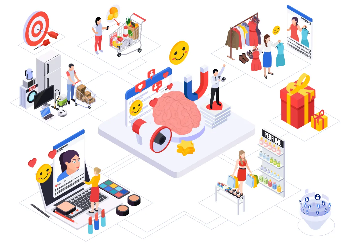
The Psychology of Online Shopping: How Design Choices Influence Buyer Behavior
Why do some ecommerce stores instantly feel trustworthy, while others trigger hesitation? Why do users abandon carts over a single checkout field?
The answers lie deep in our psychology. Behind every click, scroll, and swipe is a series of subconscious decisions shaped by emotion, design, and cognitive bias.
Understanding buyer behavior isn’t just a marketing advantage, it’s a strategic necessity. Today’s most successful ecommerce brands are built on user-first design principles that harmonize aesthetics with psychology to drive conversions.
This article explores how online shopping behavior is influenced by UX design, cognitive science, and visual hierarchy, and how marketers and designers can use this knowledge to build better digital storefronts.
The Brain on E-Commerce: Cognitive Biases at Play
Online shopping isn’t purely logical. Much of it is emotional, fast, and driven by mental shortcuts—also known as cognitive biases.
Understanding these behavioral patterns can help you design websites that guide users more effectively toward a purchase.
Decision Fatigue and Choice Architecture
When faced with too many options, our brains get overwhelmed. This phenomenon leads to indecision, second-guessing, and eventually, cart abandonment. The most effective ecommerce brands use choice architecture to simplify decisions.
Instead of listing 50 similar products, offer filters, curated collections, or “bestseller” highlights. Guide shoppers gently toward the decision you want them to make, instead of leaving them stuck in analysis paralysis.
The Anchoring Effect in Price Display
Pricing isn’t just about numbers. It’s about context. Users subconsciously compare prices to the first number they see, a bias known as the anchoring effect.
That’s why “Was $79, Now $39” feels like a great deal even if the product’s true value is closer to $39. Displaying original prices, using strike-throughs, or highlighting savings can significantly increase perceived value and conversion rates.
The Power of Urgency and Scarcity
Ever seen a “Only 3 left in stock!” warning and felt a sudden urge to buy? That’s FOMO (fear of missing out) at work.
Countdown timers, flash sale banners, and low-stock alerts all create a sense of urgency. These cues activate our instinct to act quickly and avoid regret, driving impulsive purchases and reducing the time shoppers spend second-guessing.
First Impressions: How Layout and Visual Flow Shape User Trust
You only get one chance to make a first impression. In the online world, that impression happens in milliseconds. Website design isn’t just about looking good, it’s about establishing credibility, trust, and clarity.
As the team at ZeroBounce discovered during their 2023 redesign:
“We didn’t just improve a few features and add new ones; we completely redesigned the experience to make it more modern, intuitive, and user-friendly… the redesign also helped boost our visibility in search engines, since user experience is such a big part of SEO. Ultimately, our conversions started going up – and they’ve been climbing ever since.” – Liviu Tanase, founder and CEO of ZeroBounce
Thoughtful design has the power to build trust and elevate user satisfaction. Both of these elements are essential for ecommerce success.
Visual Hierarchy and Attention Patterns
The human eye scans websites in predictable ways. Most users follow either an F-pattern (reading from left to right, top to bottom) or a Z-pattern (quickly scanning across the top, down diagonally, and across the bottom).
Great UX design uses visual hierarchy through color contrast, typography, white space, and size to guide the eye. Strategic placement of key CTAs and messages ensures users focus on what matters most.
Navigation Design That Reduces Friction
Menus shouldn’t make users think. An intuitive navigation structure is essential for guiding buyers efficiently.
- Use sticky headers to keep menus visible during scroll
- Keep category names simple and clear
- Include a search bar for direct navigation
- Limit menu depth
The smoother the path, the fewer drop-offs you’ll see.
Building Trust Through Visual Cues
In a digital world full of scams, trust is currency. To win it, use visual trust signals:
- Security badges
- Verified reviews
- Product certifications
- Clear return policies
- SSL certificates
- User-generated photos or testimonials
These simple additions communicate that your brand is reliable, transparent, and secure.
Color Psychology and Typography: Subtle Design, Major Influence
In the world of online shopping, every design choice sends a signal. And some of the most powerful signals are the ones users barely notice. Color and typography may seem like surface-level decisions, but they have a profound impact on how users perceive your brand, navigate your site, and decide to convert.
From building socioemotional trust to guiding the eye toward a call to action, these subtle cues often make the difference between a bounce and a buy.
The Emotional Power of Color
Color is one of the fastest ways to communicate emotion. It takes milliseconds for the brain to assign meaning to a color, and ecommerce brands use that snap judgment to their advantage. Each hue carries associations that can either inspire action or soothe anxiety.
Here’s how some of the most common ecommerce color choices play out psychologically:
- Blue: Trust, security, calm. It’s no coincidence that banks, tech firms, and SaaS platforms lean heavily on blue. It reassures users and feels reliable.
- Red: Urgency, passion, power. Often used in flash sale banners or CTA buttons, red grabs attention and creates a sense of immediacy.
- Green: Balance, wellness, growth. Green is commonly used by eco-conscious brands and wellness companies. It’s also easy on the eyes and often associated with positive outcomes (think “green = go”).
- Black: Luxury, exclusivity, confidence. High-end fashion and lifestyle brands often lean on black backgrounds or bold black text to signal sophistication.
- Orange and Yellow: Optimism, friendliness, energy. These bright tones are great for highlighting free shipping messages or bonuses, but they can also create visual fatigue if overused.
For conversion-focused design, your call-to-action (CTA) buttons should pop without clashing. Use contrast to draw the eye: if your background is white or light, a bold-colored button (red, green, or even a saturated blue) can create immediate visual focus.
Always A/B test button colors across audiences. What works for one market or vertical may fall flat in another.
Also consider cultural context. For example, red symbolizes good fortune in some cultures but can feel aggressive in others. Know your audience before committing to a palette.
Typography That Converts
While color draws attention, typography shapes the tone. Fonts carry personality, set expectations, and determine how comfortably users can consume your content.
In ecommerce, where fast scanning and clarity are essential, readability should always come first. But that doesn’t mean typography has to be boring.
Best practices for high-converting typography include:
- Sans-serif fonts (like Helvetica, Open Sans, or Roboto) are clean, modern, and ideal for screens. They keep product descriptions and navigation simple and digestible.
- Use font weight strategically like bold for pricing, benefits, or section headers; light for supporting details. Contrast helps create hierarchy and improves scanability.
- Limit your site to 2–3 fonts max (e.g., one for headings, one for body copy, and one accent font if needed). Too many styles can feel chaotic.
- Maintain ample line spacing and padding around text blocks. Dense paragraphs increase cognitive load and can drive mobile users away fast.
- Avoid decorative or script fonts in body copy. While they might look stylish, they quickly become a barrier to comprehension.
Typography also plays a role in brand trust. A serif font might convey tradition and authority (ideal for heritage brands), while a rounded sans-serif could evoke friendliness and approachability.
Match your font choices to your brand’s tone and be consistent across pages to create a unified user experience.
Together, smart color and type choices help reduce friction, build confidence, and keep users moving naturally toward the next step. They don’t scream for attention—they quietly guide it.
The Role of Imagery and Micro-Interactions in Engagement
A picture really is worth a thousand words, especially in online shopping. While persuasive copy addresses logic, high-quality visuals speak directly to emotion and intuition, two forces that drive buyer behavior even more than we like to admit.
In fact, studies show that over 90 percent of first-time visitors rate product imagery as the single most influential factor in their purchase decision. When visuals are sharp, contextual, and interactive, they reduce doubt, create desire, and foster instant trust.
Product Design and Contextual Content
Static studio photos are no longer enough. Shoppers want to imagine an item in their own lives, so prioritize:
- Contextual shots – Show the product in a real-world setting that mirrors your customer’s environment (e.g., a sofa in a lived-in living room rather than a white cyclorama).
- Multiple angles & zoom – Let users inspect texture, scale, and details without guessing.
- Usage-driven video & GIFs – Quick loops demonstrating key features boost comprehension and shorten the decision cycle.
- Lifestyle storytelling – Weave images into a narrative that reflects the customer’s aspirations.
A standout example is PrimePutt’s putting mat pages. Beyond crisp close-ups, they embed short videos of golfers rolling putts in a home office, basement, or backyard.
This contextual content closes the imagination gap, proving the mat’s realism and convenience and nudging hesitant shoppers toward “Add to Cart.”
Micro-Animations and Hover Effects
Once visuals pull users in, subtle movements keep them exploring. Micro-interactions, the tiny, purposeful animations triggered by a scroll, tap, or hover, provide immediate feedback and a sense of polish that subconsciously signals quality.
Done well, they:
- Reassure – A button that darkens on hover confirms it’s clickable, reducing uncertainty.
- Delight – A gentle image zoom or 3-D rotation sparks curiosity, inviting users to linger.
- Guide – Progressively revealing information (e.g., color swatches that animate on hover) directs attention without overwhelming the page’s visual hierarchy.
Best practices:
- Keep duration short (200–400 ms) so motions feel snappy, not sluggish.
- Ease in/out rather than abrupt changes to align with human perception.
- Use consistency—similar actions should trigger similar responses to avoid cognitive load.
- Test accessibility—ensure motion can be reduced or disabled for motion-sensitive users.
Remember, restraint is key. Excessive animation can distract, slow load times, and erode trust. Aim for a handful of purposeful interactions that elevate perceived value without stealing focus from the primary CTA.
Strategic imagery and thoughtful micro-interactions work together to create an ecommerce experience that feels tangible and premium. When customers can both see and feel a product’s value, conversion is no longer a leap of faith; it’s the obvious next step.
The Psychology of Checkout: Reducing Cart Abandonment in Online Shopping
Getting a user to the checkout page is a major win, but it’s far from the finish line. In fact, studies show that nearly 70% of online shopping carts are abandoned before purchase.
Why? Because even small design missteps in the final stage can create uncertainty, friction, or cognitive overload.
To reduce cart abandonment and improve follow-through, ecommerce teams must address the psychological barriers that emerge right when users are most vulnerable to second thoughts.
Form Simplicity and Progress Indicators
Long, complicated checkout forms are a leading cause of abandonment. When shoppers are required to create an account, fill out multiple address fields, or dig for payment information, the experience quickly turns from convenient to stressful.
The solution? Streamline every step.
- Use single-column layouts to reduce visual complexity and scanning fatigue.
- Minimize the number of form fields to just what’s essential (name, shipping address, payment info).
- Offer guest checkout to eliminate the friction of forced account creation, especially for first-time buyers.
- Use auto-fill, address suggestions, and card recognition tools to speed up input.
- Most importantly, include a progress indicator at the top of the checkout process to visually communicate how many steps remain. This eases anxiety by giving users a sense of control and completion.
Even simple design improvements, like grouping related fields or displaying error messages inline, can have a measurable impact on user comfort and checkout completion.
Payment Trust and Final Nudges
At the final moment of decision, trust matters more than ever. If something feels even slightly “off,” users will hesitate, or worse, exit.
To instill confidence and close the sale, your checkout page should clearly display security and trust signals:
- Include SSL encryption icons and recognizable payment method badges (Visa, Mastercard, PayPal, etc.).
- Offer Buy Now, Pay Later options like Afterpay or Klarna for greater financial flexibility, especially on higher-ticket items.
- Display clear return policies and money-back guarantees close to the payment form to reduce perceived risk.
- Reinforce your value with last-minute reminders like “Free shipping over $50,” “30-day hassle-free returns,” or “Secure payment guaranteed.”
These final nudges help lower psychological resistance by addressing common buyer concerns: “Is this secure?”, “Can I change my mind?”, “Is this really worth it?”
Designing the checkout process with empathy and clarity isn’t just about moving users through a funnel, it’s about removing every obstacle that stands between intent and action.
Final Thoughts – Designing With the Mind in Mind
The psychology of online shopping reveals a simple truth: great design isn’t just aesthetic—it’s strategic. Every layout decision, color choice, and interaction element works on a subconscious level, guiding users toward trust, comfort, and action.
As ecommerce competition grows, the brands that win are those that think beyond conversions and optimize for real human behavior. That means auditing your site for friction points, aligning your visual hierarchy with attention patterns, and using trust cues to reinforce credibility at every step.
Ultimately, designing with psychology in mind is about putting the user first. And when you do that, engagement follows. So does loyalty. So does long-term growth.
Looking to stay ahead in the evolving ecommerce landscape? Learn from the brands doing it right. Those that blend UX insight with emotional intelligence to turn browsers into buyers and clicks into customers.


Leave a Reply