Elements

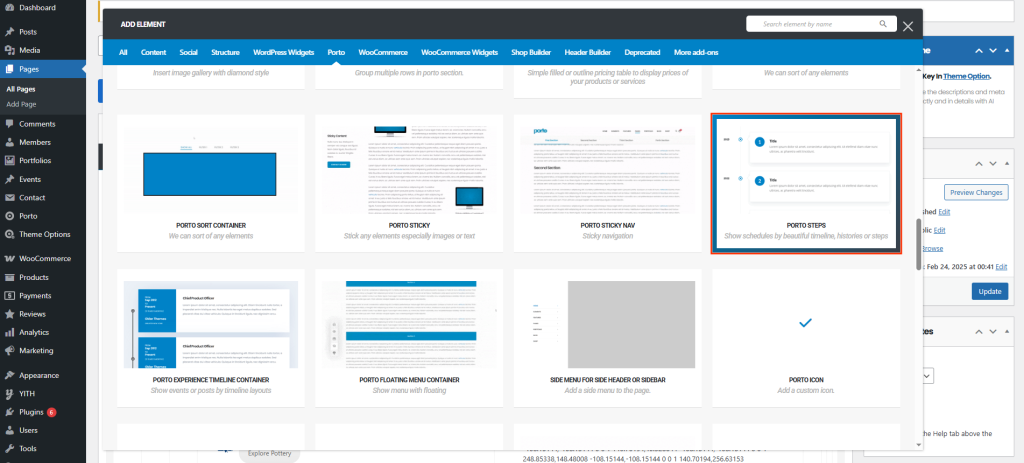
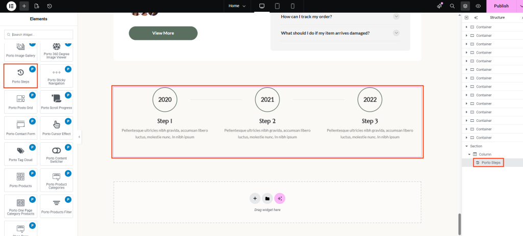
The Elements category in the Porto theme documentation provides a complete reference to all reusable design components available in Porto’s Page Builder integrations, including WPBakery and Elementor. These elements serve as the building blocks for creating custom layouts, enhancing user interfaces, and improving the visual and functional experience across your website.

Porto Elements include everything from structural components (rows, columns, containers) to interactive tools such as sliders, buttons, carousels, grids, forms, icons, counters, accordions, and dynamic WooCommerce elements.

Whether you’re building a product page, portfolio, blog layout, landing page, or a fully dynamic WooCommerce storefront, the Elements category helps you understand how to use each component effectively. It guides you through configuration options, best practices, and available style controls so you can build professional-grade pages with ease.

Post Share

The Porto Post Share element allows you to display social sharing icons on single post layouts, helping visitors easily share your content across social networks. This element dynamically loads the social platforms configured in Porto → Theme Options → General → Social Share, ensuring consistent behavior...

Post Navigation

The Porto Post Navigation element adds Previous and Next post links to single post layouts. It improves content flow by allowing visitors to move easily between posts without returning to archive pages. This element is designed for use inside Porto Single Post Builder templates and dynamically...

Related Posts

The Porto Related Posts element is a dedicated widget used inside Porto Single Post Builder templates to display contextually related content below or alongside a post. It automatically queries related posts based on taxonomy relationships and renders them using a selected Post Mini Type Layout, ensuring...

Post Comments

The Porto Post Comments element displays the comment list and comment form on single post pages created with the Porto Single Builder. It allows you to control spacing, typography, avatar styling, and interaction elements, ensuring that discussions remain readable and visually consistent with your layout. Additionally,...

Post Meta

The Porto Meta element is a flexible component of the Porto Single Builder that displays post metadata such as author name, publish date, categories, comments count, and other post details. This element allows you to control exactly which meta fields appear on a post, as well...

Post Author Box

The Porto Author Box element is a dedicated component of the Porto Single Builder that displays author information on single post pages. It helps visitors quickly identify the post author while improving content credibility and user engagement. This element automatically pulls author data from WordPress, including...

Post Featured Image

The Porto Featured Image element is a core part of the Porto Single Builder. It displays featured images or videos from the current post in a flexible and visually controlled way. Instead of relying on a fixed layout, this element lets you choose how featured...

Steps Element

Porto Steps is a flexible visual element designed to display chronological information, processes, or milestones in multiple formats. It supports several step presentation styles, making it suitable for schedules, histories, timelines, and step-by-step workflows.

Content Switcher Element

The Porto Content Switcher lets you display two different contents in the same area and switch between them using a toggle. It’s ideal for comparisons such as pricing plans, feature differences, or alternative layouts—without duplicating page space or adding custom scripts.

Contact Form Widget

The Porto Contact Form widget allows you to easily display an existing contact form and apply consistent styling that matches your site design. It provides granular control over form fields, buttons, and message states, enabling you to create polished and accessible contact forms without custom CSS. This...